Halloween Inspiration: How We Use Orange and Black
Day to DayThe most spooktacular time of year is approaching with Halloween just around the corner. Thinking about our many design tricks and the resulting treats led us to an unusual combination, orange and black. We’ve put together a number of ways we use these colours to help ensure your home isn’t a house of horror this Halloween…
The most spooktacular time of the year is approaching with Halloween just around the corner. Thinking about our many design tricks and the resulting treats led us to an exciting colour combination: orange and black.
Reminiscent of the autumn season, you will find these colours reflected in our natural surroundings. Leaves are slowly beginning to change to a crisp burnt orange whilst the black of night draws in as the days become shorter.
A powerful team when combined, orange and black are contemporary, energetic and powerful, and they certainly have a place in the right interior setting. We’ve put together a number of ways we use orange and black to help ensure your home isn’t a house of horror this Halloween…
Vibrant yet subdued, these colours create a unique atmosphere when used in tandem. We like to use them in big rooms where you want to make a statement.
At Refuel Bar & Restaurant at The Soho Hotel, not a single corner escaped our attention. This colour palette creates the perfect cosmopolitan setting, perfect for enjoying a delicious dinner or innovative cocktail.
We adopted a similar approach at Ham Yard Hotel. The bar has an abundance of natural light from the floor-to-ceiling Crittall windows, which helped us on our way when using a mix of powerful colours. On the walls we have used my lively ‘Willow’ fabric in Lemon and to create distinct seating areas throughout the room we used a very purposeful combination – you guessed it, orange and black.
If you’re still not sold on these colour companions, try using them with creams and whites to balance out the intensity.
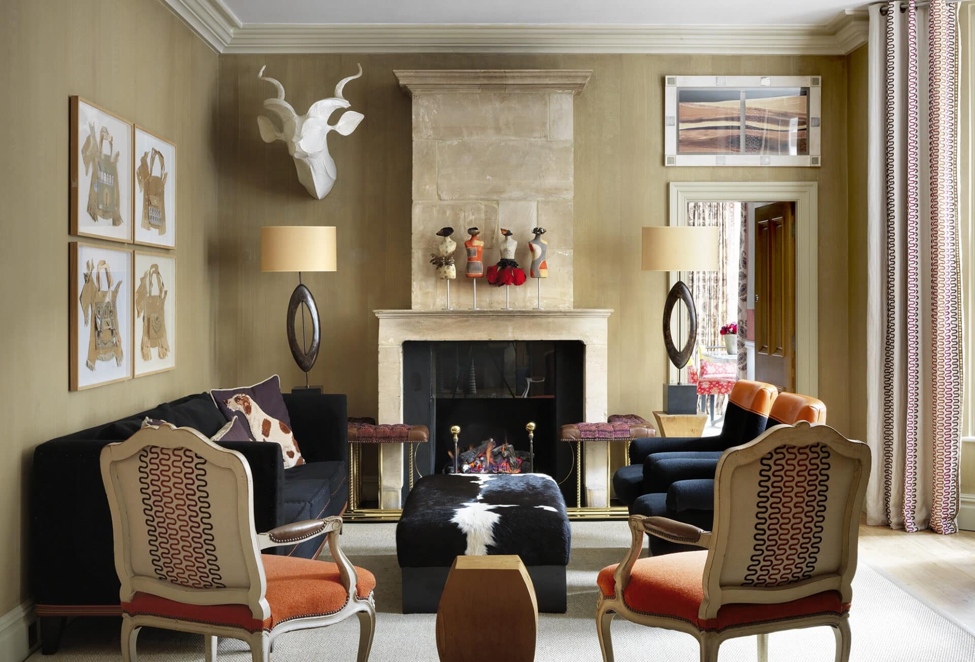
The Drawing Room at Knightsbridge Hotel looks elegant and serene, grounded by its stone coloured walling and antique French fireplace. The pops of orange and black used on the upholstery create a statement without dominating the room.
Embracing what could have been quite a dominating feature, the pillars been given a purposeful splash of paint to create a distinct sense of unity and flow throughout the room.
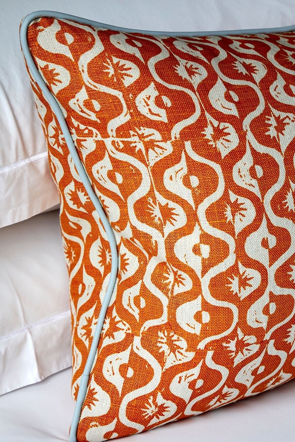
At Haymarket Hotel, this room feels fresh and crisp as the geometric pattern on the headboard takes centre stage. The contrasting third of the bed cushion and the depth on the headboard lift the scheme, whilst the plain linen walling allows the colours to breathe.
Here at The Whitby Hotel, we have confined our combination of black and orange to the sofa. This is a case of ‘a little goes a long way’, and combining different fabrics in the same piece of furniture is a sure-fire way of packing a punch and adding a touch of the unexpected to a room.
We love seasonal moments, so if you’re not ready to go full steam ahead try adding some decorative touches or in-keeping home accessories: a centrepiece with pumpkins, autumnal leaves or some colourful cushions. When it comes to creating a layered interior, as we always say, the devil is in the detail.
A less vibrant orange, such as terracotta or amber, will read with a lower intensity. This calming room offers a peaceful haven from the buzz of city life.


