At the Kit Kemp Design Studio, we use wall dressings to give a room personality, create a unique character and add warmth to the space. But what is the difference between a wallpaper and a mural?
Traditionally, wallpapers have offered a regular and uniform look, whilst a mural is more unique and varied across its surface. Wallpapers include repetition whereas a mural will have less symmetry and a larger repeat.
Join us as we explore some of our most-loved murals and wallpapers to see how we have transformed large expansive walls from a blank canvas into their own immersive story…
1. A Modern Day Mural
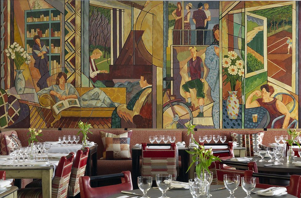
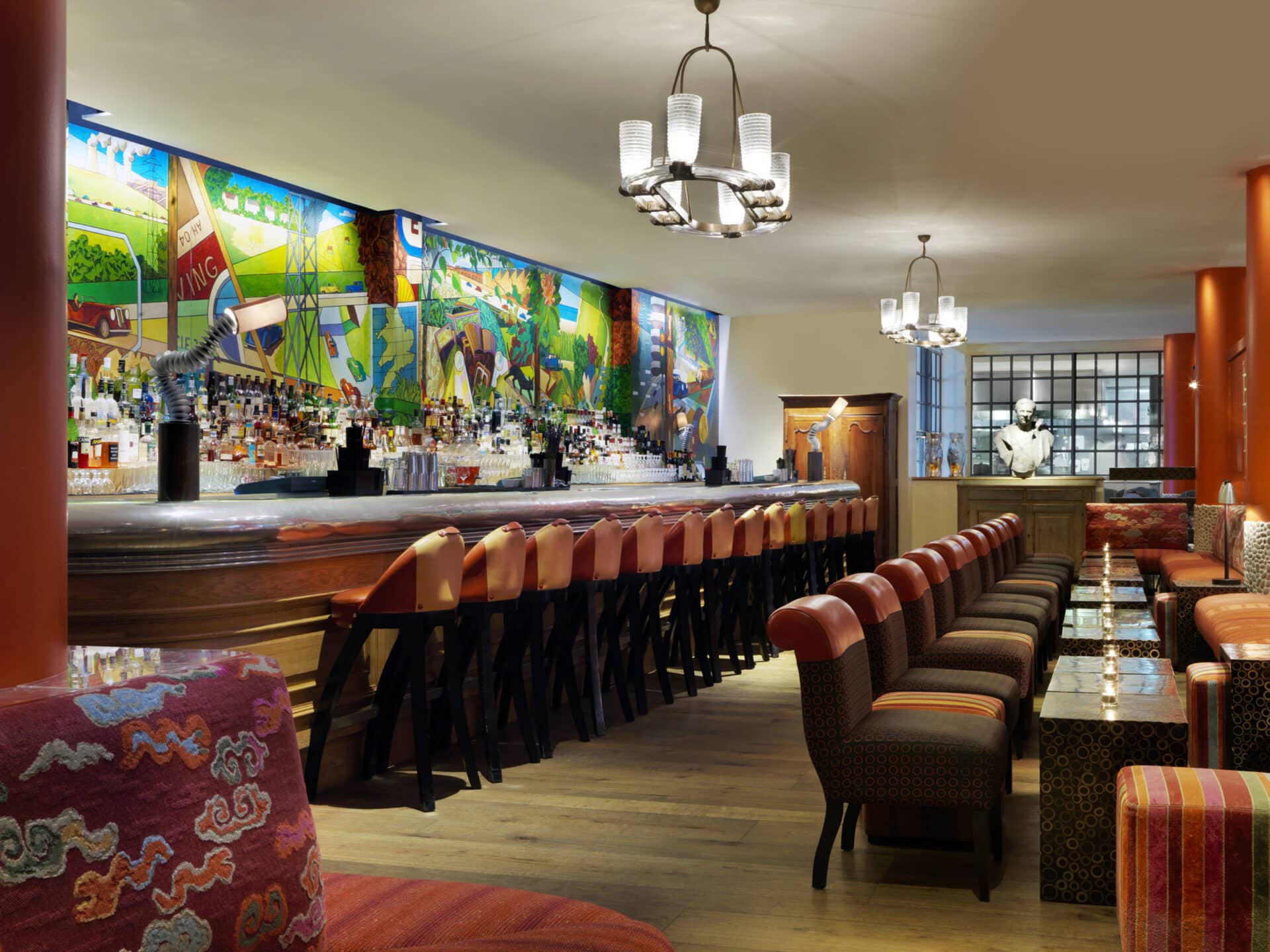
The colourful mural in Oscar Bar & Restaurant is a hero feature at Charlotte Street Hotel. This kaleidoscope of colour is a tribute to the Bloomsbury Group, a set of intellectuals and artists who lived and worked in the area in the early 20th century.
We commissioned artist Alexander Hollweg to create this mural that was to be inspired by the early 1900s but with a nod to the late 20th century. It depicts everyday scenes of modern life, inspired by a photograph of an original mural by Duncan Grant of very elegant ladies coming out of a London Underground station. Details in the mural include the London Eye, people on mobile phones, at the cinema, and Tim Kemp playing chess, all created in the style and colour palette of the Bloomsbury Set.
2. Up Above The Trees
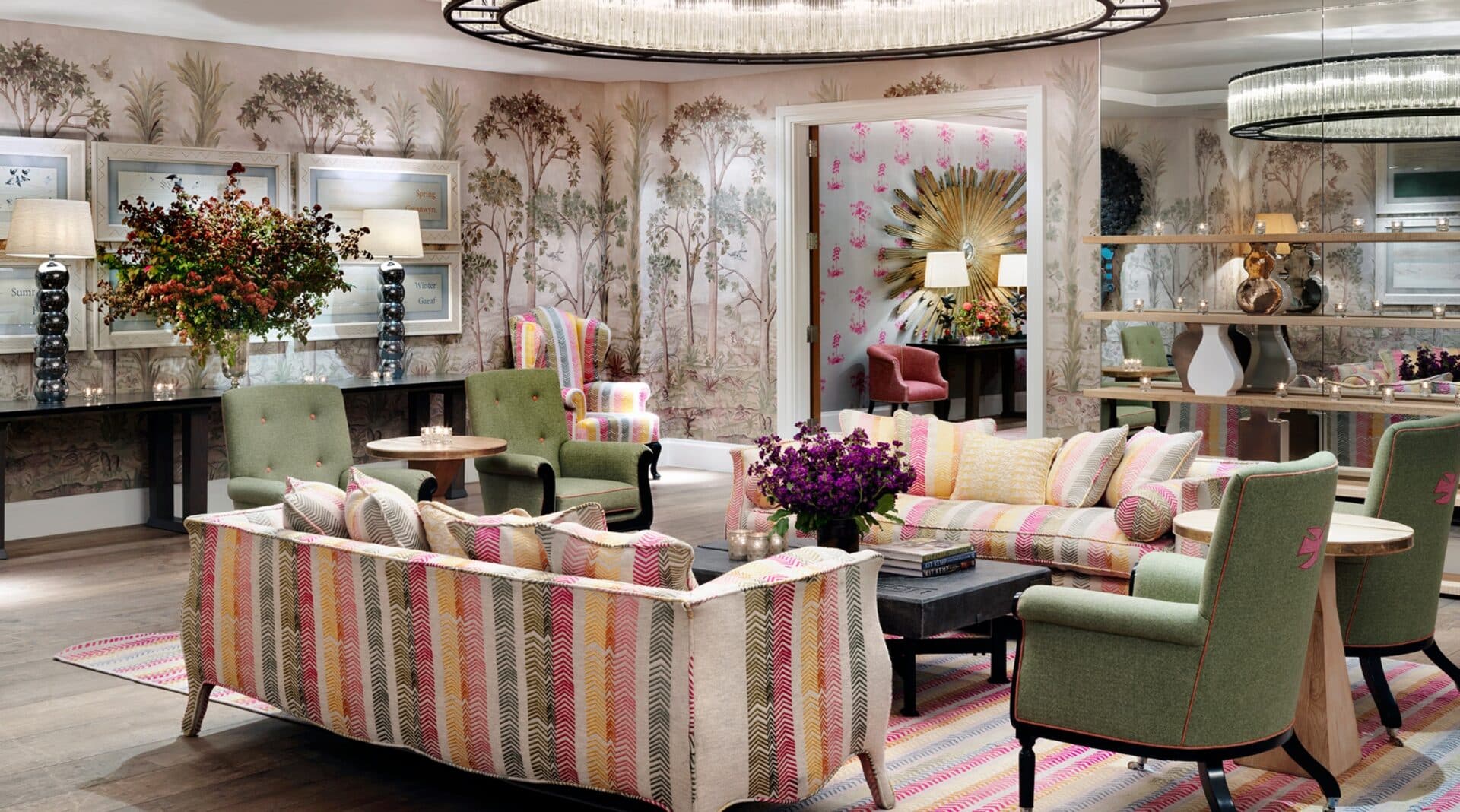
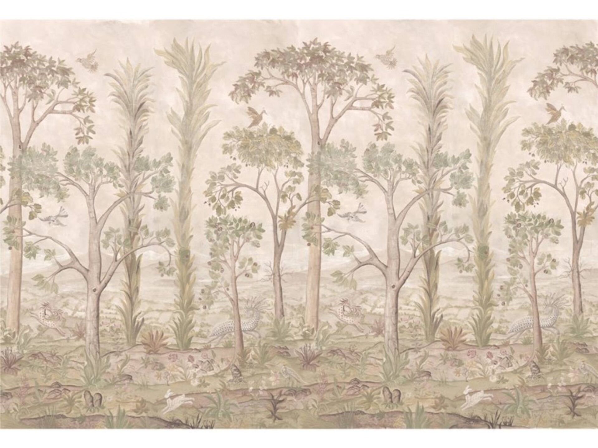
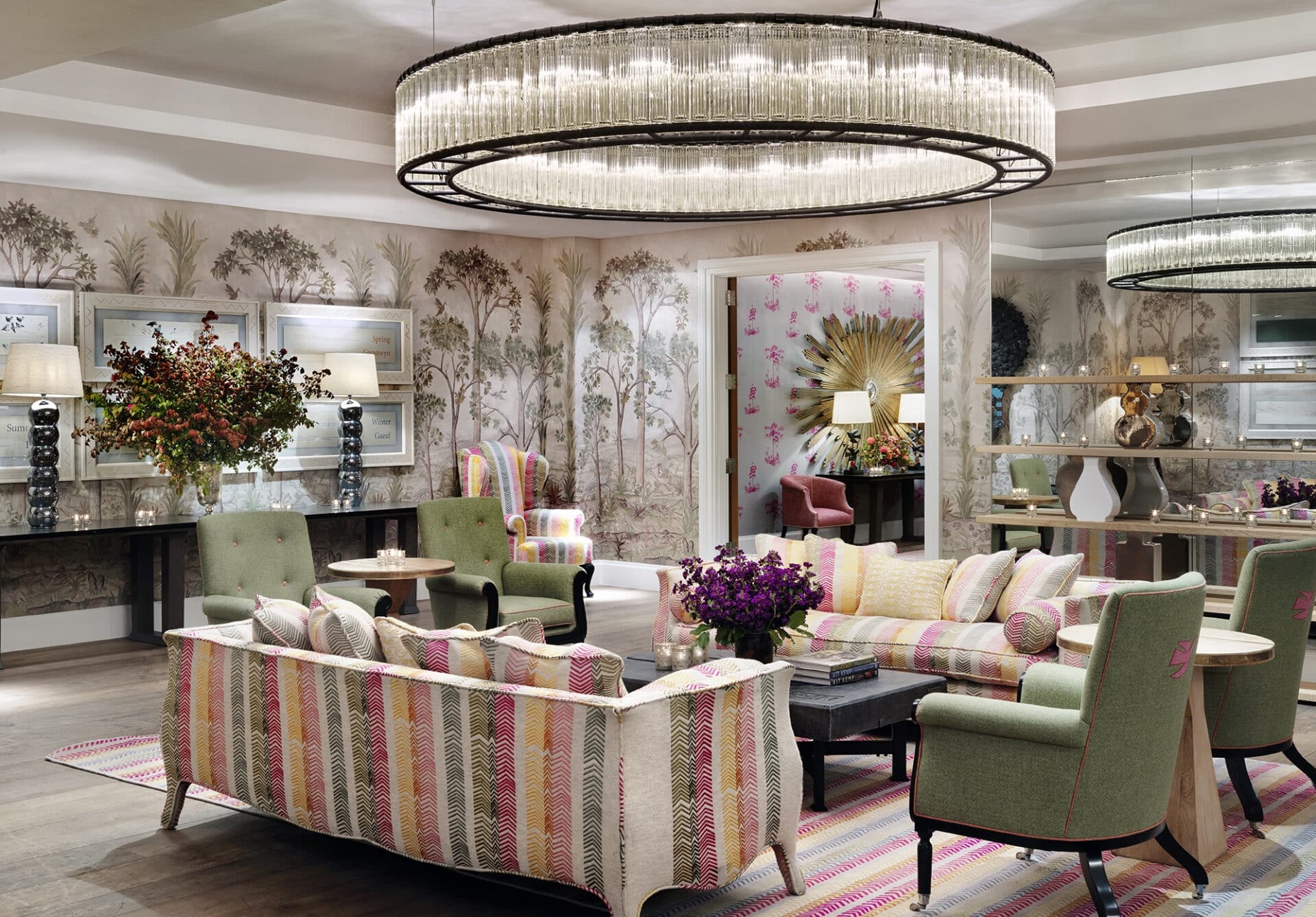
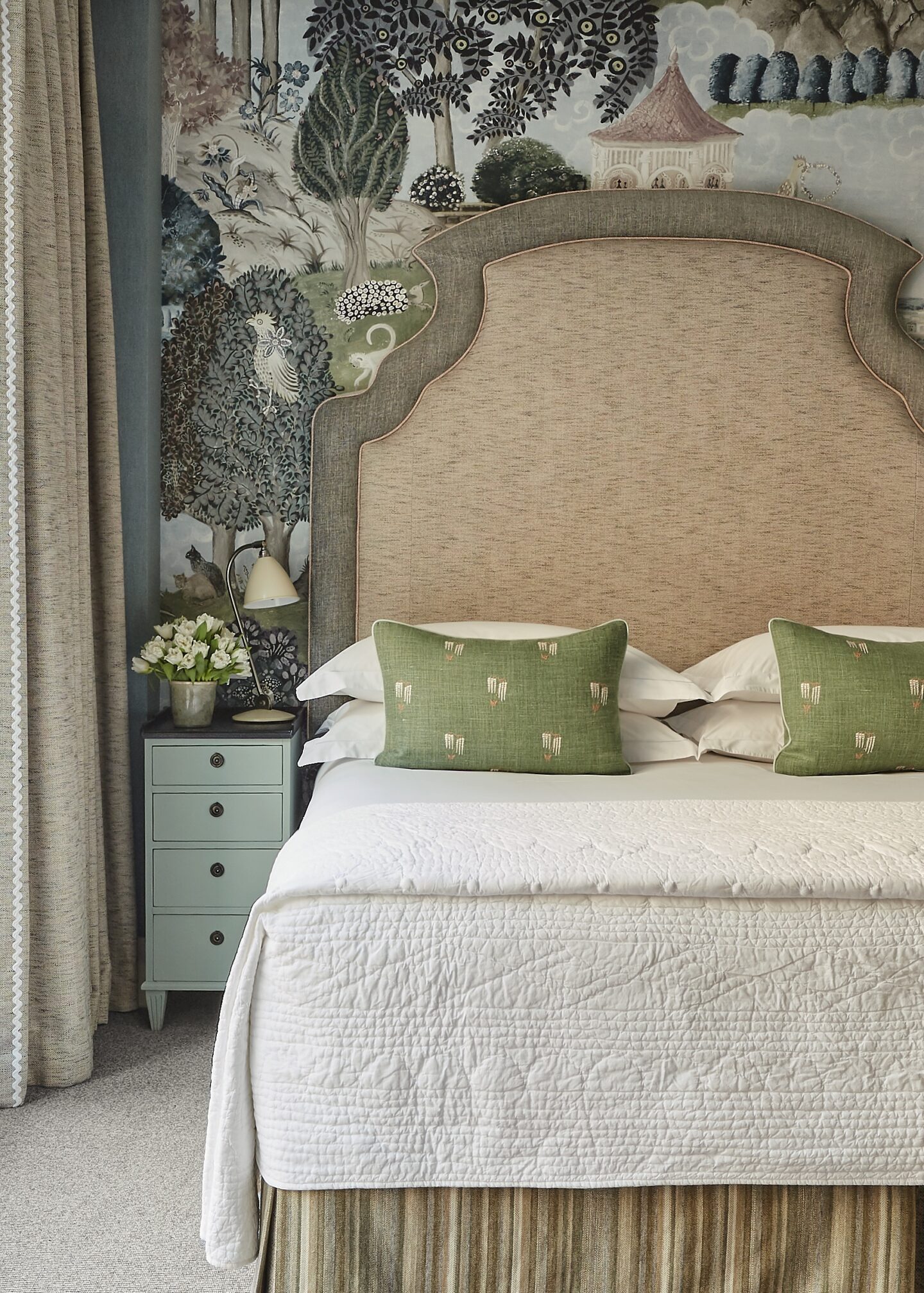
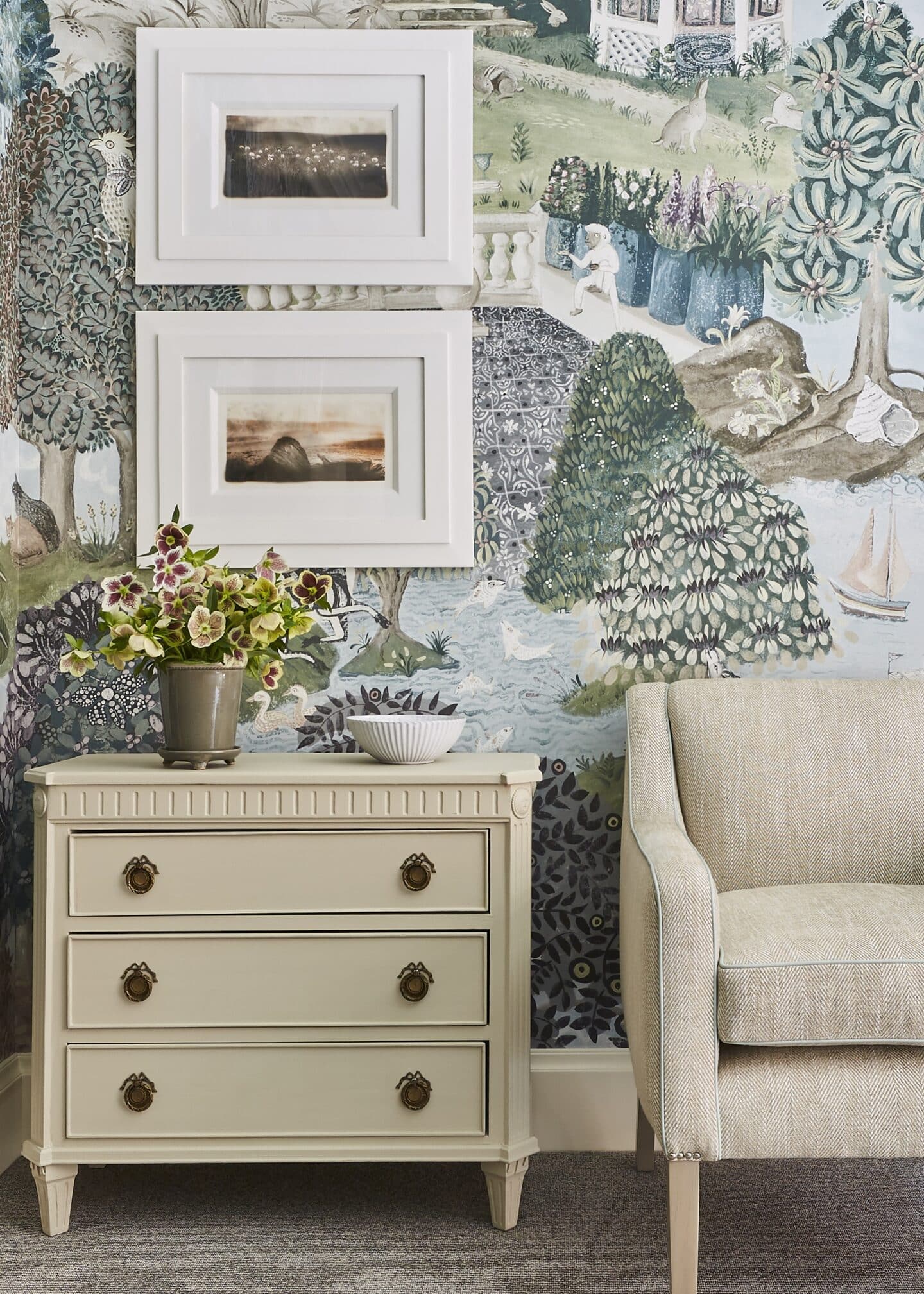
You have surely seen our Tall Trees wallpaper before, perhaps in our recent Sleeping Around post Soulful Sage. Its large repeat will trick you into thinking it is a mural, however, this wallpaper has a repetition. In our Prince private event room at Crosby Street Hotel, we have used it all along the walls to whisk dinner party guests away to an enchanted forest. Tall Trees tells a unique story allowing a special treetop view surrounded by birds, mythical creatures and rolling hills fading into the distance. The scale is large but as the colours are de-saturated and chalky, the scene can be layered with other pieces. Shop our Tall Trees Wallpaper on Shop Kit Kemp here.
5. Relax and Refuel
Similarly to Oscar, you will find a mural in Refuel Bar at The Soho Hotel. This was also done by artist Alexander Hollweg. It uses vibrant colours and tells the story of the hotel’s former life as an NCP car park. The mural was inspired by a Rousseau painting and given to Hollweg to use as inspiration.
Murals are a simple way to refresh any room. If you want to make an impact with one contrasting wall, a wall mural is a great stand-alone feature.
3. Play With Proportions
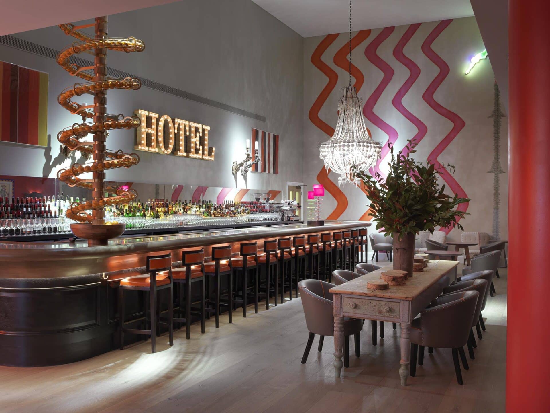
It is always important to consider proportions. Make sure the scale accommodates the height of the room and makes sense within the space. In the Dive Bar at Ham Yard Hotel, we enlarged our Rick Rack design and scaled it to fit the dimensions of the wall. This time it is used as a mural rather than a wallpaper repeat, achieving a statement wall that emulates the joy and fun nature of the room without feeling too repetitive.
4. A Secret Garden
Here in Room 207 at Crosby Street Hotel is “Emily’s Garden” wallpaper by Melissa White. The large repeat tells a story and by using it on a single wall flanked with solid colours on the adjacent sides it becomes more sophisticated and the focal feature of the room.
6. Spectacular Scenes
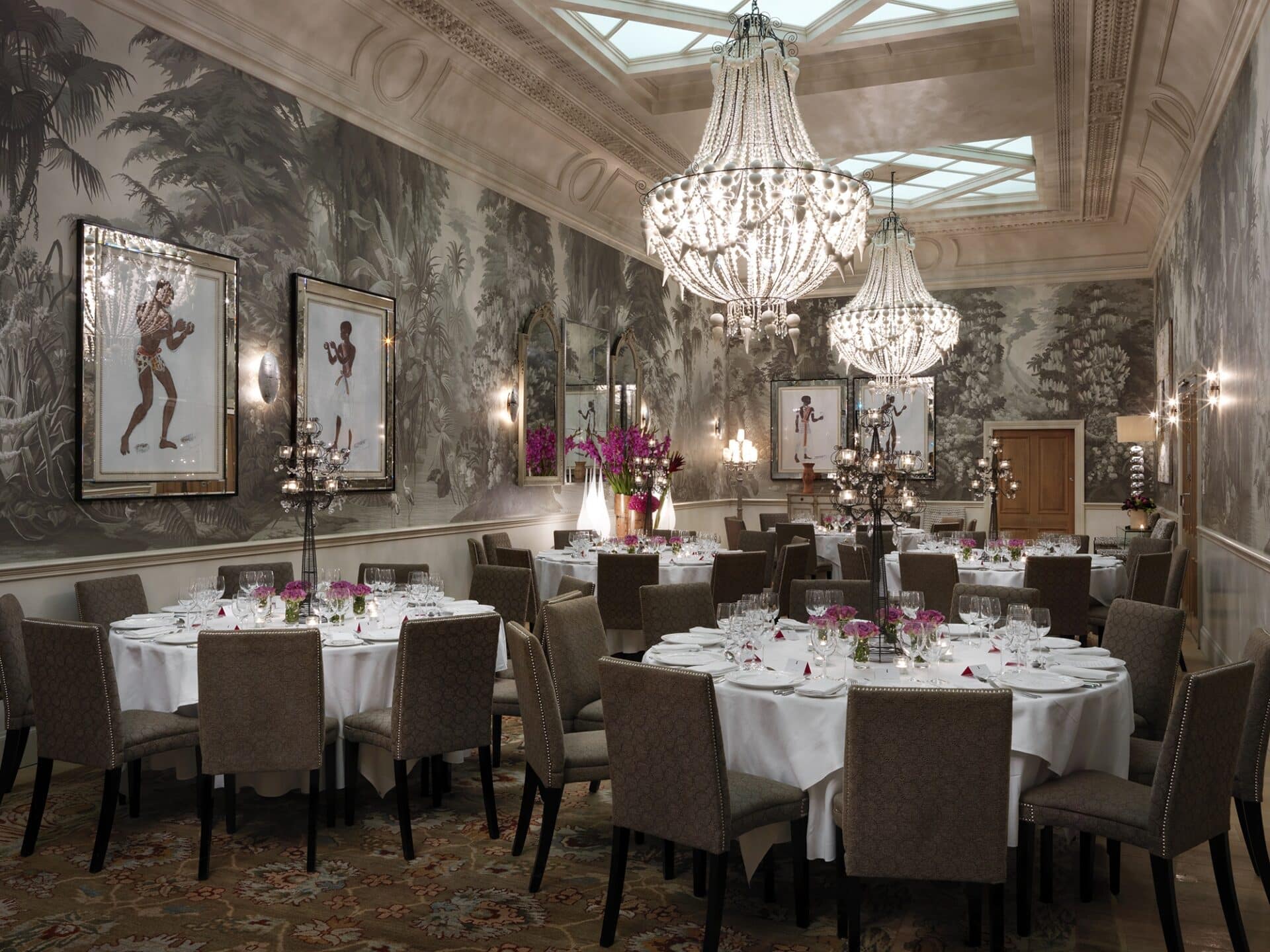
A vast space that is 60 feet in length with 18 foot ceilings, the Shooting Gallery at Haymarket Hotel was a wonderful opportunity to create something spectacular. The walls are covered in a dramatic de Gournay wallpaper featuring jungle landscapes in grey sepia tones. It is furnished with an eclectic collection of furniture including 70’s lucite tables and lamps and pictures by Oliver Messel, illustrating his costume designs for a production of Antony and Cleopatra.
7. Layer Up
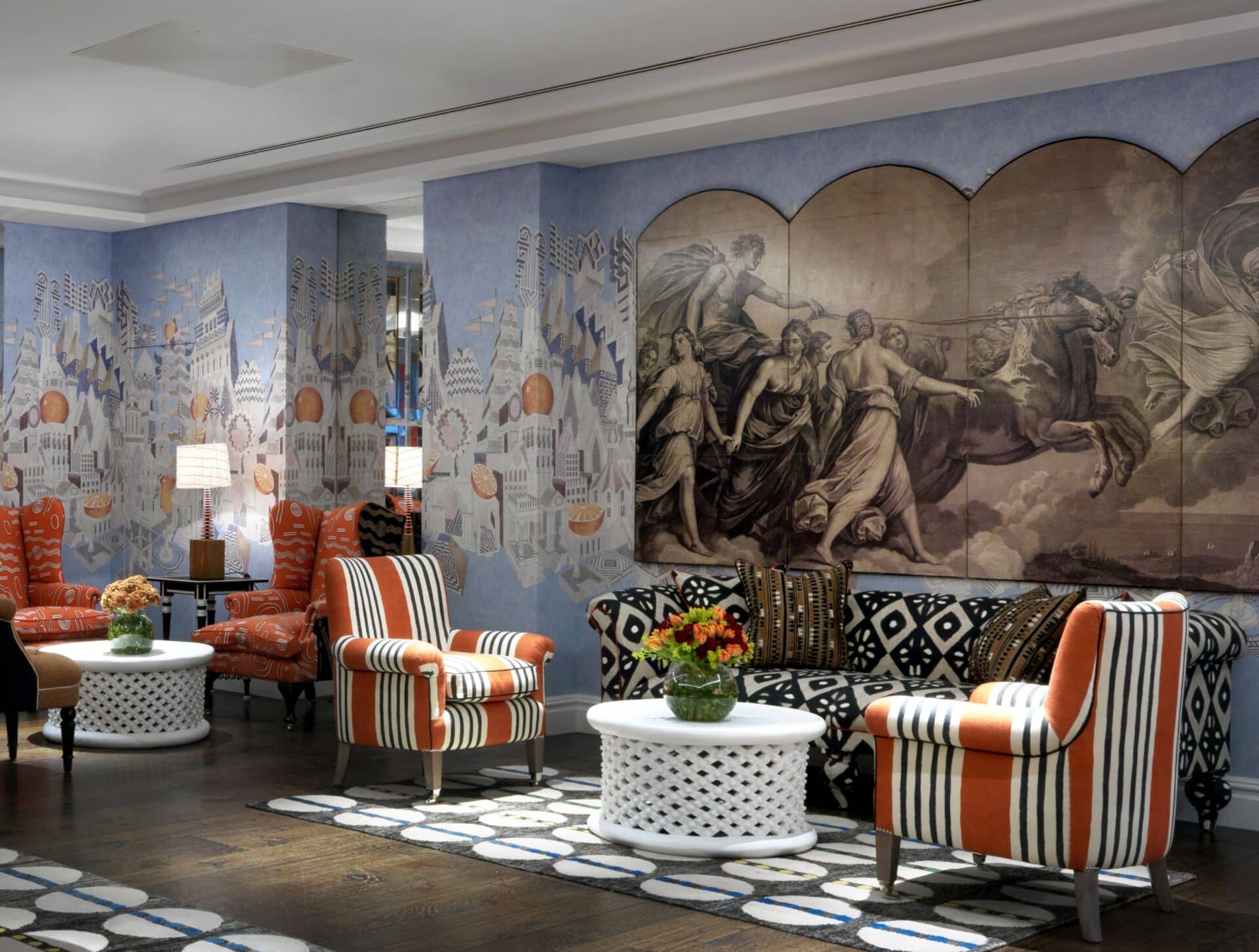
Our last example is in one of our events spaces at The Soho Hotel, the Indigo room. This wallpaper runs along the four walls of the room. The furniture and the wallpaper talk to each other in colours. We have placed a mural on top of the wallpaper to continue the story and stand out.
As you can see, there are multiple interpretations and ways of using wallpaper and murals. Just be sure to know the difference and how to make the most out of them within the given space. Don’t be afraid of going bold!

