Behind the scenes of every beautiful room are the functional objects that make it tick. Although essential, we won’t compromise on a smart, tailored look with anything that detracts from a seamless finish.
One such item is the curtain track, and today we’ll be sharing our tips and tricks on how to seamlessly blend these into your designs.
Located on the picturesque and cobbled Monmouth Street, in the heart of London’s West End, is our grand dame, Covent Garden Hotel. The oldest and most historic of all our buildings, it dates back to the 1890s when it operated as a French hospital.
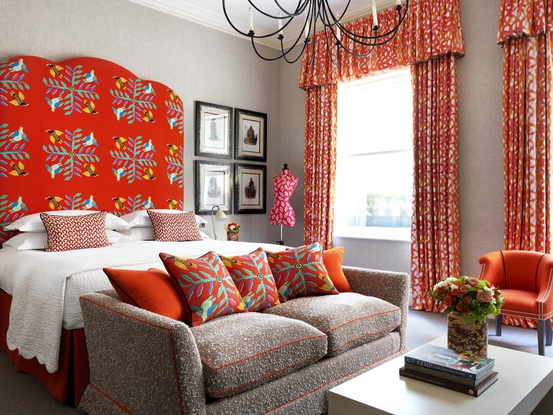
Befitting of its era, the high ceilings give way to generous windows allowing natural light to flood through. We chose to add pelmets in some of the rooms in a nod to the building’s traditional character and history. By using the space above the window encasement, this invites the eye to journey up, elongating the height of the room further.
It would be remiss of us not to share a careful word of warning when it comes to pelmets. It is rare that we actively block out a portion of the window, particularly from the top quarter which is where the most light radiates through. If you are going to use pelmets, make sure you have very tall windows and an abundance of natural light so as not to darken the room.
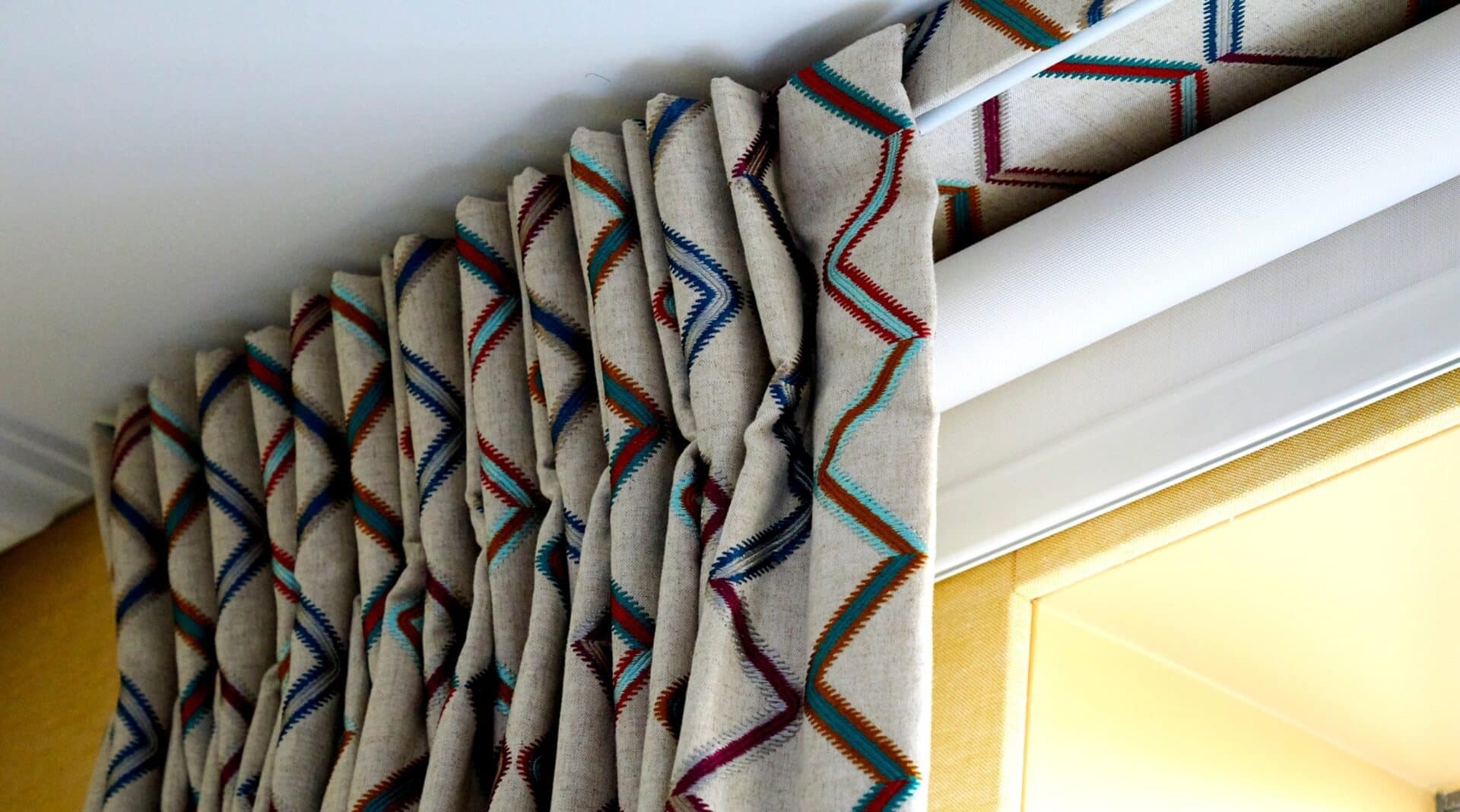
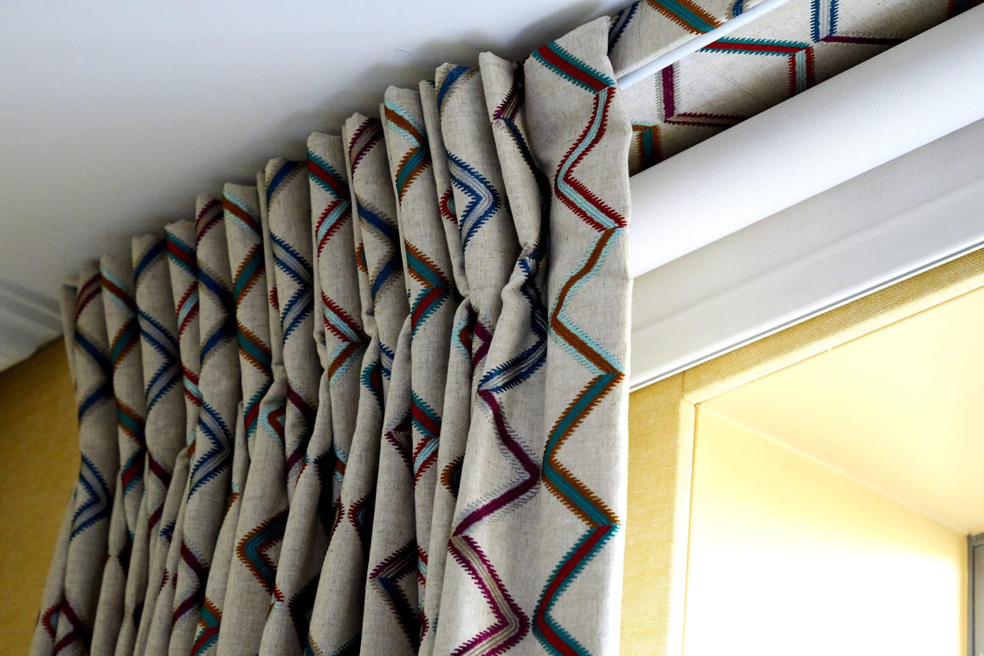
The lath and fascia system allows an elegant pinch pleat curtain to remain on show as the curtain sits in front of the fascia rather than under and behind it when the curtains are closed.
In this photo you can see the underside of the lath covered in the same curtain fabric, finishing off the space beautifully.
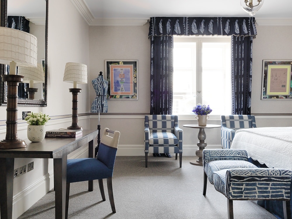
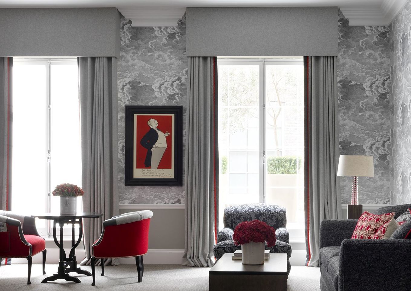
Our Terrace Junior Suite at Haymarket Hotel is an example of a more modern box pelmet, used for equally high windows fitting of this beautiful Regency building by John Nash. With a clean, crisp look this pelmet has been covered in a grey ‘Earth Silver’ by Moon. It creates depth within the elevation and has been paired beautifully with Cole & Son’s Fornasetti wallpaper. The same curtain fabric is edged in ‘Kensington Red’ by Holland and Sherry to compliment the scheme, majestically framing the French doors leading onto a private olive tree lined terrace.
A covered ‘lath and fascia’ is very different to a full pelmet and is a more contemporary hanging mechanism, formed of a corded metal track fixed to a board. The track is then hidden from view by a 5cm fascia.
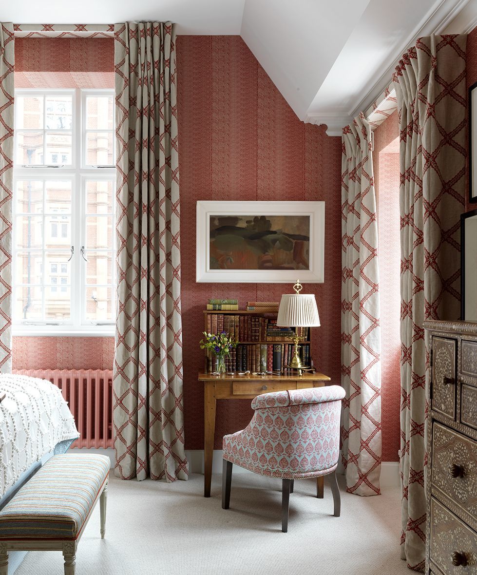
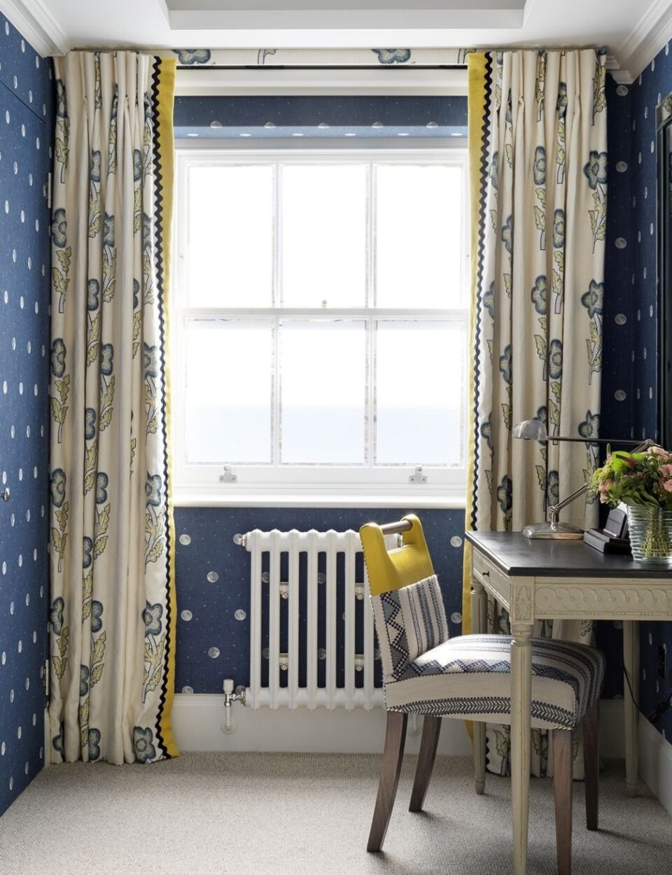
We dearly love our British weather, but in sometimes sombre London where we have grey and moody skies, we like to invite as much light as we can to enter into our rooms. It is here a lath and fascia really comes into its own. Nestled tightly up against the ceiling, the fascia only drops down as deep as the track to hide the curtain rail. It works very effectively both where the window stretches up to the ceiling, and where there is space between the window, architrave and ceiling.
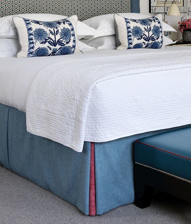
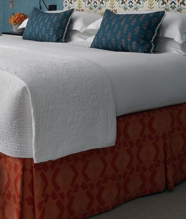
Another hide-me item is the bed base. Naturally, a bed is of utmost importance to ensure you have a good night’s sleep, but it is also generally the largest item in any bedroom. There’s certainly no need to show its base, so we hide it using a bed valance. At times we add a contrasting kick pleat or we leave it plain, but it always dresses the bed base completely.
Sometimes a challenge such as this presents itself in the form of an opportunity, and we certainly don’t need asking twice when it comes to using any opportunity to showcase beautiful fabrics.
Whilst I love his furniture, I am not quite persuaded by Ludwig Mies van der Rohe’s dictum of ‘Less is More’, which came to define the utopian ideals of modernist design and architecture.
I prefer architect Robert Venturis’ quote ‘More is More’. It is with this in mind that we use layers of colour, texture and pattern in our approach to functional challenges, and view them as an opportunity to flex our creative muscles. We hope we have encouraged you to do the same!

