Creating a room that feels comfortable, well-balanced, cosy and unique requires an eye for detail, an understanding of textiles and an ability to think with your design hat on. There are seven elements of design that when carefully combined can help to achieve a well-styled room.
In today’s blog post we will show you how our rooms incorporate these principles and what you should consider when designing your rooms at home…
SPACE
This is the first element to consider. Observe the space you are presented with, ask yourself what the purpose of this space is. What sort of activities will take place? Think of circulation, gain awareness of its limitations and work within them to achieve the right proportion of positive and negative space.
LIGHT
Take advantage as much as possible of natural light. In room 1408 at The Whitby Hotel in New York we have installed floor-to-ceiling Crittall windows, allowing light to stream in and make the space feel larger.
LINE
Creating lines is a way of focussing attention and subtly guiding one’s eye. Vertical lines will draw your eyes up and make the room seem taller. In Suite 609 at Crosby Street Hotel we have used a William Yeoward fabric on the walls and to break it up we used a contrasting Pierre Frey fabric on the headboard. Horizontal lines, which are achieved through the furniture, create a sense of a space within the room.
If, however, this is not possible you can create the necessary light yourself. We always think of lighting as having a dual purpose. It can create ambience within a room whilst being used as a decorative element.
We often use our stack lamps in our designs, not only for the purpose of adding light, but because they add a statement to the room.
Here you can see our stack lamps paired with white lampshades, creating a sharp contrast with their surroundings. They can also be personalised with your own design to give a splash of colour and a unique touch to a room. In a recent blog, we gave some tips on how to paint and personalise one of our stack lamps.
FORM
Whether it is organic or geometric, shape will give personality and add character to a space. It is all about creating harmony and balance.
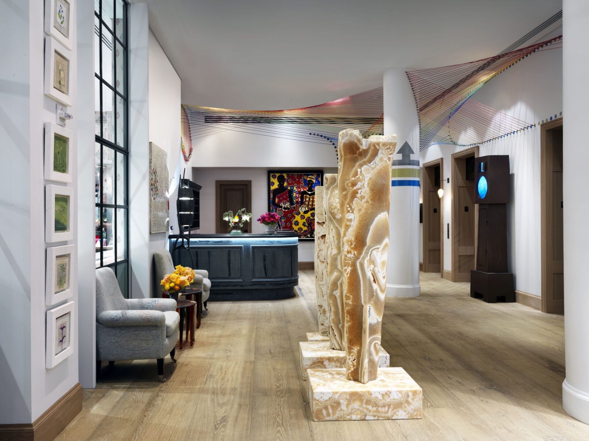
The lobby at The Whitby Hotel has a wonderful dialogue between different shapes. As you enter you are greeted by artist Stephen Cox RA’s alabaster plinths that stand strong on square blocks. This beautifully contrasts with Hermione Skye’s vast rainbow-hued loom that weaves through the air above the reception desk, interacting with the space and creating a dreamy organic wave.
You can also have some fun and mix up the colours in a room, however, there must be a thread that draws it all together.
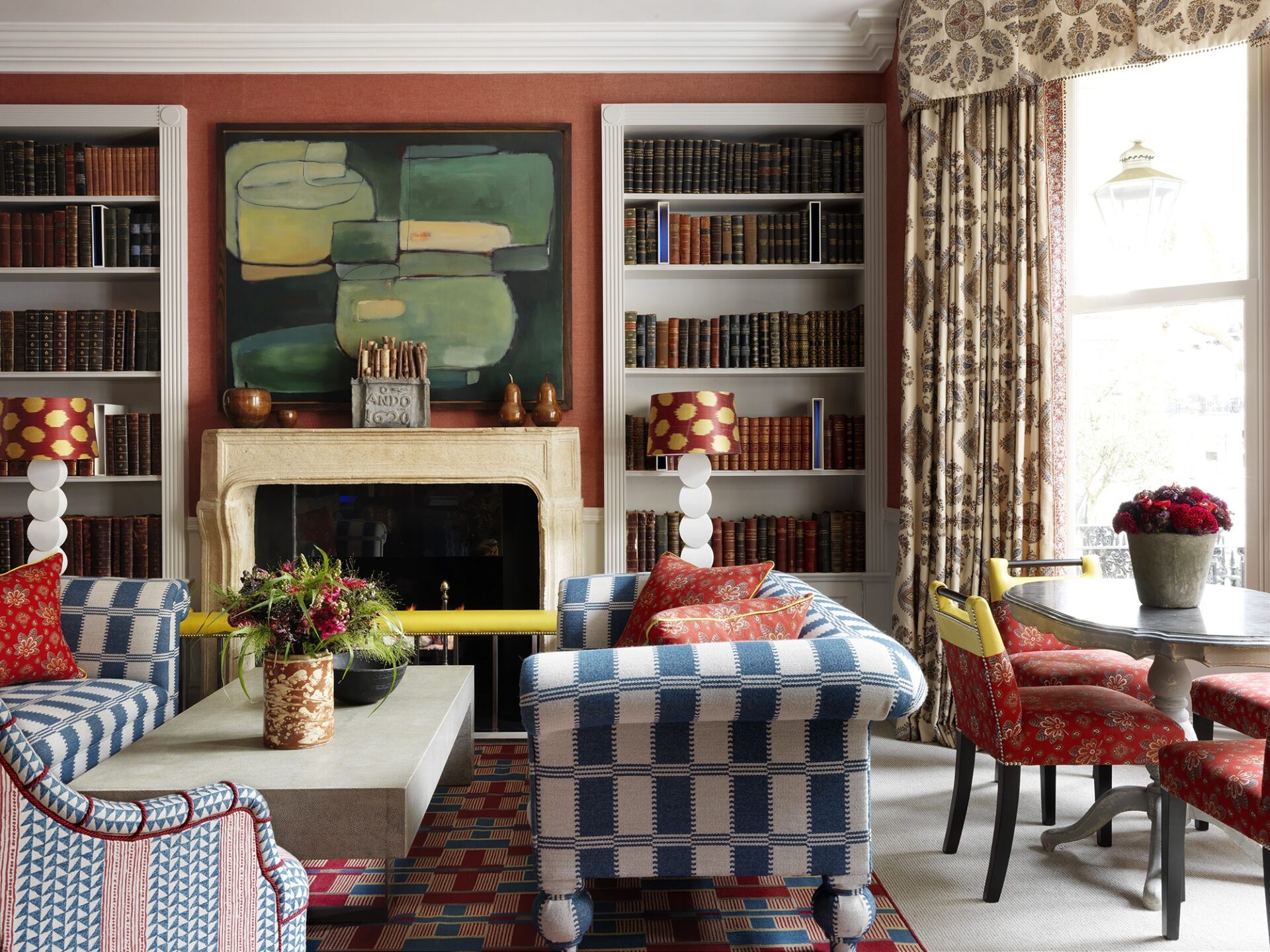
Our Library at Knightsbridge Hotel is a good example of how to do this. This timeless scheme is influenced by the primaries – reds, yellows and blues. We have tied the colours together through the details in the lampshades, cushions and the upholstered chairs. Lining the floor is a woven rug which we designed specially to bring in the reds and blues from the scheme.
COLOUR
We are masters in using colour. There is just so much you can achieve with it. Colour can be used to make a room feel bigger, focus on a specific point, make it feel lighter or add that extra punch to let your personality shine.
In this room at Covent Garden Hotel, orange is the protagonist. The sofa is upholstered in our Bookend fabric by Christopher Farr and when combined the orange rug and vivid artwork it creates a bold statement. It is important to remember that a bold interior should not look frantic, so be sure to balance stronger colours with something light and fresh – as we have done here with a calm, neutral walling.
PRINT AND PATTERN
Patterns add that extra layer of character to a room. The variety in scale and design allows for multiple combinations. The pattern can set the tone or emphasise the mood of the space. Sometimes a specific pattern can even be the starting point of the whole scheme.
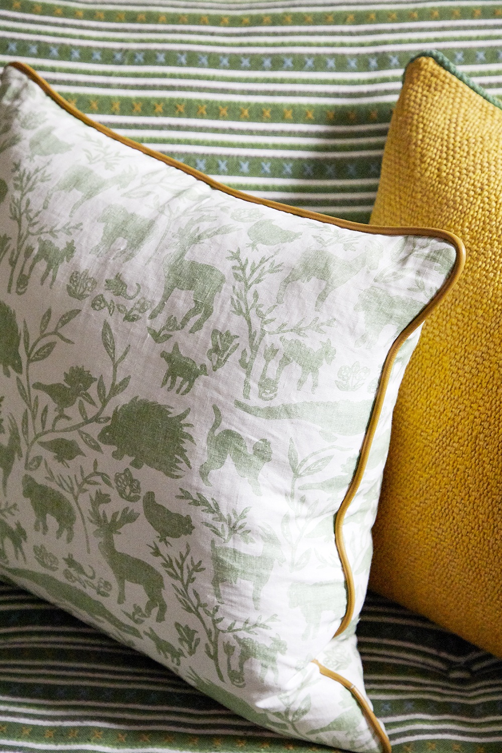
The Library at Number Sixteen is an explosion of pattern that works very well together to create a fresh and uplifting scheme. Korla’s geometric Grand Vida fabric in Lemon Grove has been used on the walls. This creates quite a statement so on the curtains we have used our large scale, but subtle repeat of Travelling Light on a neutral background. On the chairs, we have used a combination of Lost and Found in green and yellow.
The sofa is upholstered in my Criss Cross fabric by Christopher Farr which is a smaller, more intricate repeat. On the cushions we used yellows and greens with contrast piping.
The key to using so many different patterns is to tie it together with colour, paying attention to even the smallest of details.
TEXTURE
You wouldn’t want your room to feel flat or two-dimensional. It should feel lively and be interesting to the eye. Adding texture is a fail safe way of achieving this.
At Number Sixteen, we have created texture through a wonderfully sculptural pendant light. As you enter the room it draws the eye up, catching your attention. The rough wood creates a spectacular contrast against the calmer tones of the room and the powder blue hues of the ceiling above.
In the library at The Soho Hotel, we have added texture through the fabric used on the sofa. The wool itself has a textured feel, but we have added an extra touch with embroidered flowers and petals.
There are many ways to interpret how to use the seven elements of design and as you can see each of our examples unite these concepts in different ways.
We hope our rooms inspire you to play around with each of these principles and remember when designing, always tell a story!


