Brown is not the first colour you might think of when envisioning a lively and colourful interior. Our hotels, projects and schemes are known for perhaps every colour but brown. But to us brown is the unsung hero of the colour chart. After all, from the Earth sprouts all life and all the colours of the natural world.
This post is our little ode to brown and how we use it. It’s secretly an integral part to making a space layered, balanced and in some cases even the star of the show.
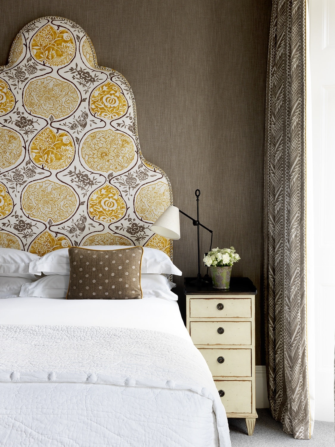
Brown can be a rich and inviting tone in an interior, but it’s important when using it as your main colour for a space to give it zing and dalliance with the help of a colour that’s just as strong. Pairing these coffee brown walls and walnut spotted cushions with this golden yellow fabric on the headboard gives an instantly warming feel to this cosy little room at Number Sixteen. It’s instantly luxurious and delightful.
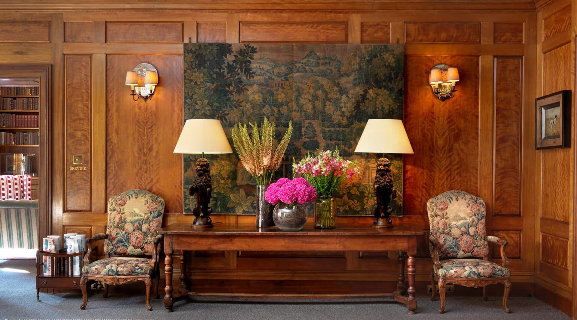
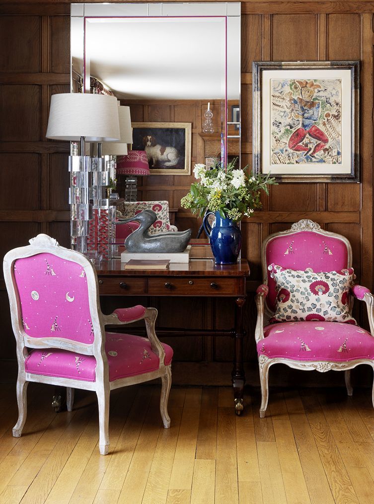
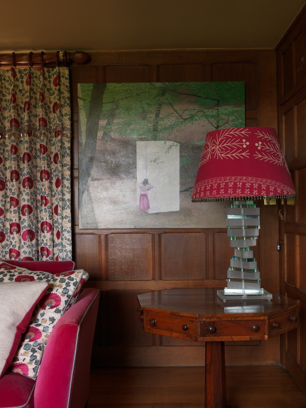
Using a zingy and vibrant pink is also another really fun combination with brown tones. The flash of a hot pink enhances the richness of the panelled wood walls in this country house scheme. Whilst this room feels classic and timeless with the wooden canvas, it is also young and fresh with its Indian pink pairing.
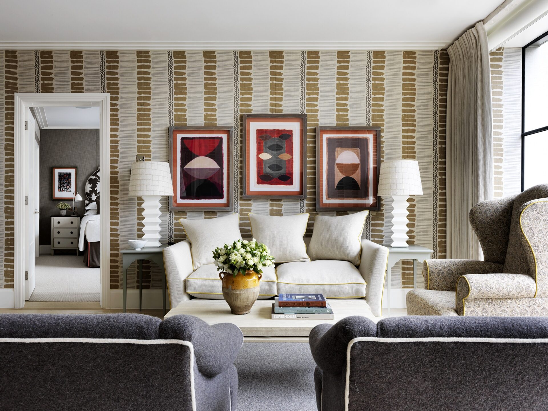
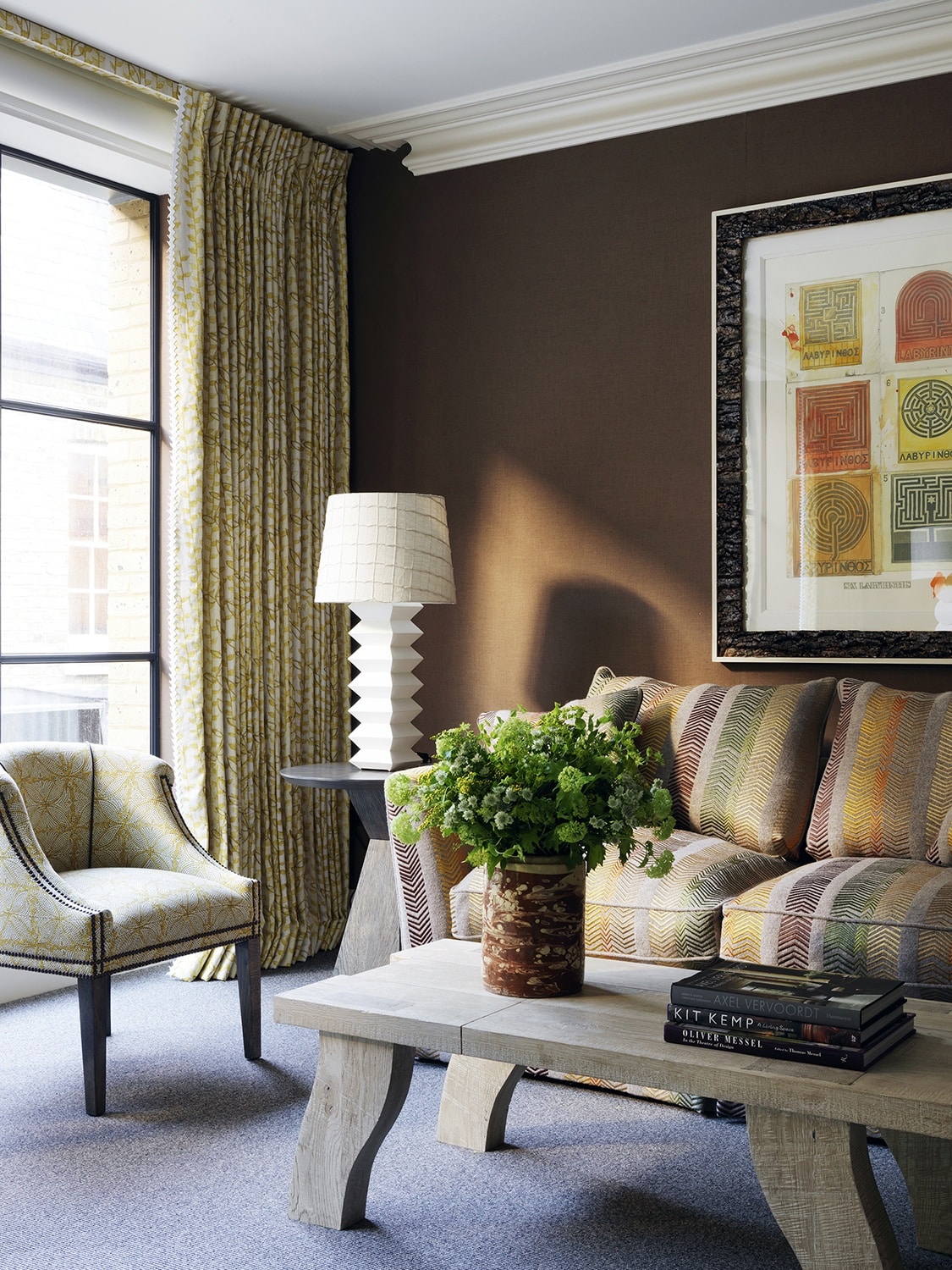
This interior at Ham Yard Hotel is vastly comprised of earthy rich browns. A ginger linen lines the walls with chocolate earth browns making an appearance on the sofa. But a vibrancy is brought forth by the happy yellows and spring greens that also run through my Bookends fabric on the sofa. This combination makes for a mature scheme that tells tales of the natural world. The cascading tea leaf fabric in yellow adding to this story. The styling with the Joe Tilson artwork framed in bark and an overflowing vase of green flowers creates a cheery feel centred around the gravitas and maturity of the brown walls.
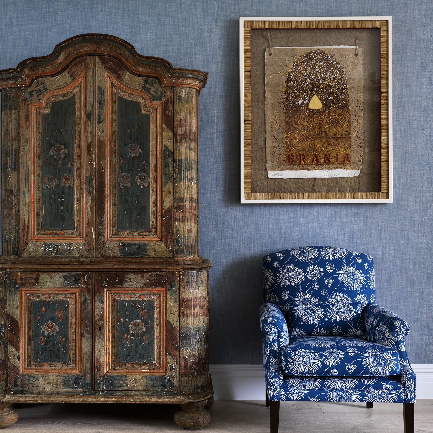
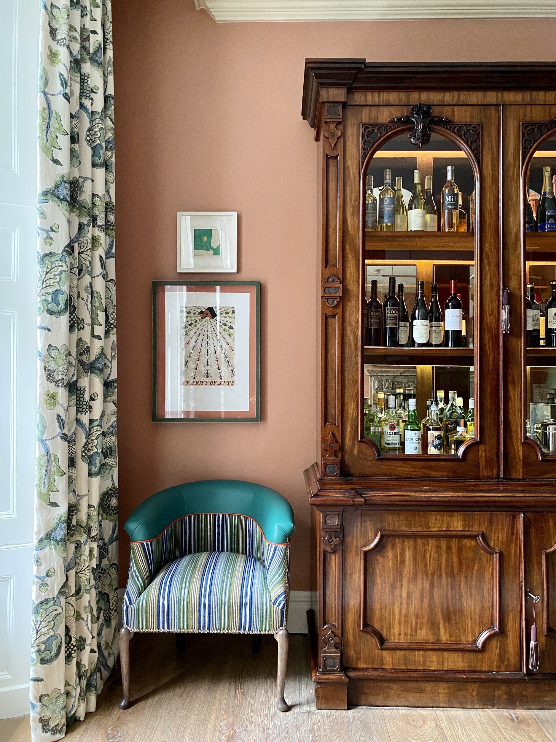
Using woods that are all manner of brown tones in a room creates a depth and importance to any scheme. As with green, brown is a colour of nature and therefore just simply goes with everything. Don’t overlook the power of gorgeous wood pieces of furniture and aged antiques to lift and amplify a space. This scheme at The Whitby Hotel has an added layer with the rough wood of this gorgeous Swedish cabinet that takes centre stage in this otherwise almost entirely blue scheme.
Here at Dorset Square Hotel, this happy scheme is nothing without this statement antique.
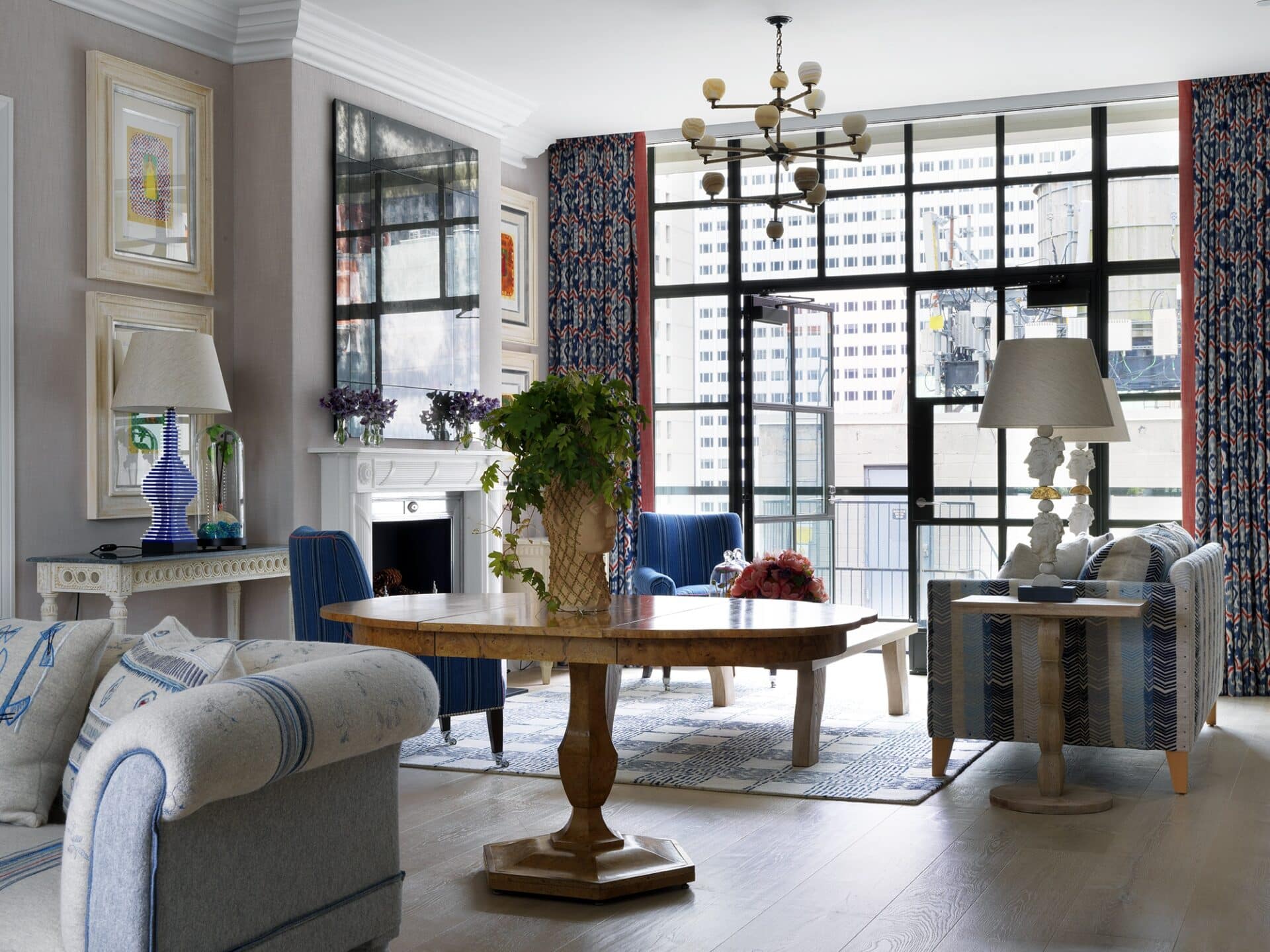
Blue can often feel cold, but to ensure it stays happy and playful, I like to add in brown accents throughout the room to enhance warmth, also seen in the careful raw framing of the artwork and the burl wood centre table.
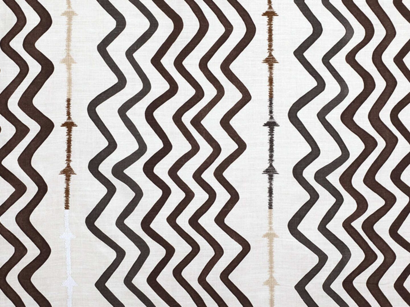
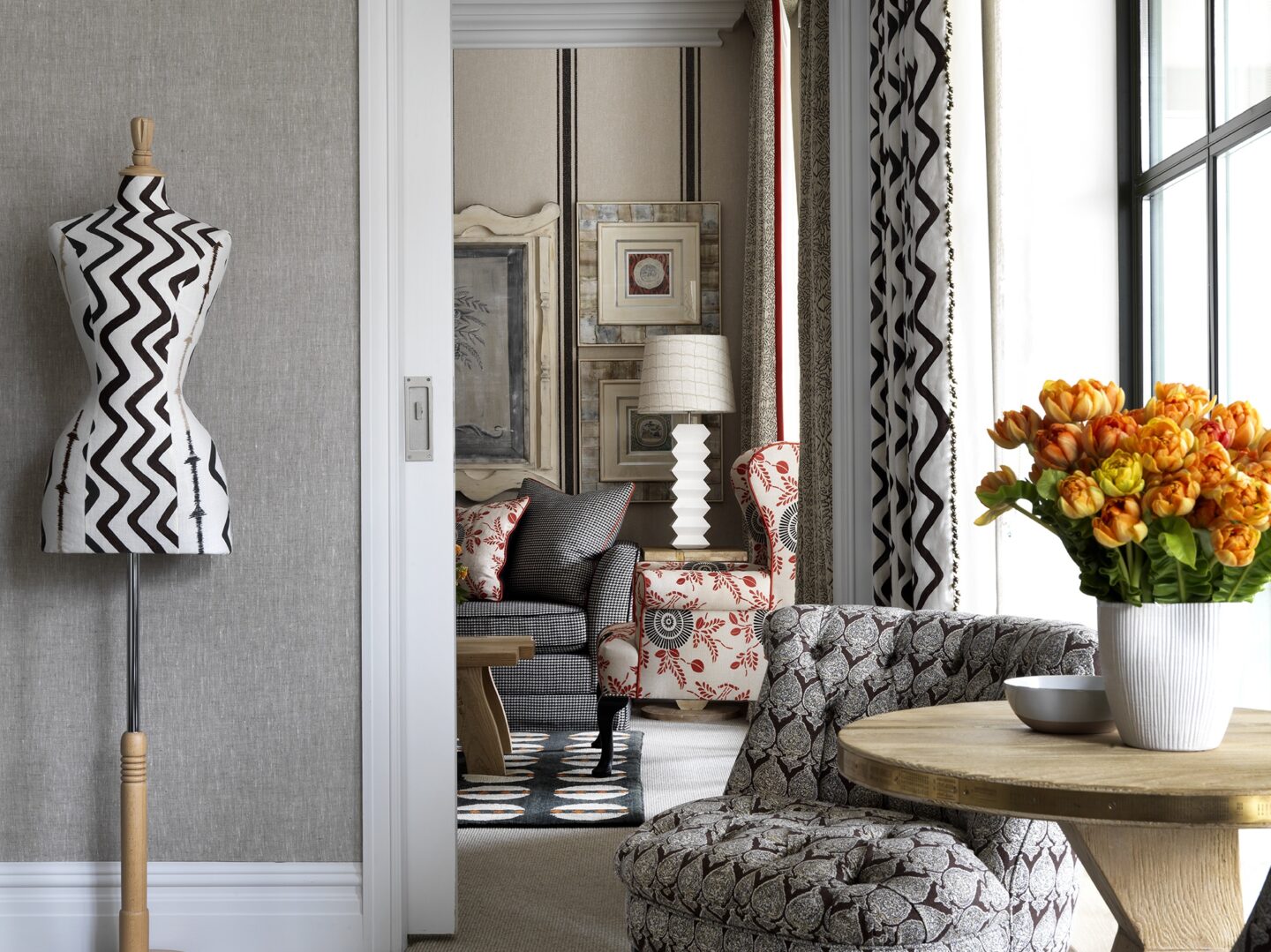
One of my favourite fabrics has to be this chocolate brown colourway of Rick Rack. It’s not the sparkiest tool in the box but it works to create mature and investing interiors that are still playful and fun.
We think brown gets a bad rep, but the more you look around you see how it comes into play in many ways, giving that added extra to a space.
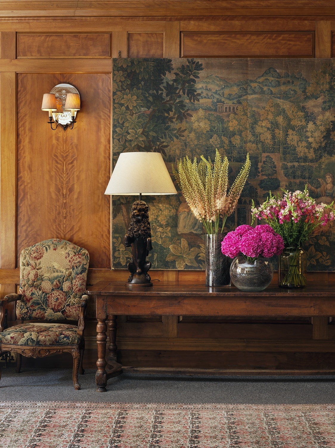
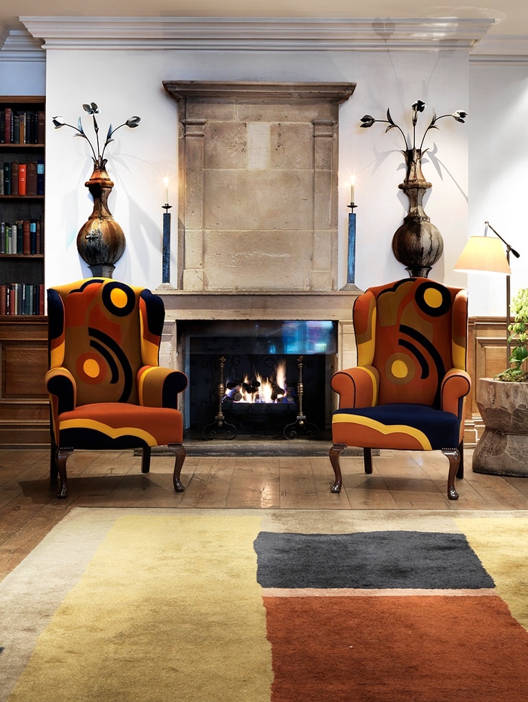
Whether it’s creating a classic agedness like the reclaimed panelling we installed in the Covent Garden Hotel Drawing Room, or providing a room with a warm and inviting twist, as with the entrance chairs at Charlotte Street Hotel, brown certainly wears many hats.
To us, it’s an integral element to design and brings life to a space in many unassuming and creative ways.

