We are so often asked about our perfect recipe or formula for designing a space. Our philosophy is to try not to have a defined formula. We try to make every scheme refreshing and surprising. That said, there are some key design guidelines which help us create balanced and timeless designs.
As ever, a picture is worth a thousand words, so here are some images to demonstrate how we have used this intangible formula to create spaces which are harmonious and fun to be in.
Satisfying Every Sense
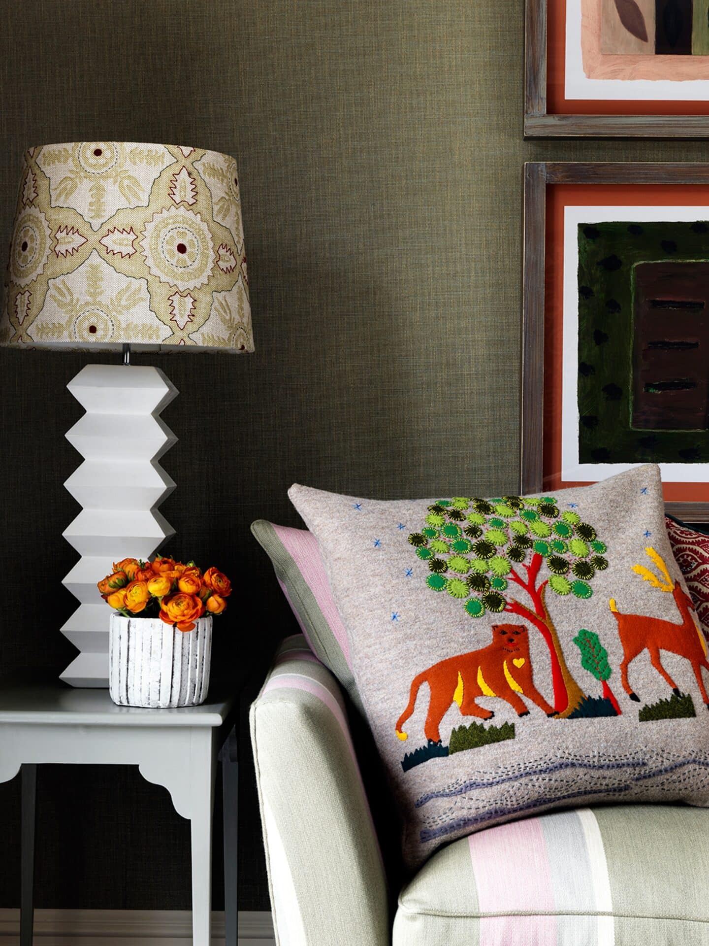
A room should do just this. Scale and balance are so important. My first love is textiles and I’m not afraid to combine different textures, colours and patterns; sometimes in a surprising way, but always with method behind the madness!
Each fabric should be used in the right way. For example, heavy weaves on chairs and sofas, lighter linens on cushions and curtains. We often mix and match the old and new. For example, using contrast trims and found fabrics to upholster furniture. A room should have many layers and textures.
Celebrate Craft
We celebrate all forms of craft and love to commission artists to create bespoke pieces.
We love to create one of a kind pieces which make a room completely individual, from hand-painted murals to embellished cushions and headboards.
Create a Focal Point
Here in our Soholistic Spa, a surprising focal point at the end of a long view is this wonderful elephant head spouting water which I found on my travels in India. It is a bespoke piece that adds a touch of fun to this serene space.
This beautiful hand painted applique headboard in the Terrace Suite at Ham Yard Hotel is an example of that handcrafted touch and how to combine textures. We must keep craft going in this modern world.
Using Mirrors
Mirrors are one of our favourite design tricks, reflecting light and adding depth to a space. They are the solution to so many designs challenges, they can be used to enhance something or deflect attention away from it.
Note here, the artworks are hung in three, which is pleasing because the eye recognises patterns. The lowest number that involves a pattern is three.
Framing Artwork
You can even use mirrors to frame artwork, which should be hung at the correct height, with their centre normally around head height.
Warm Colour Palette
We love colour, but we always choose from a warm palette. This wonderfully ornate mirror makes a relatively narrow space seem larger. The ottoman is covered in a found textile. The warm colours of the rug ground the room. You don’t want your furniture to appear to hover above ground!
Raw Materials
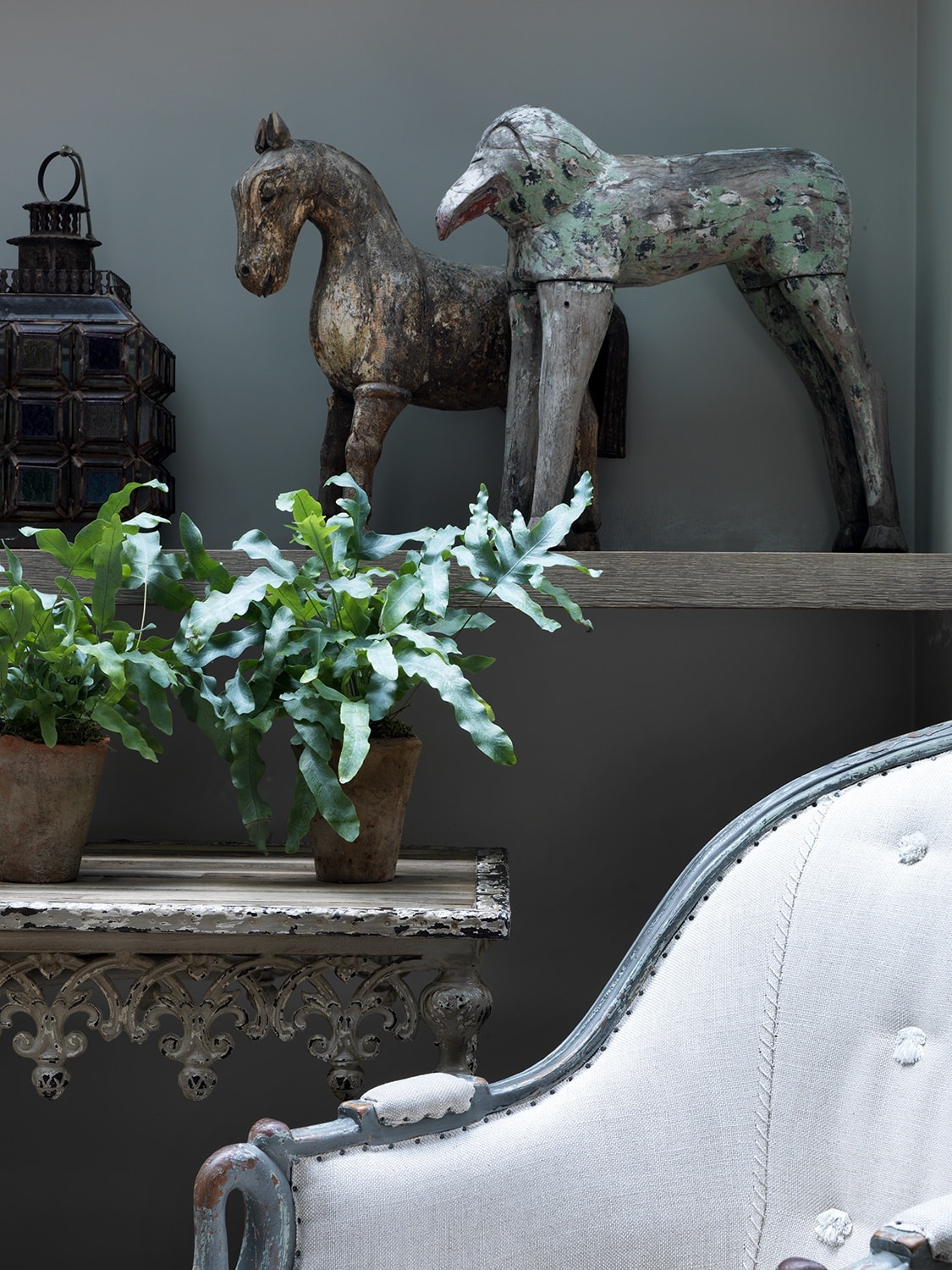
In this studio apartment, this clever method of defining spaces does not restrict the view, or make the space smaller. It also combines two materials, matt timber and glossy ceramic, in complete contrast to each other, which is so interesting.
The Orangery at Ham Yard Hotel is another example of where we have combined an array of raw materials.
The pebble mosaic, brickwork and flagstone flooring add texture and are practical in the way they define the space.
The natural texture is in contrast to the Daniel Reynolds glossy ceramic mobile that gently rotates in a peaceful dance above your head.
The sandstone fireplace we found in France is a real luxury. It gives the long space structure and entices you into this indoor/outdoor space.
We always say that the fun of being a designer is breaking the rules…but never forget that a room has to feel calm and a place where you want to spend many happy hours.
Rather than a formula, we hope these guidelines inspire you to get creative in your own home!


