We love to work with textures and materials of all kinds, from aged oak surfaces to fresh and zippy perspex, and from chunky wools to shiny silks. We use a plethora of mediums to bring the many textures of our designs to life but one of my favourites has to be Alabaster.
This mineral is soft and versatile, so it is a favourite for carving and sculpting. Its softness enables it to be carved into elaborate forms. Alabaster can be translucent or opaque, meaning it is also an excellent material for lighting, creating a soft inviting glow. Here are a few ways we have used Alabaster in our designs.
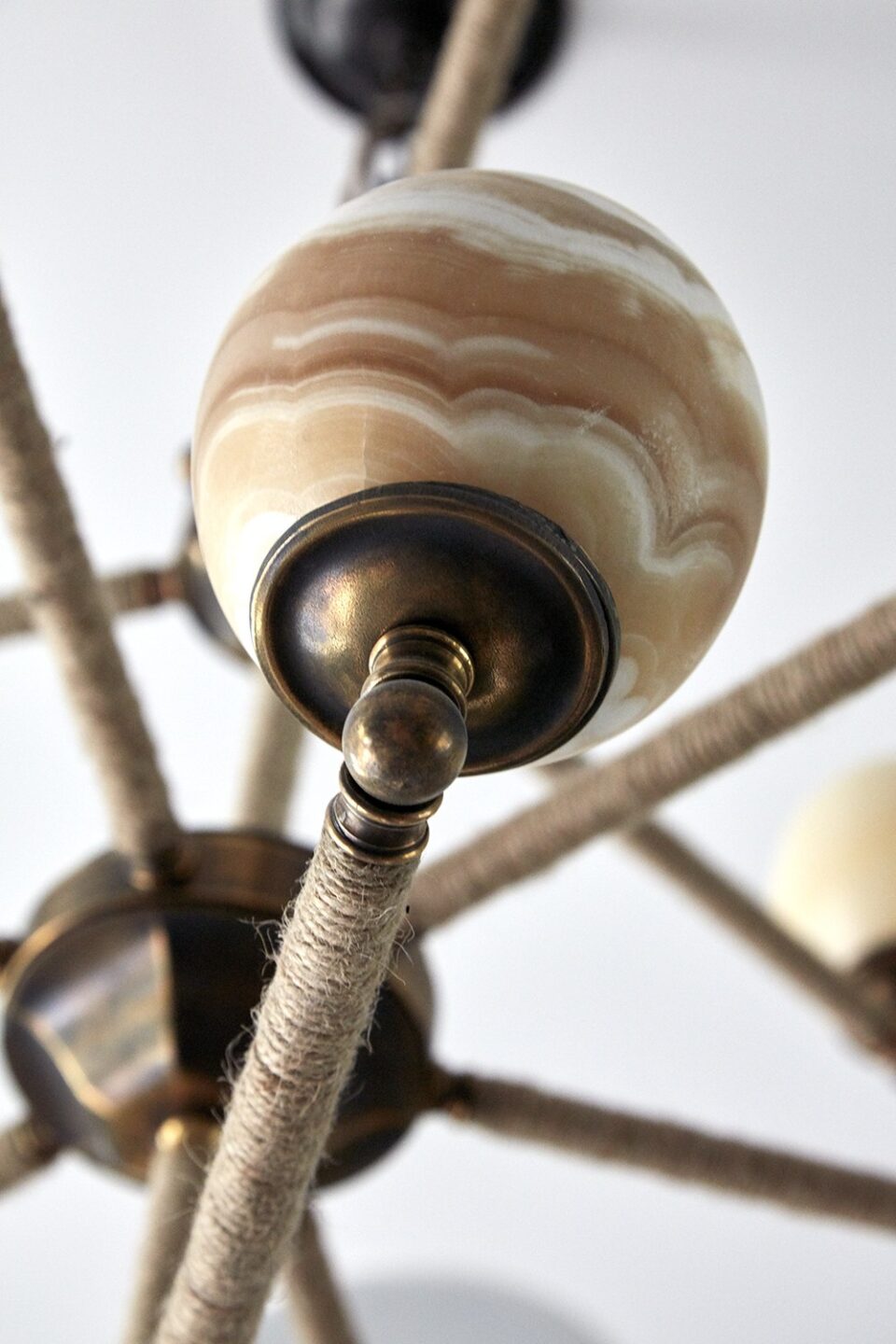
We commissioned this chandelier for the library at Ham Yard Hotel. The little Alabaster balls dance around one another, suspended from protruding metal rods wrapped in twine. The natural white and milky tones of the Alabaster balls complement the soft hues of my ‘Ozone’ fabric behind. There is a balance of delicacy and strength here. The balls of Alabaster are smooth and simple, giving a lovely warm glow which is so important for any chandelier.
We designed these elegantly simple Alabaster end lights for our Whitby Restaurant. They glow like sculptural vases and sit atop the partitions, creating defined sections within the bar and restaurant.
They are such an important detail, providing an unexpected sculptural presence and a glow that you might miss when putting this space together. It’s so important to look at every nook and cranny and think, could we do something with this space?
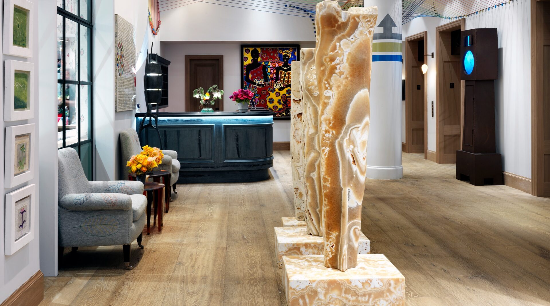
This piece is an Alabaster sculpture triptych by the artist, Stephen Cox. I first saw this at the RA Summer Show, and when I found it I instantly knew it had to sit pride of place in The Whitby Hotel’s Lobby.
This figurative upright sculpture of three female forms is a showcase of Alabaster in all its glory, smooth in places yet granulated and textured. It is a swirl of pattern, a surface you just want to explore. Again we see that balance of delicacy, yet it is robust and strong. This piece was so heavy that it took eight men to carry each section into position, we even had to reinforce the floor!
These chandeliers are a perfect example of how much I love Alabaster, since they are in actual fact, not Alabaster. I designed these lights especially for the Whitby Orangery, inspired by a Parisian brasserie.
They are monumental three tiered chandeliers. I was desperate to have the shades in Alabaster, to capture that glow and feel of ultimate luxury. Alas, since there was such a large amount of shades required to bring my design to life, we had to instead use glass made to look like Alabaster. The unexpected swirls and patterns found in the stone are mirrored in these glass replicas.
It is always important to be flexible but be true to your vision, even if it means a little bit of smoke and mirrors!


