Our love for natural materials is clear in every space we design. The humble pebble is often overlooked and cast aside for its more glittery cousins but we love the untouched rawness of stone and its natural texture.
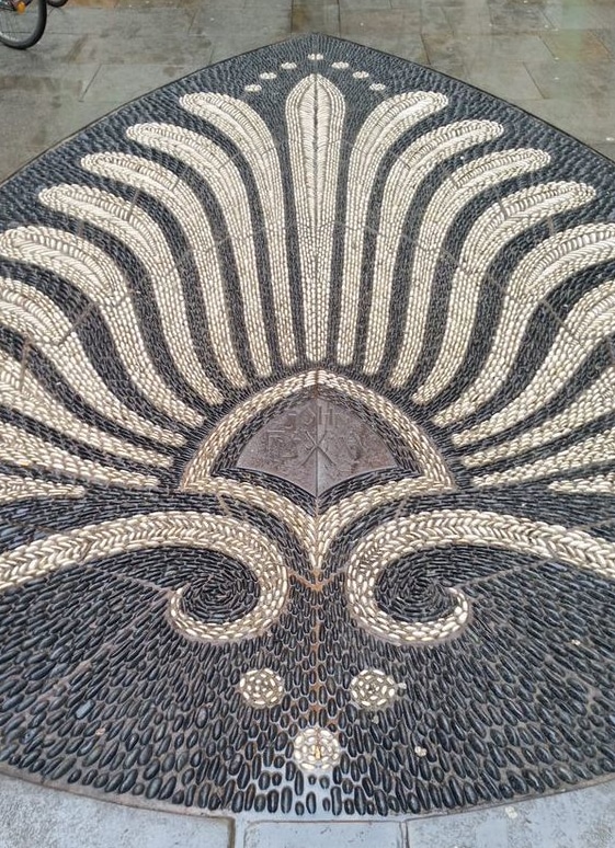
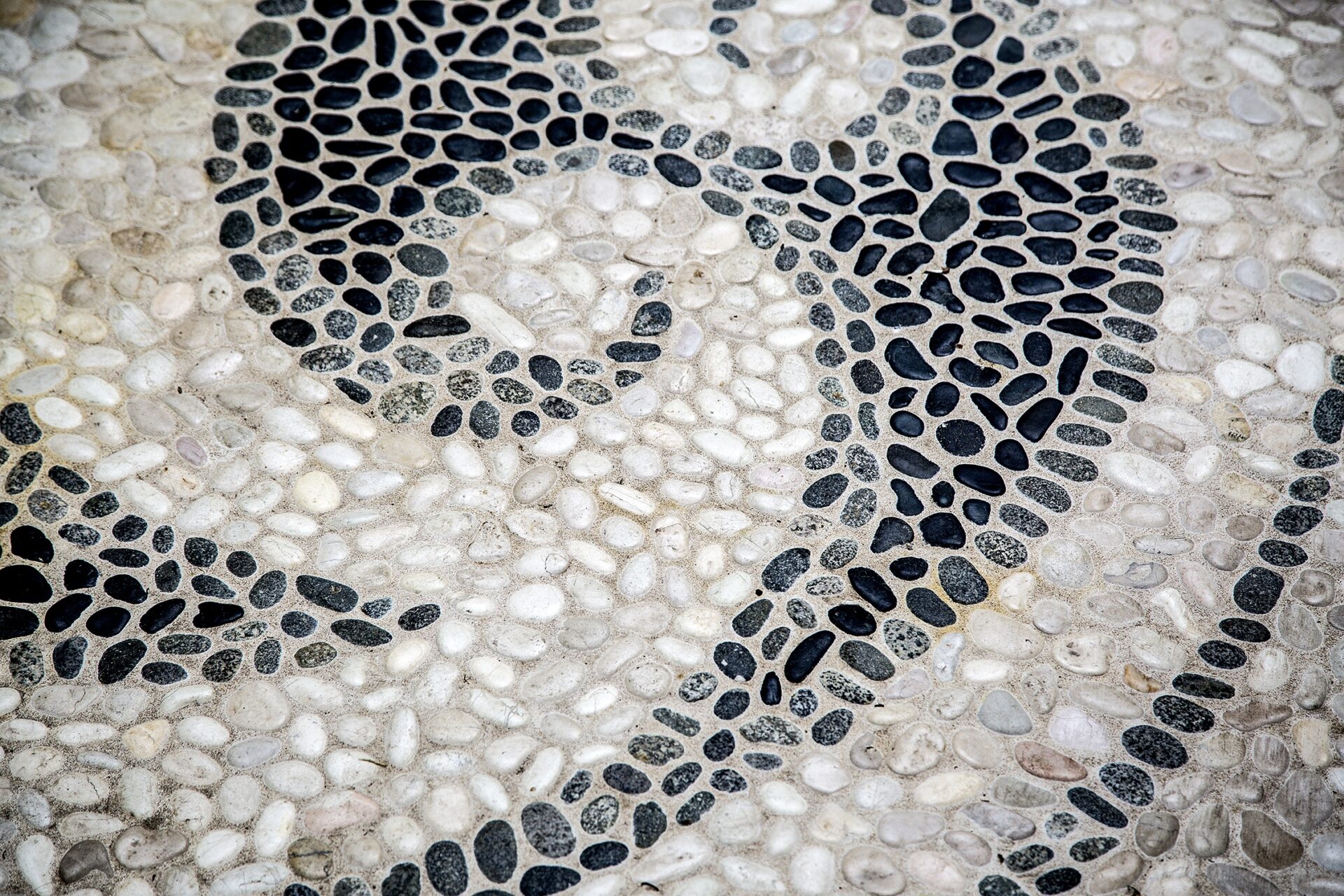
At The Soho Hotel, we commissioned Maggy Howarth to create this wonderful piece just off Wardour Street. Maggie Howarth is an inspiration and the author of four pebble mosaic handbooks. She is well known for her original designs and decorative floorscapes.
Maggy creates art that can be walked on; a functioning piece of art that is durable and should last for centuries. She often uses an upside down fabrication technique that ensures a flat yet textured surface.
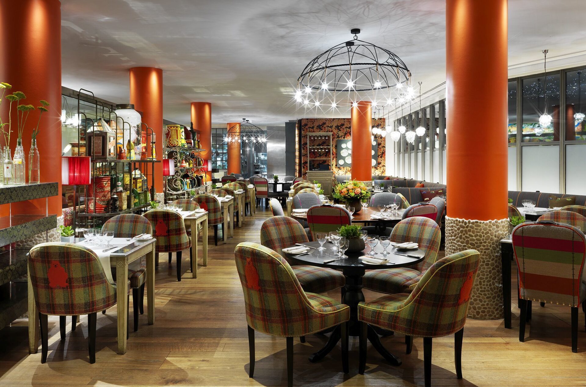
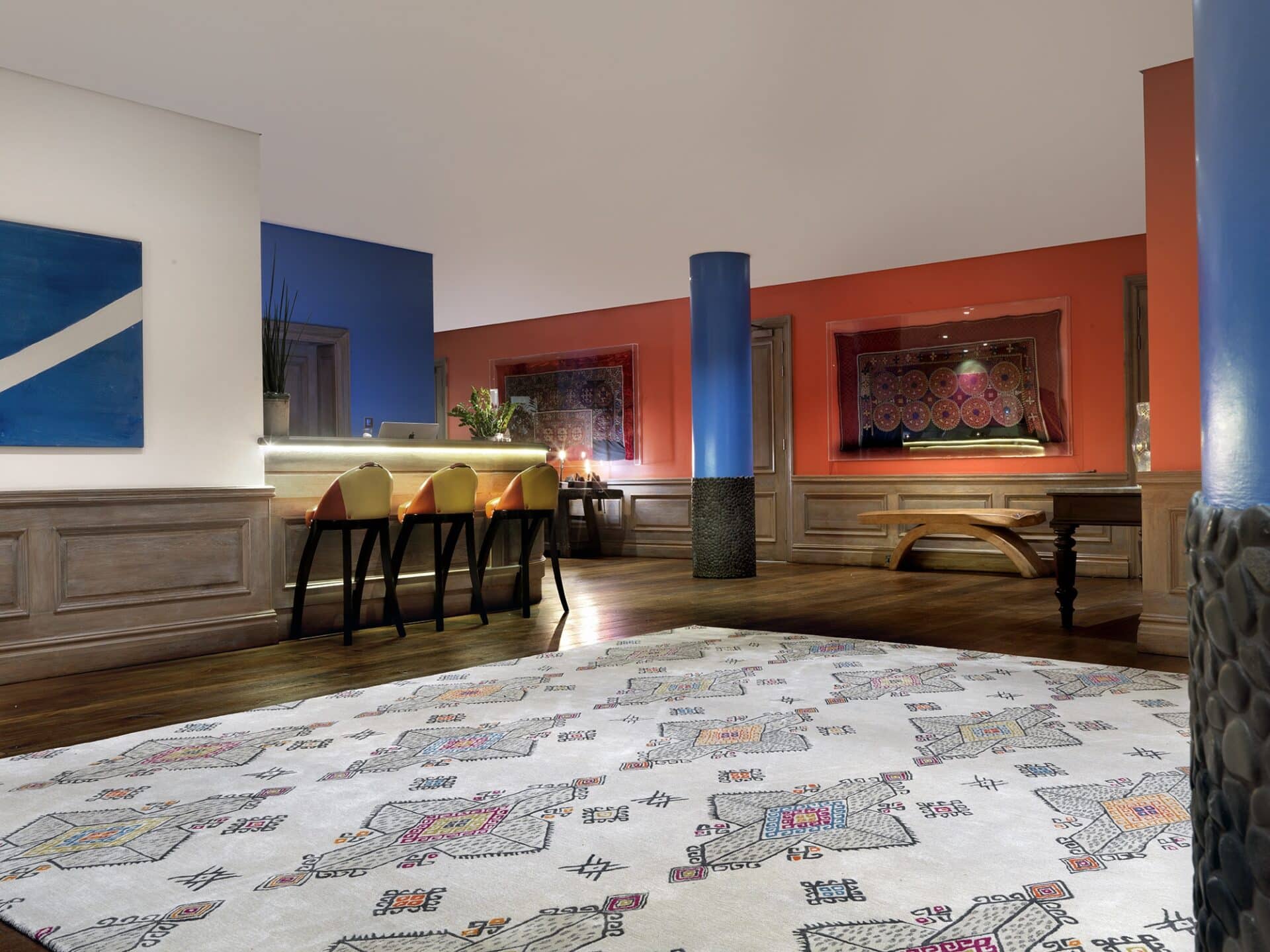
At The Soho Hotel, we have structural features that most might try to conceal – pillars. I love a pillar in the wrong place; it’s a chance to do something different. Instead of blending in, we make sure to celebrate them. Each is painted a powerful and joyful colour and stands proudly in the space.
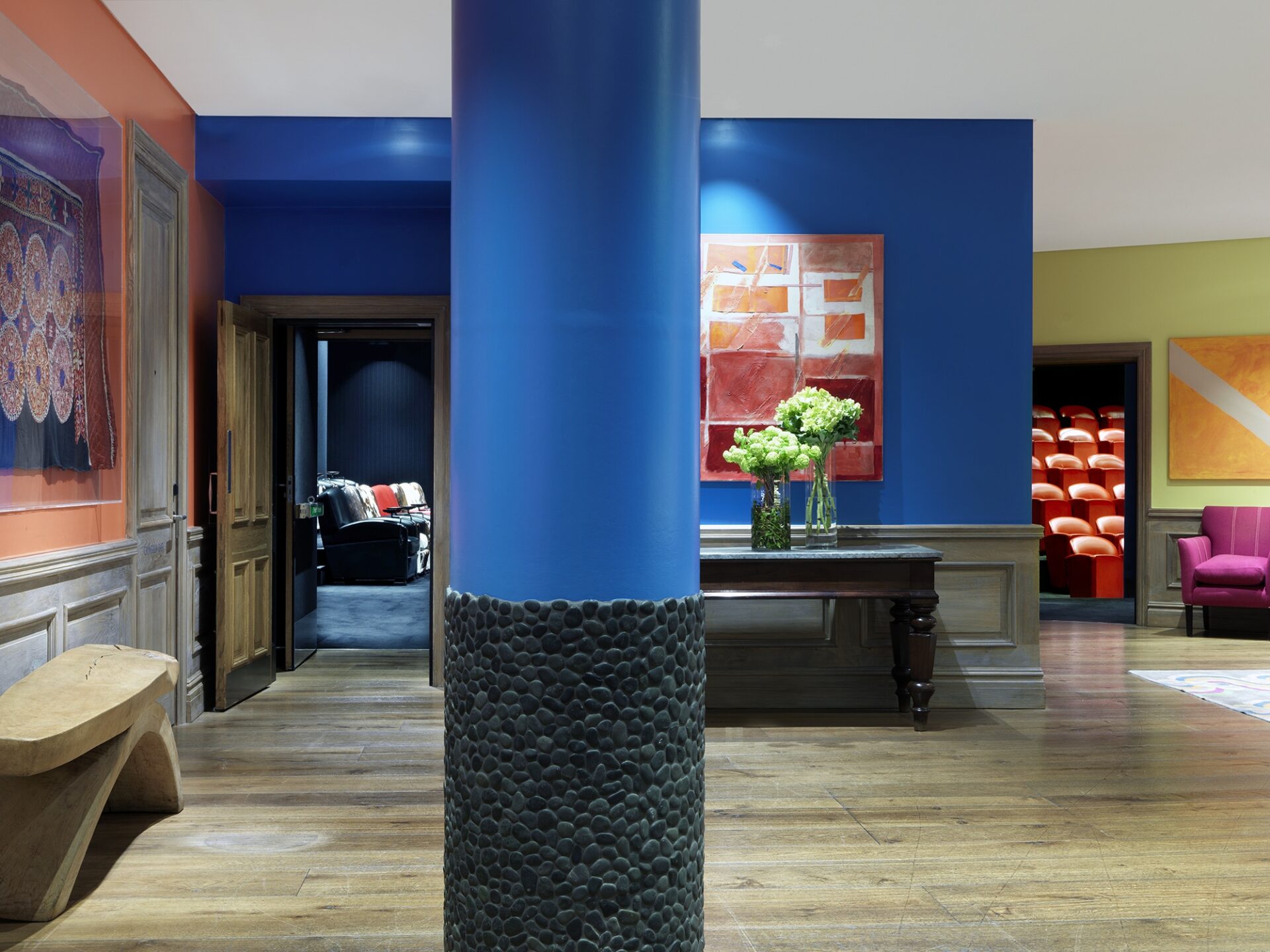
The base of the pillars are clad in stone pebbles. These tile carpets are wrapped around the base, adding interest to an otherwise overlooked structure.
In Refuel Bar, the pillars are the stars of the show, painted in bright orange to celebrate these structural giants.
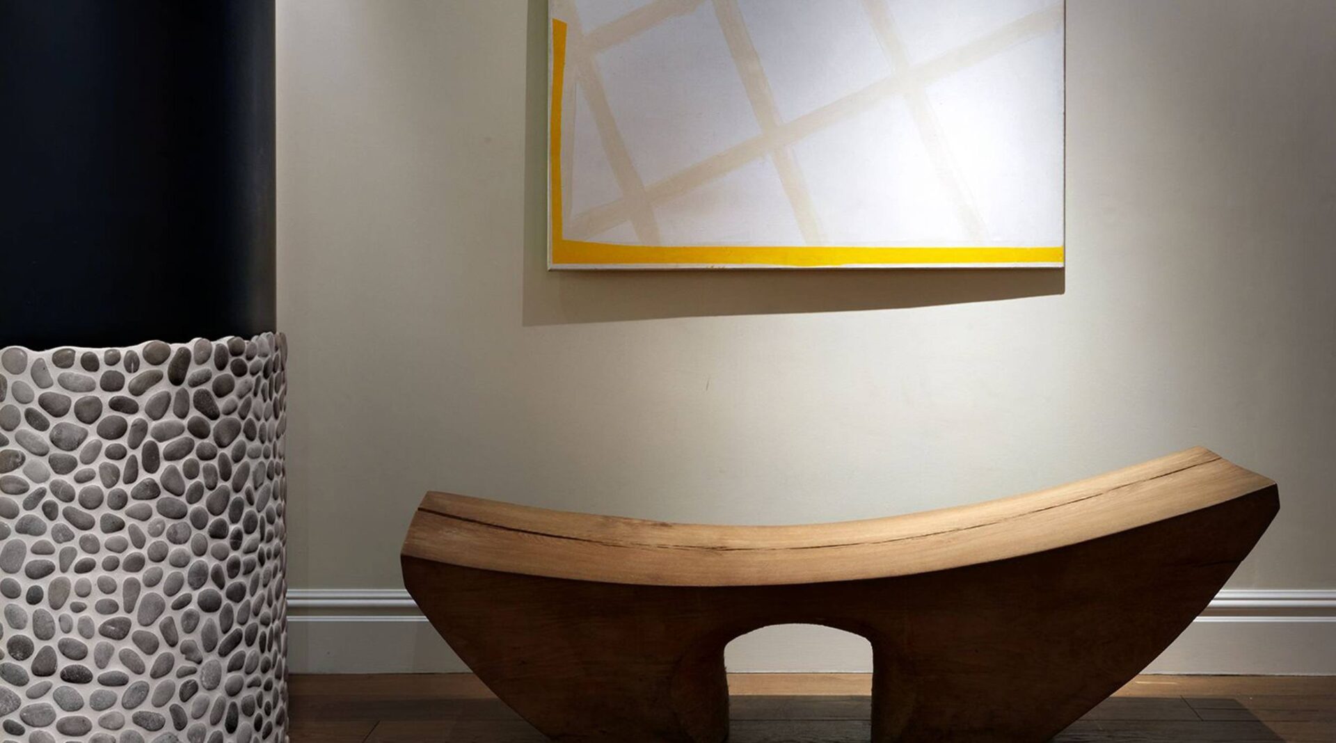
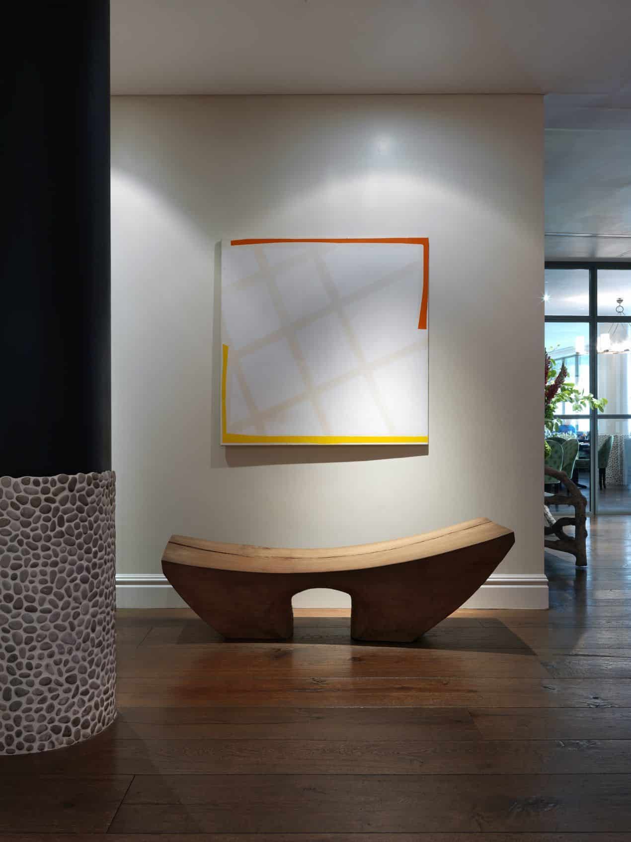
Here, a striking painting by Sandra Blow creates a moment of calm in the lobby at The Soho Hotel. The abstract painting is punctuated by the powerful black paint on the pillar in front, yet softened by the pebble wrap below.
Downstairs in the events lobby, the walls have been painted in contrasting block blue and orange tones. The striking blue pillars with dark grey pebbles are such a fun contrast to the warmer walls behind.
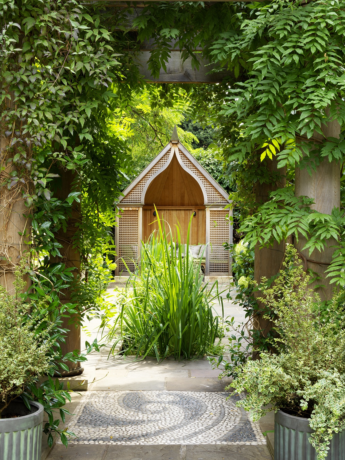
In the garden at Number Sixteen, spiral stone mosaics are dotted around the walled courtyard. This garden is such a wonderful respite away from the bustling South Kensington streets outside, with its koi ponds and shady mulberry trees.
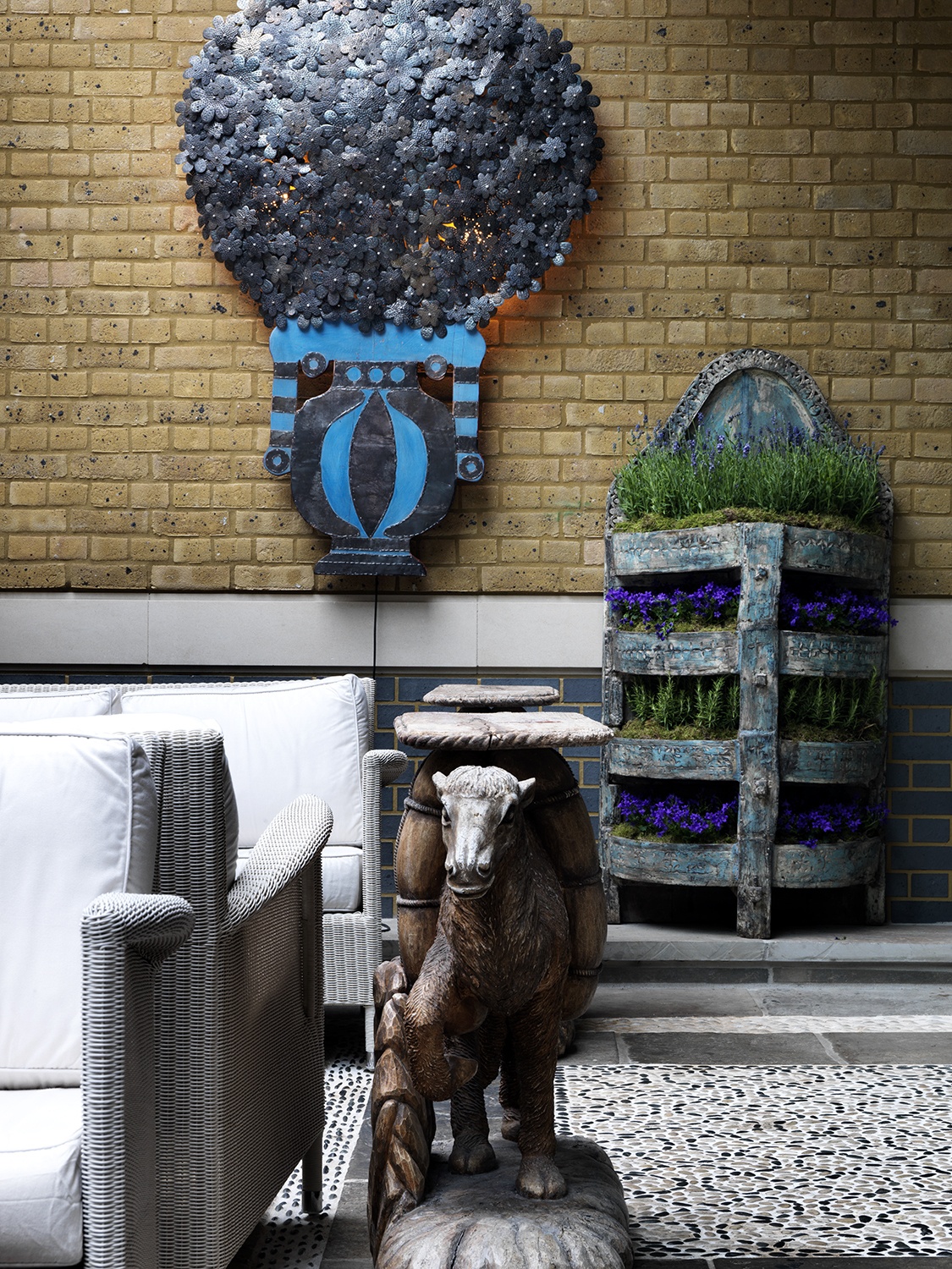
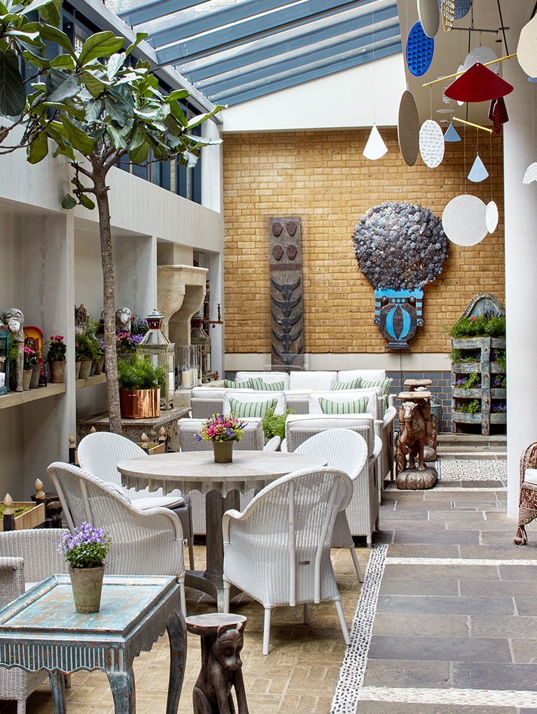
In the Orangery at Ham Yard Hotel, the space is made up of several seating areas. Large flagstone areas meet sandy brick, and dividing the two are rows of pebbles, slightly raised from the ground. The wonderful contrast between stoney grey and dusty sand is punctuated by sharper white and black flecks.
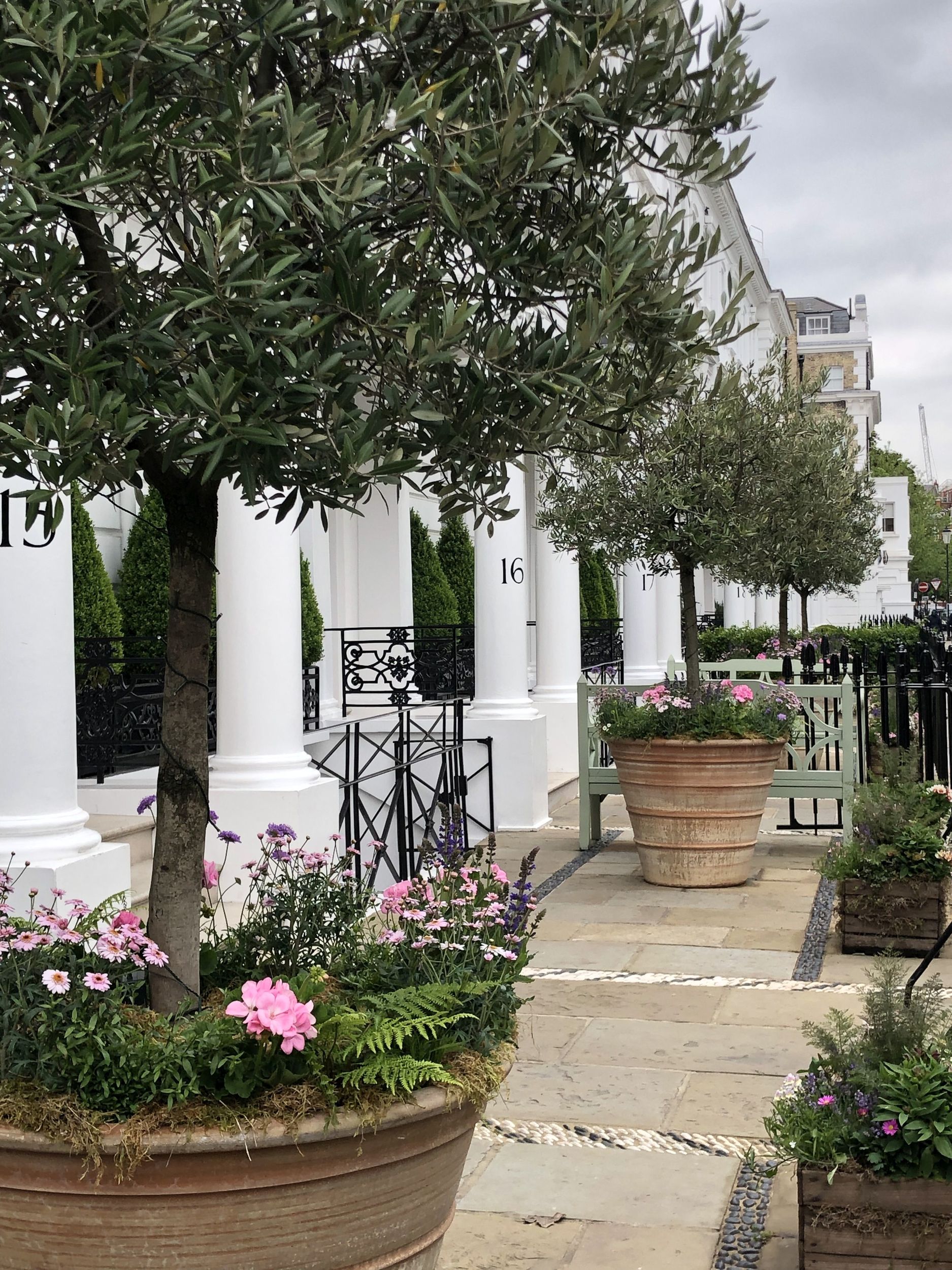
At the front of the hotel, rows of pebbles are peppered in with the sandy slabs of stone. The darker grey and creamy whites look fantastic against the classic white stucco terrace buildings behind.
Adding a little extra detail to the otherwise ordinary is so easily done. These pebble creations are so simple yet add an entirely new dimension. Why not have a go yourself? Edging your flower beds for example, or lining the walkway to your front door. Tag us at @kitkempdesignthread so we can see your stony creations!

