Art in Context (Part 1) Ham Yard Hotel
Day to DayArt plays such a huge part in our design and is a vital addition to any space. Each piece, whether it is by a well-known or an emerging talent, has been carefully selected and is interwoven throughout our interiors. This eclectic mix is crucial to creating a dynamic and interesting art collection...
Art plays such a huge part in our design and is a vital addition to any space. Each piece, whether it is by a well-known or an emerging talent, has been carefully selected and is interwoven throughout our interiors. This eclectic mix is crucial to creating a dynamic and interesting art collection.
This week we caught up with Olivia Paterson, Firmdale’s Art Ambassador, to discuss a selection of artworks in the context of their surroundings at Ham Yard Hotel. Her strong passion for the arts is synonymous with Kit’s own and her breadth of knowledge is astounding.
As Time Goes By 2009 – Howard Hodgkin
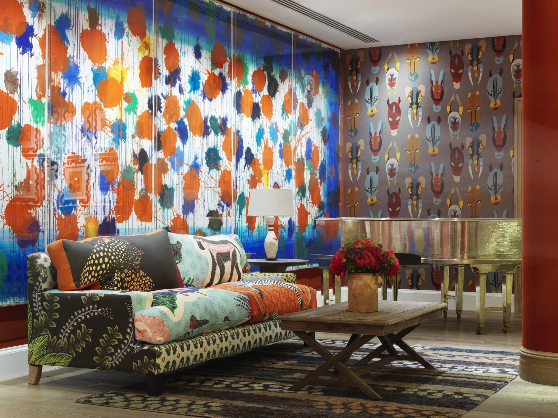
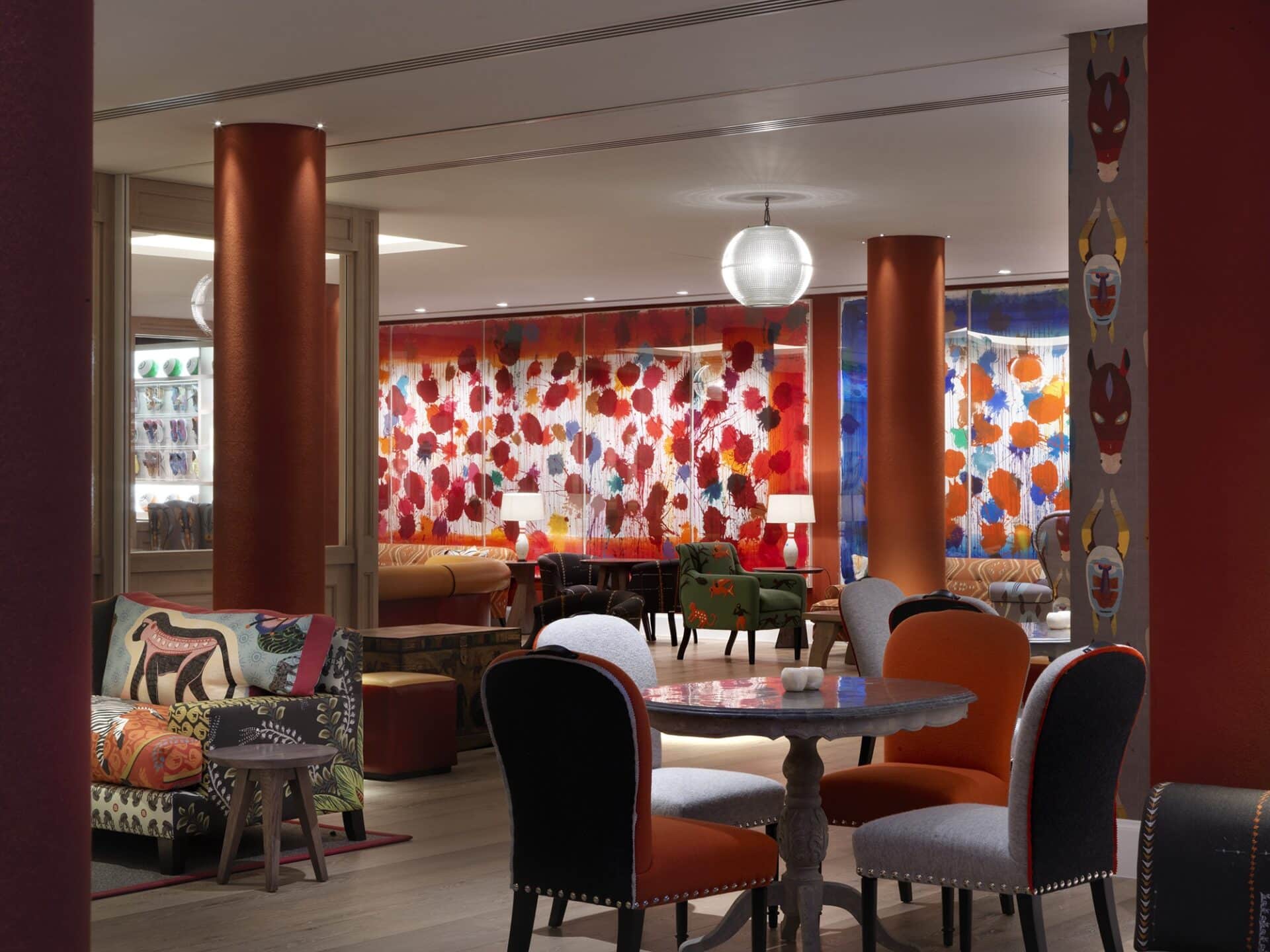
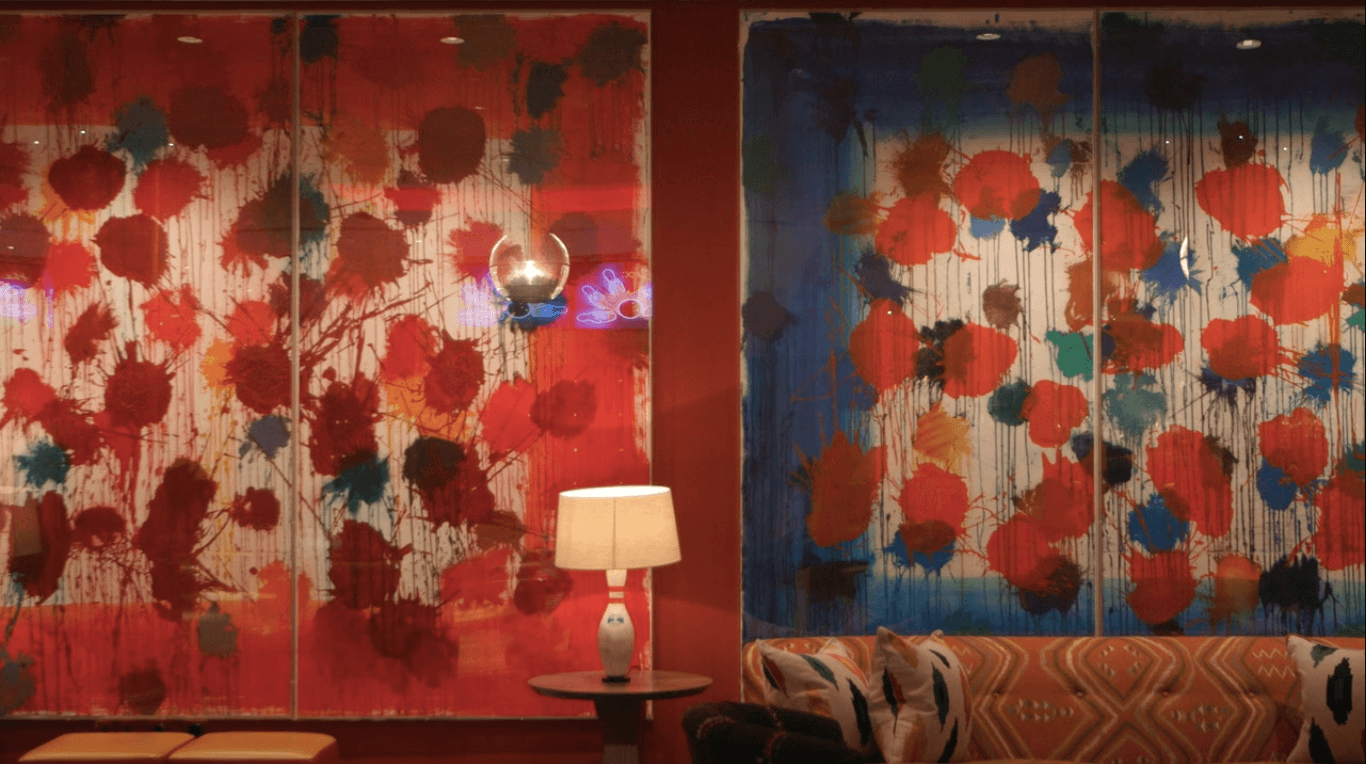
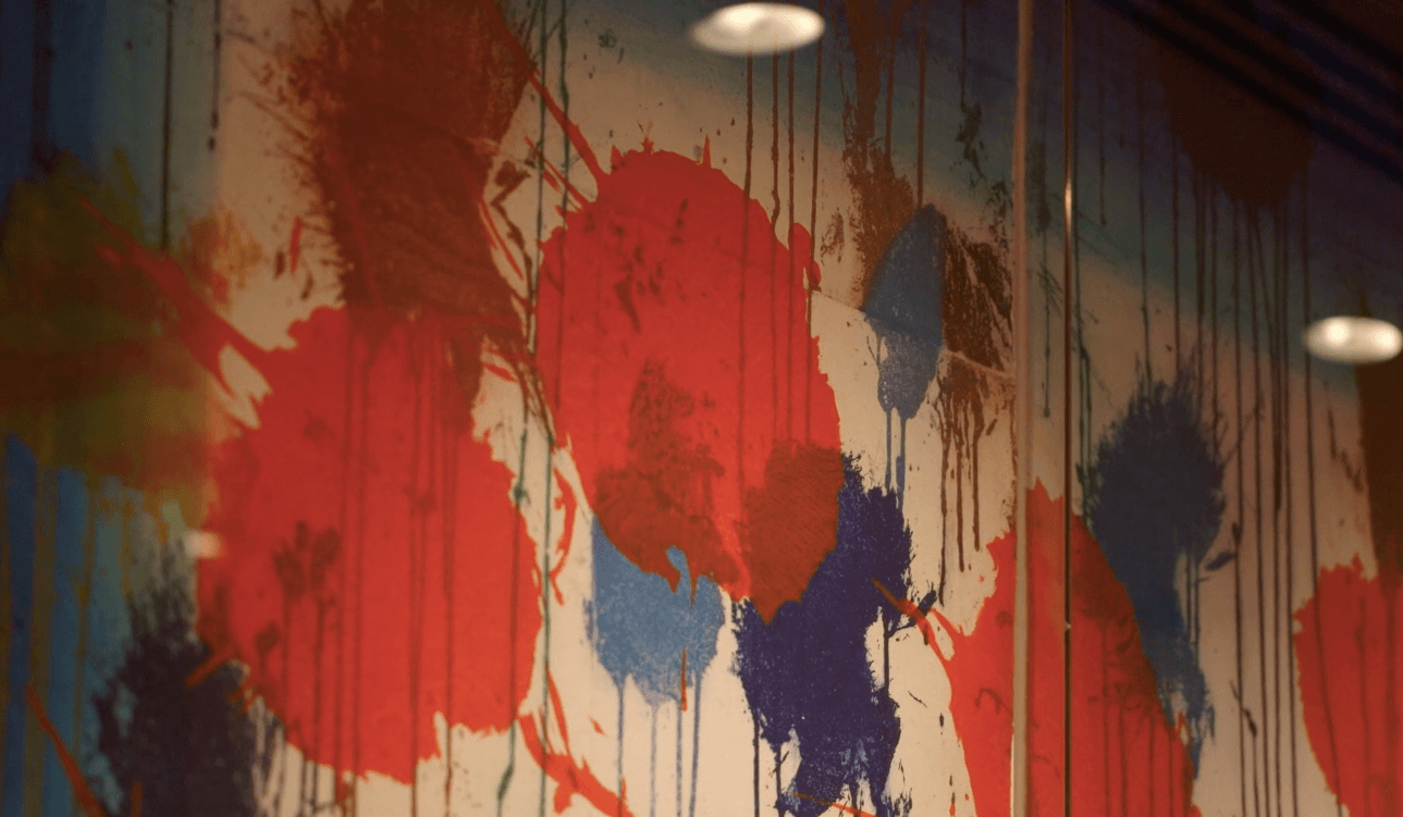
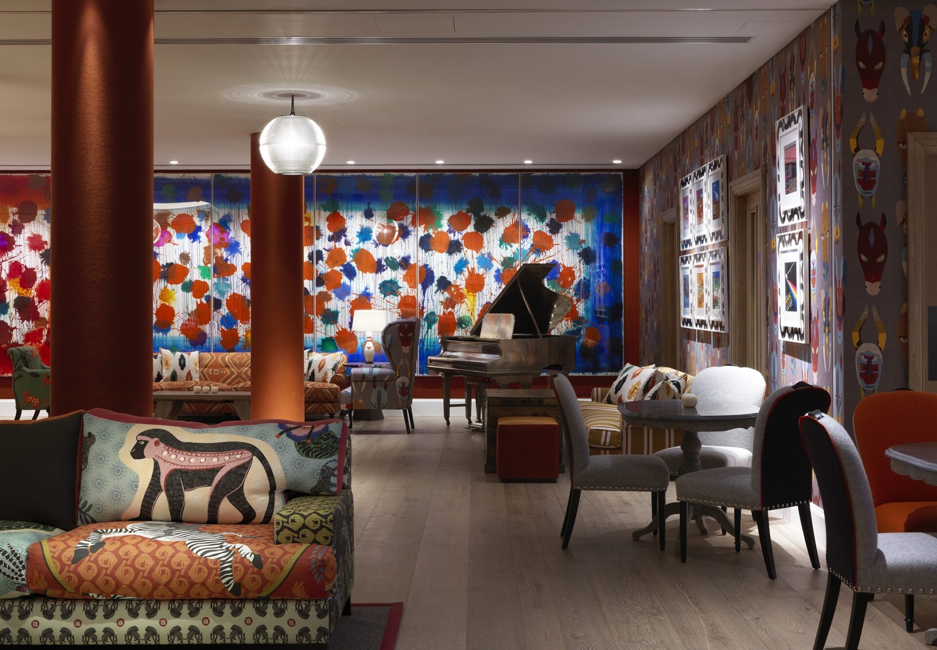
These artworks, in the Croc Bowling Alley at Ham Yard Hotel, were the largest and most ambitious etchings ever completed by Hodgkin. The scale of these paintings is an impressive, physical undertaking for an artist in a wheelchair in the latter years of his life. These works, as reflected in the title and colours, represent an element of nostalgia and the passage of time.
The blue evokes the coolness of autumn and winter and the red the heat of spring and summer. The title is also a direct reference to the song in the film Casablanca that celebrates how a great love story defies the stresses of daily life and the passage of time.
Hodgkin hated being defined as an ‘Abstract artist’ – he saw his paintings representing specific places and moments in time.
Why do you feel the Bowling Alley is the perfect place for these works?
What I like most about these works in situ is that they’re able to hang as a diptych; side by side on the same wall, which allows for a much more interesting reading of the works.
I also love how these abstract forms almost look like bowling balls, spinning down the alleyway.
An installation of this scale (they are both around 6 meters long!) is almost impossible outside of a museum context. In fact, in the gallery where Kit purchased them, they were only able to hang them at right angles to each other, due to limited wall space. You can see how this would detract from their monumentality and how it disrupts the rhythm of the piece.
Why was our choice to frame in Perspex so crucial to how these works are read?
Hodgkin often painted frames throughout his career, and you can see this reflected here in the composition of these prints– but how do you frame something that’s already essentially framed? The answer is, don’t. These individual Perspex box frames were the perfect solution to allow for a very clear reading. It avoids distracting from the works themselves. The lighting is also carefully positioned to illuminate the white area, accentuating the contrast of the blue and red printed frames.
Why does the scale work so well here?
The work fills the space from floor to ceiling, almost like a mural. The art and wall become one and these prints are ‘the view’ in an otherwise windowless room. This play on scale is seen throughout the event space with the up-scaled RikRak wallpaper and giant orange juicer in the Dive Bar. Event spaces are the largest areas of a hotel and usually quite soulless, so it’s wonderful to be able to play with scale and supersize all the elements of art and design.
What subtext makes this work such an interesting choice for a library?
Kemp-Welch was also famous for the first illustration on the 1915 cover of Black Beauty written by Anna Sewell, an interesting connection to the female literary tradition which ties in with other pieces in the room.
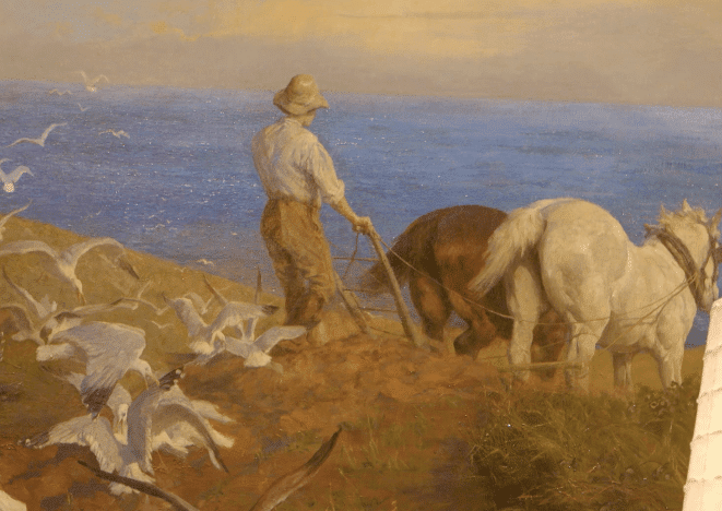
Ploughing On The South Coast – Lucy Kemp-Welch
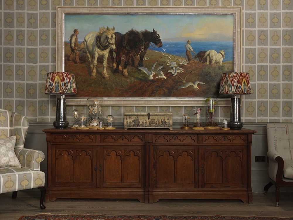
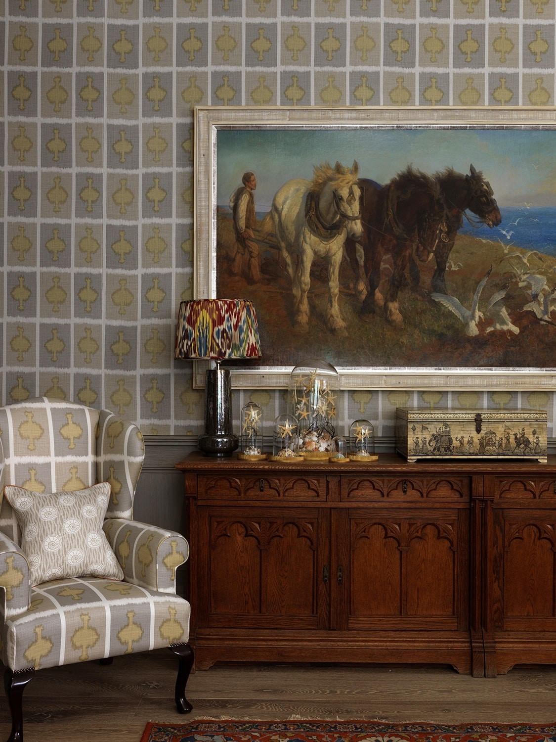
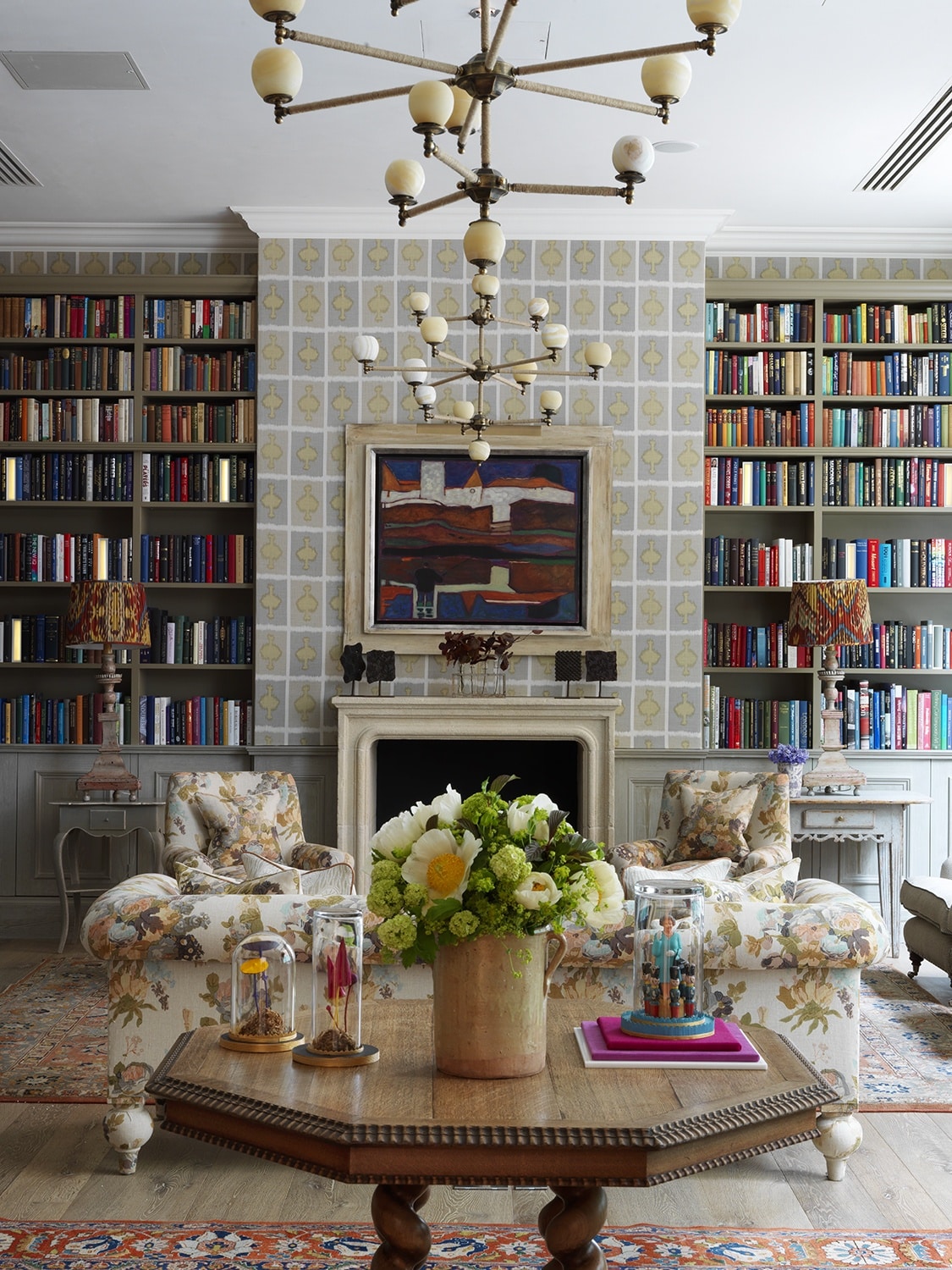
This impressive work is situated in the Library at Ham Yard Hotel, hung on the largest wall in the room amongst shelves of books.
Lucy Kemp-Welch was a young female artist, famous for equestrian painting, working at the beginning of the 20th Century. Due to the outbreak of WW1, women took over many agricultural roles, giving Kemp-Welch the opportunity to observe horses from life. Her work is often compared to Munnings, however his subject matter is much more society-focused, and I think her paintings possess a dynamic realism – a direct result of her observing from life. Her work is included in the Tate collection and she went on to become one of the two founding women to join the Royal Society of British Artists.
Why is the white frame such a success?
A work of this date and scale would traditionally be framed with something heavy and gilt. Here the light frame refreshes the overall feeling of the work, bringing it up to date, despite it probably being the oldest painting in the hotel.
Why do you feel this painting is such a success in this contemporary context?
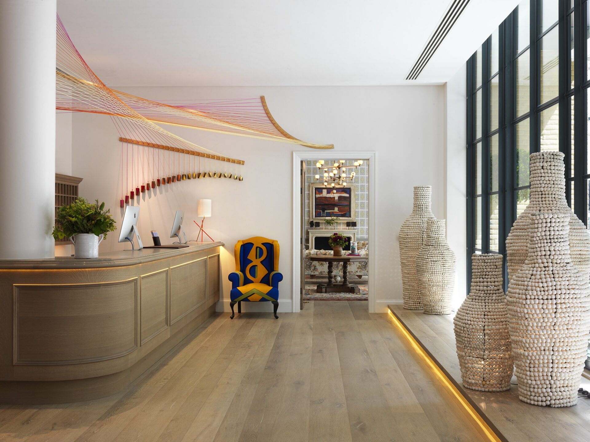
It works particularly well as it is so unexpected and shocking; you move from looking at the work by Conrad Shawcross in the lobby and the Tony Cragg sculpture outside to this traditional landscape.
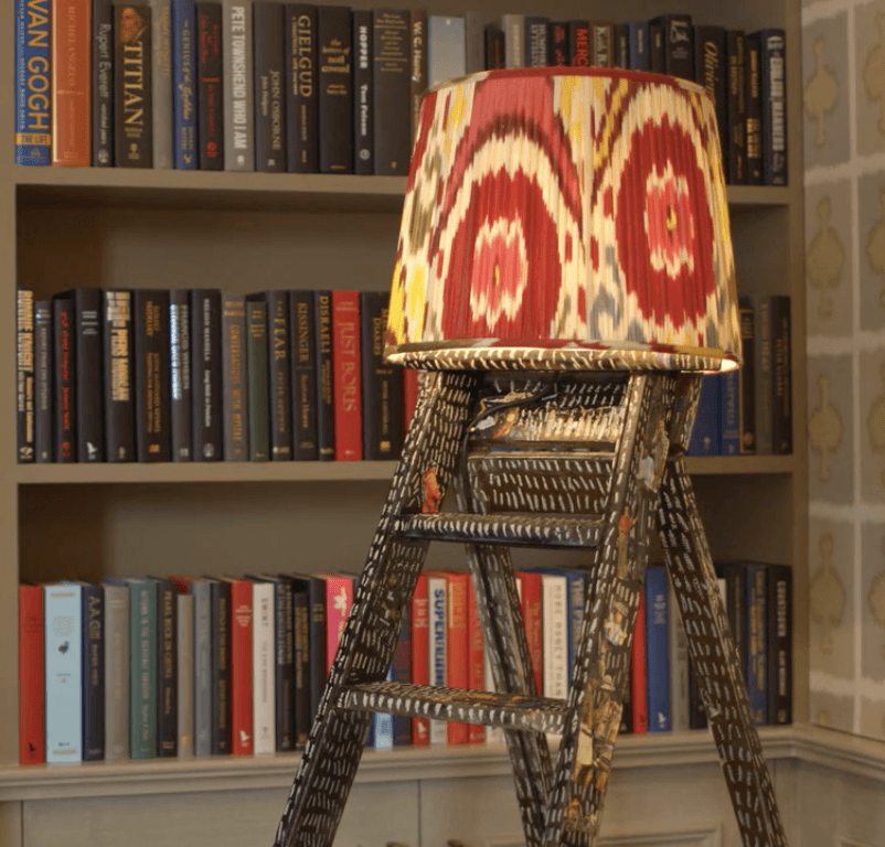
The ladder lamp is another quirky contrast and introduces an element of craft – showing that the two can exist harmoniously. The scale is perfect for the space and the earthy colourway of Kit’s modern design, Ozone, on the walls provides an unexpected, contemporary backdrop.
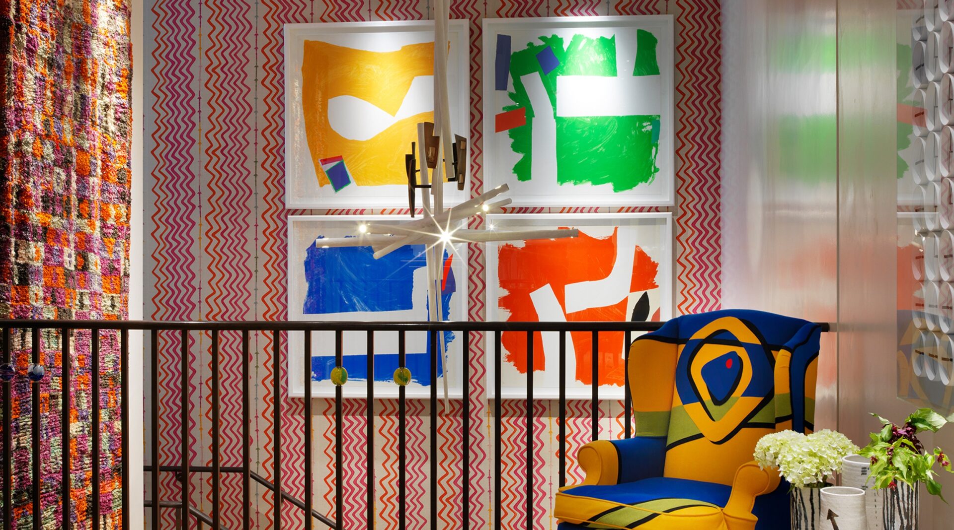
Side Effect, Split Second, Inside Story Through and Beyond, 2003 – Sandra Blow
Sandra Blow was a pioneering Abstract artist. Kit knew her and visited her studio before her death. Interested in collage, torn paper and brightly coloured cut-outs, Matisse was a clear influence, as was her partner Alberto Burri, an important member of the Arte Povera movement. From working collaboratively with him, she began to experiment using non-traditional materials in her practice including sacking, cardboard, sawdust, strips of canvas and torn paper. She had an instinctive approach to conceptualising space and void and all her work has an intense preoccupation with space, matter and movement.
Why is balance so important?
Creating inherent balance within the work and composition is crucial. Blow was a master of this – these look effortless, but if one element differed, it might look awkward. I think that’s why she is recognised as a great artist. The more you look, the more technical you realise they are.
Why is the hanging of these works so effective?
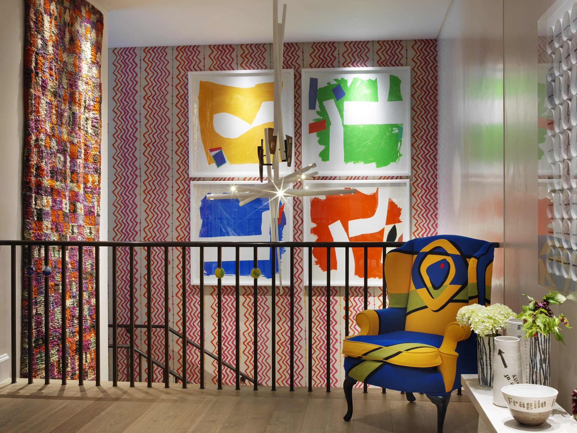
These four prints have been hung very close together so they read as one rather than as separate works. If hung individually, the impact would not have been so arresting. This is a perfect example of where using multiple works can be just as, or if not, more effective than one single work.
I also love how Kit’s choice of chandelier is a nod to the white void shades in the composition – a sculptural extension of the print almost. The abstract appliqued chair situated underneath is also a celebration of Blow’s work in a totally unique way.
Why does it work?
Primary colours with green on a textile wallcovering consisting of pink zig zags with a textile hanging alongside just shouldn’t work, but it does! The stark white contemporary frames play a big part in this making everything feel fresh rather than busy and confused. This is also helped by the choice to leave one wall white on the right-hand-side to create balance.

