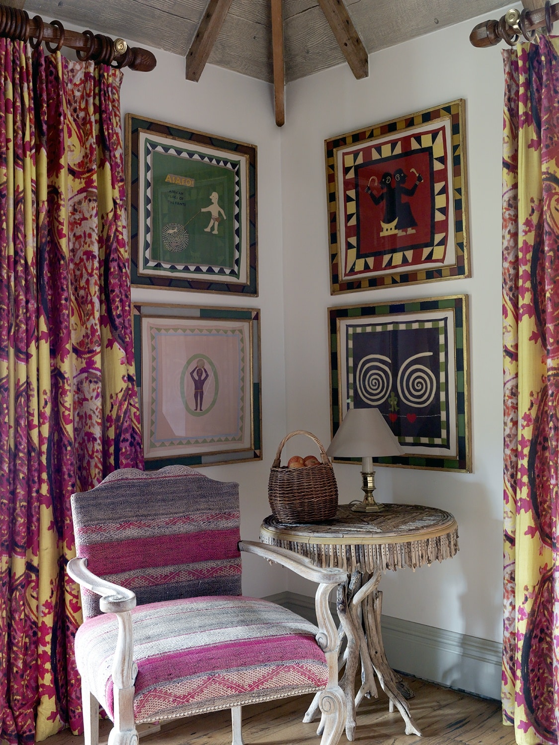
When it comes to artwork, we love a wonderful unique frame. Throughout our hotels you will spot thousands of different ways to frame a piece of art, from a simple Perspex box, to driftwood, or just painted in a wacky form. Our clever framer has reinvented the art of framing and makes the frame an art form in itself.
This week for Design Threads, we wanted to paint our own frame. It is important for a frame to work in harmony with the artwork. Our talented framer says that ‘pictures always have clues in them, a colour, a detail, a texture – which spark ideas’.
This week I have chosen a postcard of a painting by Carrie Goldsmith as the subject to my frame. It is an abstract painting with green and blue hues and hints of ochre.
Start by finding an old frame which is no longer in use, or have a look online where you can buy a cheap wooden frame. We are going to be using acrylic paint, unlike a professional framer who would use Gesso and wax to create their masterpieces.
I like to frame things in such a way that the artwork looks more striking and stands its ground in a room. Here, the picture frames echo the geometric shapes of the four vivid-print handkerchiefs by Peter Adler.
Firstly, I have picked out the dark bottle green and yellow ochre colours within the postcard. I mixed a blue and a green to get the strong dark green as a background colour for the frame.
The painting has linear and curvaceous lines which I wanted to carry through onto the frame. I made circles by drawing around an egg cup which gave me a simple graphic pattern.
We often use this design trick in our interiors. On headboards we pick out secondary colours within the fabric design and repeat them on the depth of the headboard, creating a powerful border.
In contrast to the dark background, I painted these curved shapes in a yellow ochre. I have drawn out the tiny hints of yellow within the postcard, which works well and allows the postcard and the frame to go hand in hand.
As you can see, it immediately makes a plain wooden frame interesting. Why don’t you give it a go! Not only would you be creating something vibrant for your house, you will be making something completely unique.
We want to see what you can create. Tag us on Instagram with #DesignThreads and we will post our favourite frame designs!
Weekly Book Recommendation from Much Ado Books
We were recently engrossed by this short book that explores some big themes, like life, creativity, death – and birds.
You’d expect a dense tome packed with long words, but Sara Baume’s handwork is short, unpretentious and charming.
The book has some kind of magic, subtly connecting themes and ideas while maintaining an extraordinary kind of forward momentum – it is a page-turner that demands to be read, but also asks to be set aside once in a while so you can try to absorb passages and thoughts.
Part craft theory, part celebration of birdlife, part consideration of a father’s influence, part appreciation of a partner’s presence, part philosophical rumination . . . it sounds horribly worthy, doesn’t it?
But it isn’t. It is a short, quirky, elegant, enjoyable, page-turner.
We found it hypnotic, and weeks later we are still discussing the ways it resonates. But you don’t have to take our word for it; Sebastian Barry, who knows a thing or two about books, says “Every devotee of literature and art should read this rare, bright-lit, hard-won book.”
We like it so much we have printed a bookmark, a mark of appreciation for a book that we will revisit and continue to savour. We’ll include one of the bookmarks with each copy we sell, while supplies last.
CLICK HERE to purchase your own copy.


