In the Design Studio, we are always coming up with innovative design solutions that are both practical and beautiful. Getting the balance right is key. When designing a room, the first and most important thing to consider is how guests will move through a space.
In busier public areas, we often choose round forms, allowing for multiple vantage points and an easy flow within the space. In the lobby at The Soho Hotel, we decided to turn an oval painting by Joe Fan on its side to create a table. It has a clear top to protect the work, and we made a bright red Perspex base for the table legs. An array of vases of different shapes and sizes sit upon it, adding height and scale to the room.
This centrepiece is crucial for the circulation of this large transitional space, and the unexpected nature of this artwork-come-table makes it hard to forget. We have used another Joe Fan artwork to the same effect at Ham Yard Hotel.
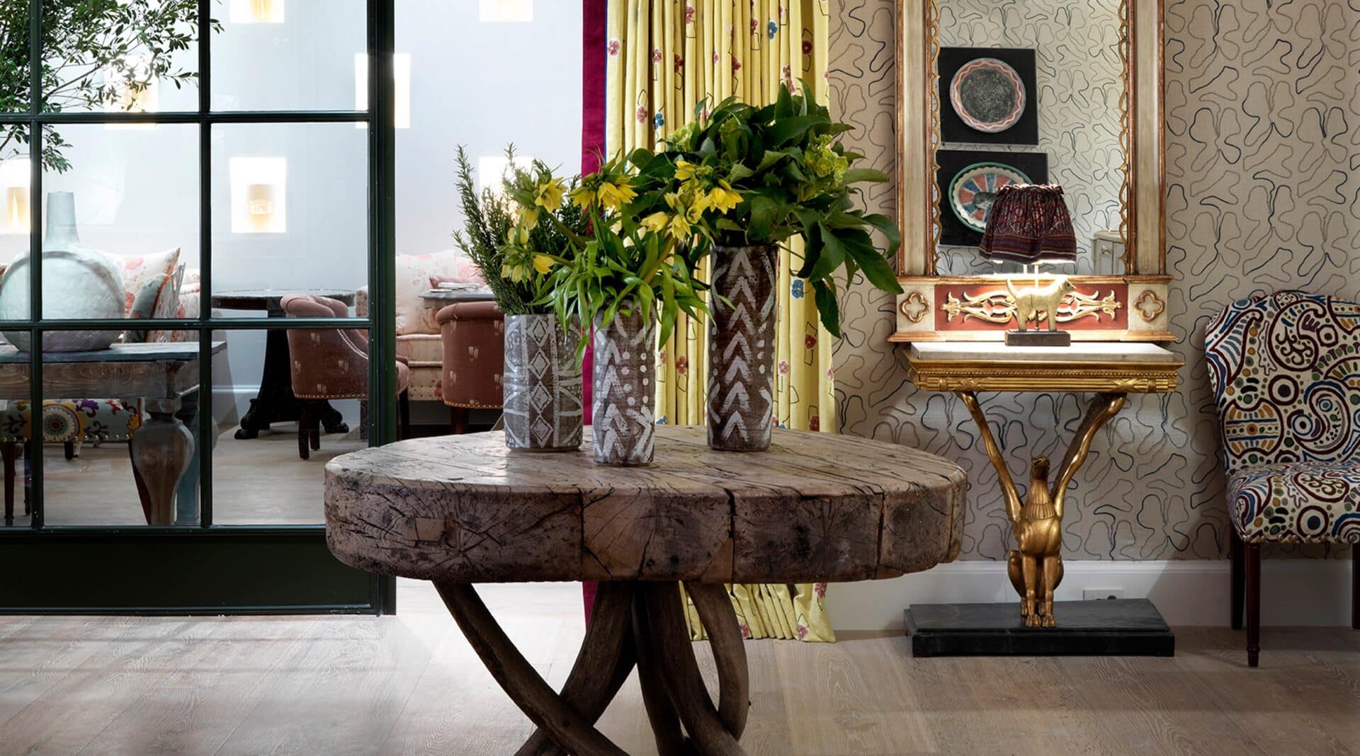
As you move from the Drawing Room to the Orangery at The Whitby Hotel in New York, you pass a stunning whalebone-leg table with an assortment of Katherine Cuthbert vases placed upon it.
The swirling organic forms of the ‘Isatis’ Casamance fabric on the walls is the perfect juxtaposition to the steel crittal doors and the fresh flowers in the beautifully painted vases. My embroidered ‘Friendly Flowers’ fabric for Chelsea Textiles used on the curtains behind adds a bolt of colour, and creates a relaxed and welcoming space.
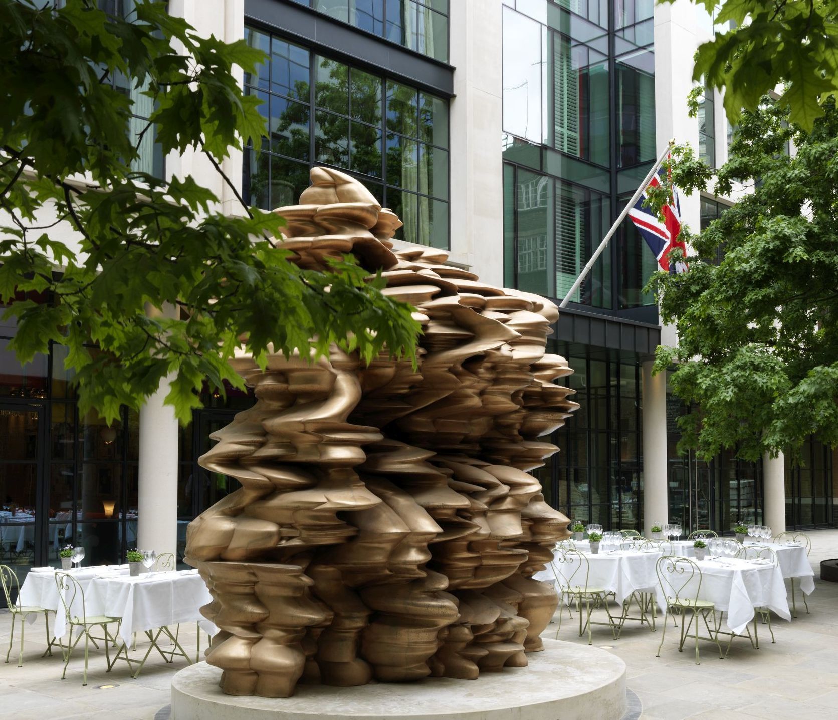
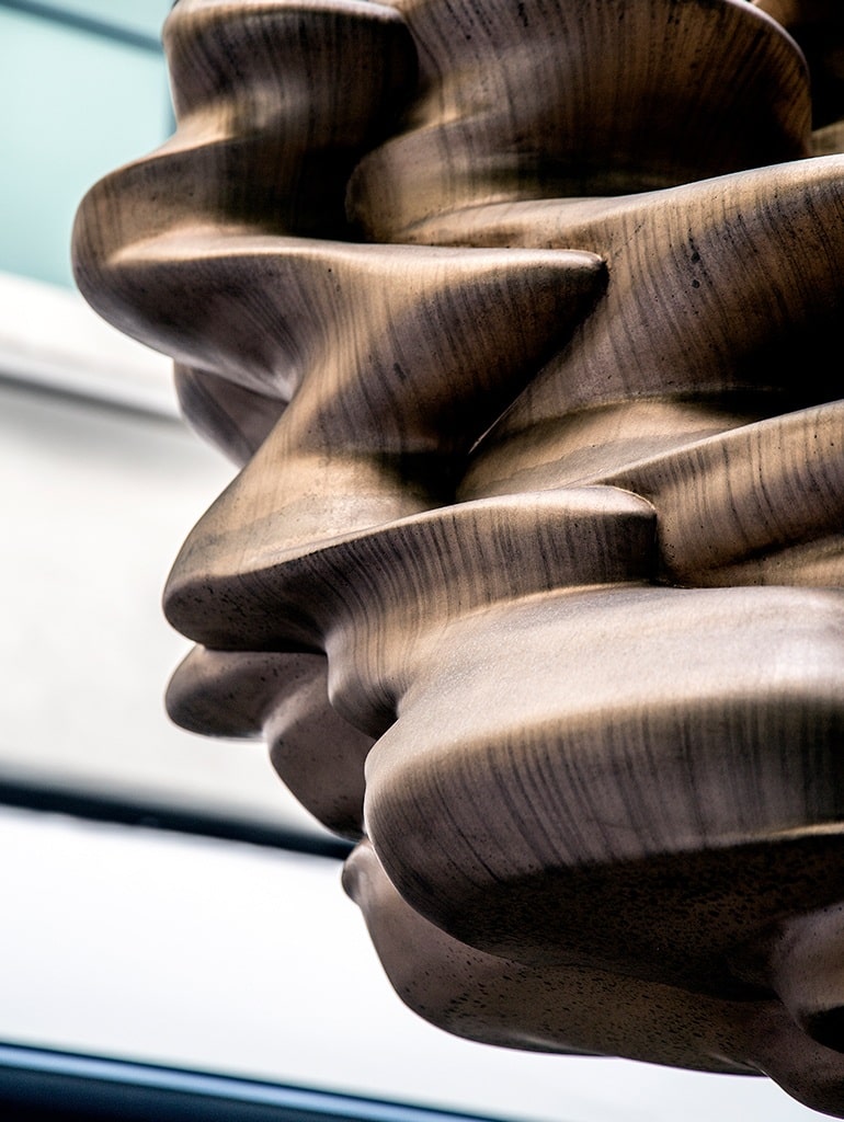
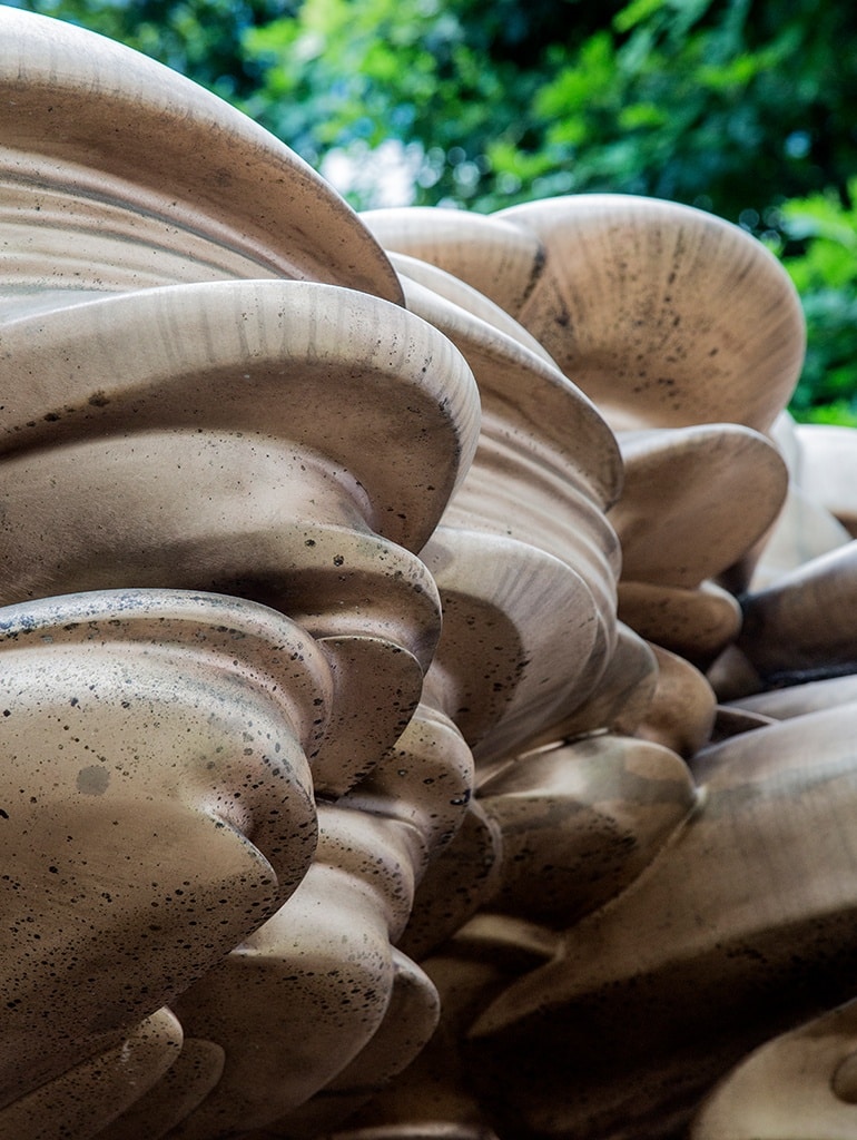
When building Ham Yard Hotel, we commissioned the sculptor Tony Cragg to create a focal point for the outside courtyard. There is very little contemporary public sculpture in London, so we felt Cragg’s fluid designs would be the perfect fit for the space. The work is called ‘Group’ and it required a great deal of engineering skill to piece this 12ft tall sculpture together.
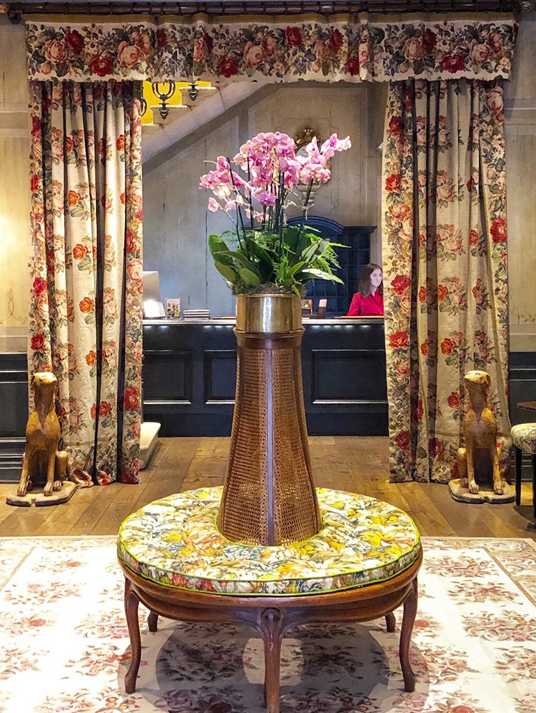
In the lobby of the more traditional Covent Garden Hotel, a cane-backed conversationé chair leads the eye towards a dramatic dividing curtain made from antique needlepoint rugs. This combination creates a charming and theatrical entrance to the reception area, and gives our guests somewhere to sit without having to over-crowd this busy space with multiple chairs.
The beauty of this work is its scale and the irregular organic forms it’s made up of. It can be viewed ‘in the round’, making it the perfect sculpture for this transitional public space. I love to see passers-by walk around it and marvel.

