Great spaces need not to be the most glamorous or luxurious – it is how personal and interesting you make them. We do this by sourcing new and antique furniture and by displaying all kinds of wonderful artworks, objects and fabrics to spark interest and intrigue in our interiors. We hang baskets above bars; display little toad stools, painted watering cans and frame plates, costumes and even bowling shoes in Perspex.
In previous posts we have looked at these more unusual methods of showcasing our prized collectibles, but you don’t always have to think so far outside the box to make a statement. We love integrating the old with the new, so we are always on the lookout for beautiful antique chests, wardrobes and cabinets which add a sense of scale to a room and help ground a space. Here are a few of our favourites:
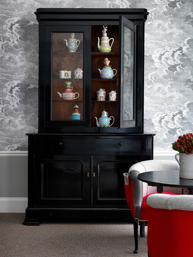
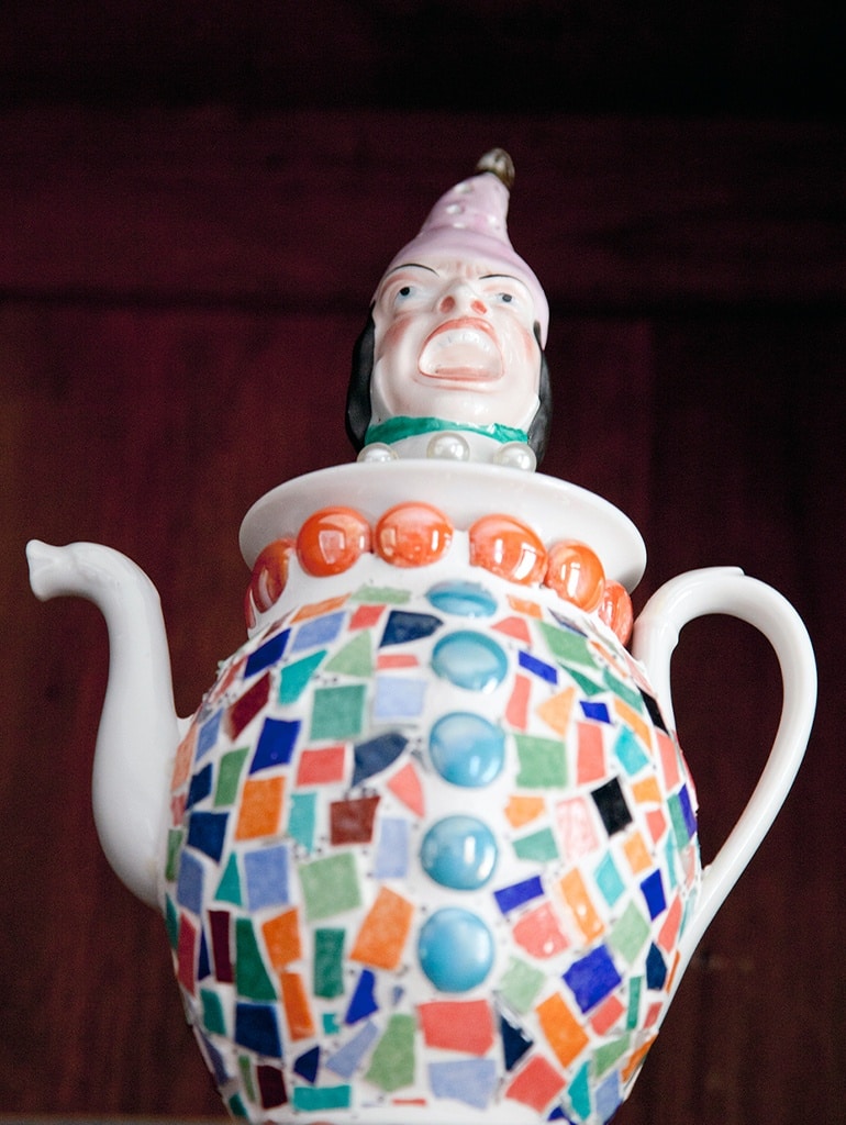
In room 101 at Haymarket Hotel stands a large black glass-fronted cabinet housing a wonderfully off-the-wall collection of ceramics in an array of mosaic jewel colours. The scale of the room allows for this large piece of furniture, but what could initially be seen as quite a serious piece is softened by the cloudy wallpaper it sits against and the silly faces, cats and flowers on the tea pots hidden within it.
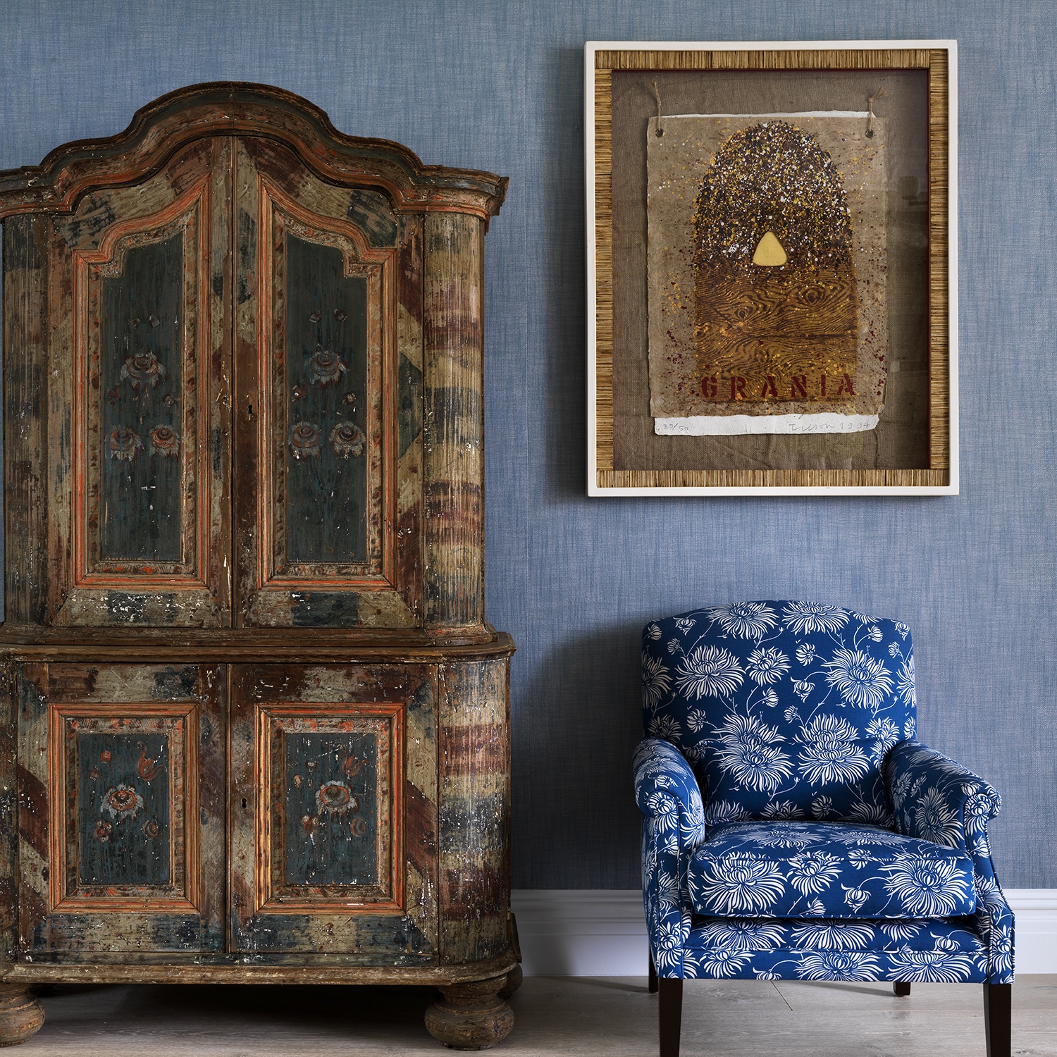
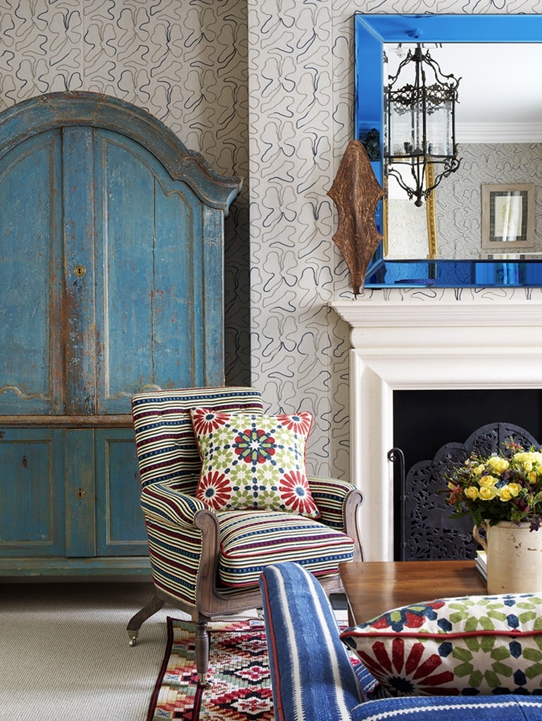
To the left of the fireplace in the Suffolk Suite at Haymarket Hotel stands a beautiful blue painted Scandinavian chest. This chest and the blue glass mirror to its right were the starting point for this room and sit beautifully against the embroidered Casamance fabric adorning the walls.
The blue is highlighted on the sofa, upholstered in C&C Milano’s ‘Palea Rigato’, in my indigo ‘Criss Cross’ fabric for Christopher Farr on the armchair and again on the cushions made up in Martyn Lawrence Bullard’s ‘Marrakesh’ fabric. Starting with a predominant colour or piece of furniture can really help tie a scheme together.
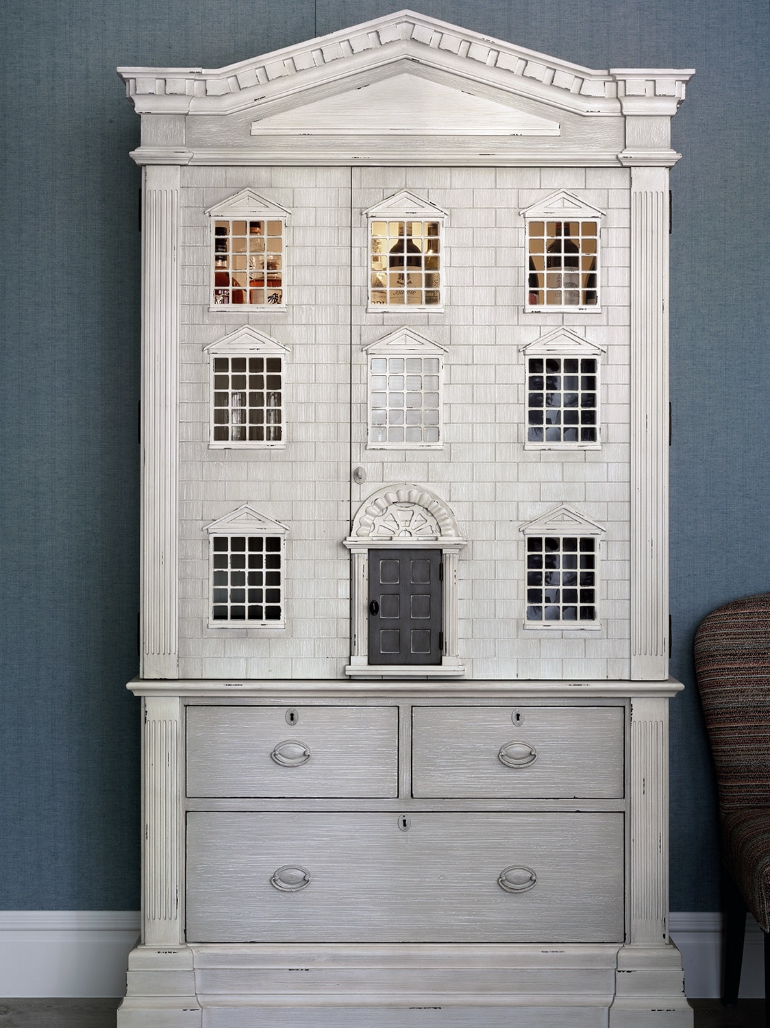
In the Terrace Suite at Ham Yard Hotel you will find a dolls house come drinks cabinet which immediately adds an element of playfulness and nostalgia to the scheme. We love an unexpected surprise and a delicious negroni is the last thing you’d expect to find behind these doors. This is a perfect example of how a cabinet does not always have to be used for displaying things, it can be practical and a witty statement in its own right.
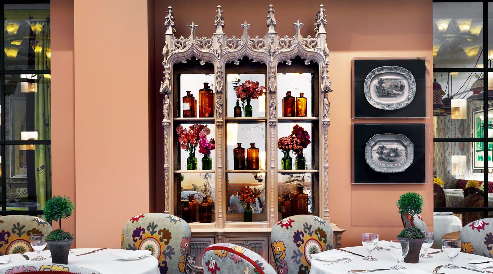
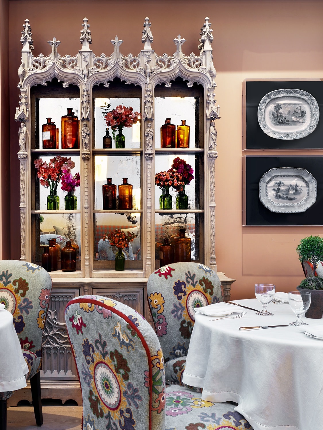
In the Orangery at The Whitby Hotel, an old Gothic cabinet, stripped back from its original black, bleached and mirrored, houses small apothecary style bottles of flowers.
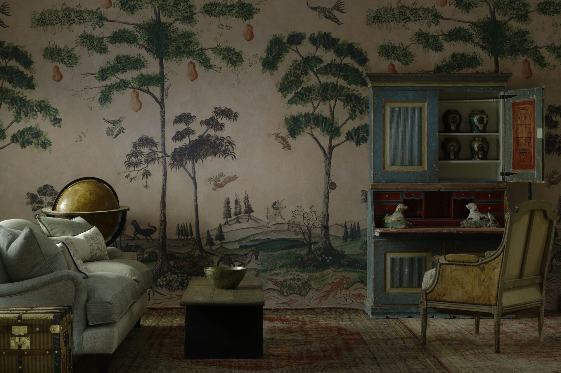
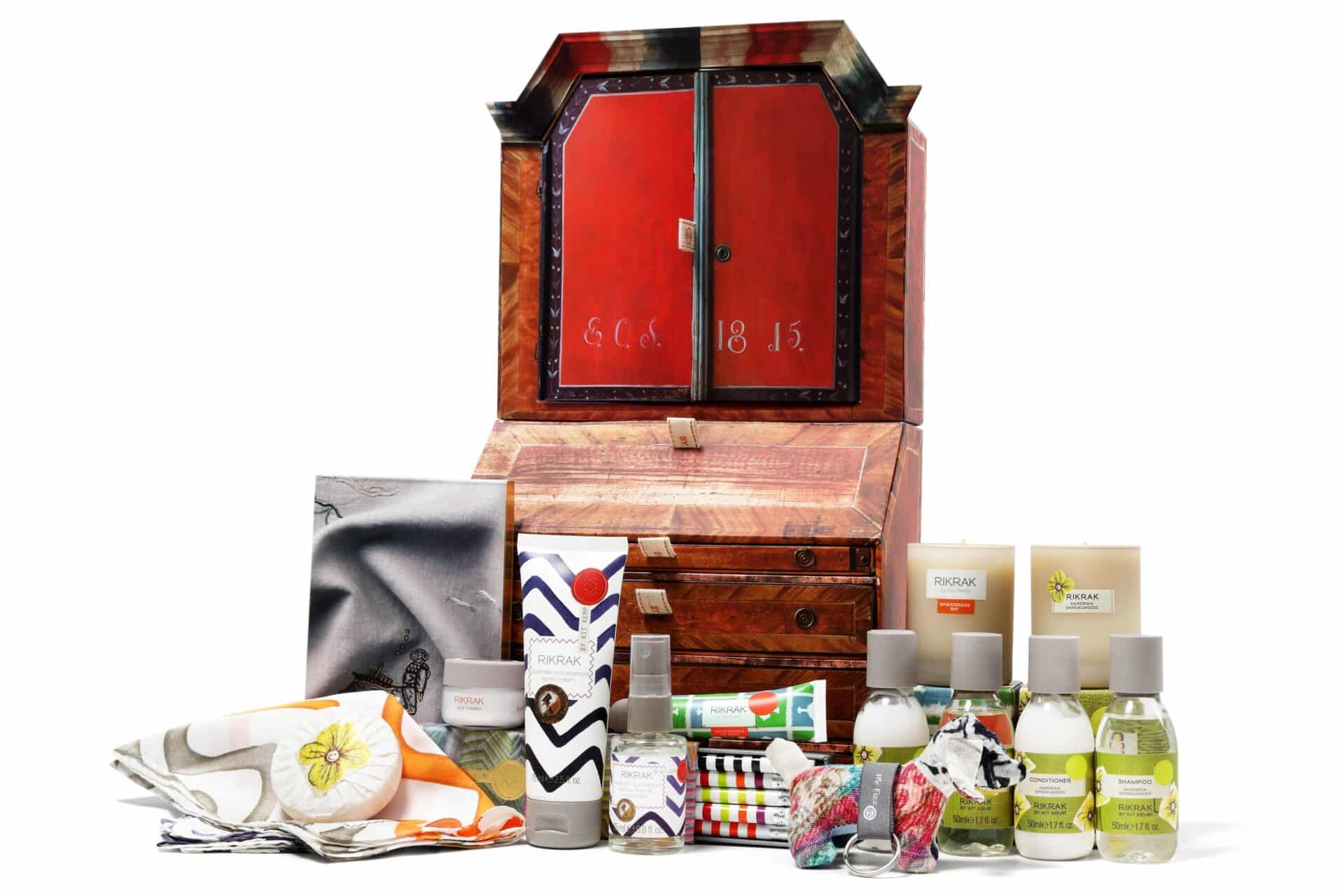
Our fondness for cabinets and the wonders and history they hold inspired us to miniaturise a hand-painted 1835 folk art marriage bureau to fill with dozens of Kit Kemp goodies.
Seen here at our pop up with Andrew Martin is another Swedish showstopper, sourced from Lorfords. The hand-painted primary colours sit perfectly in front of the soft pinks and leafy greens of the wallpaper mural we designed for Andrew Martin on the wall behind. The scene is so incredibly inviting and the globe and whimsical scene nod to storytelling and the passage of time.
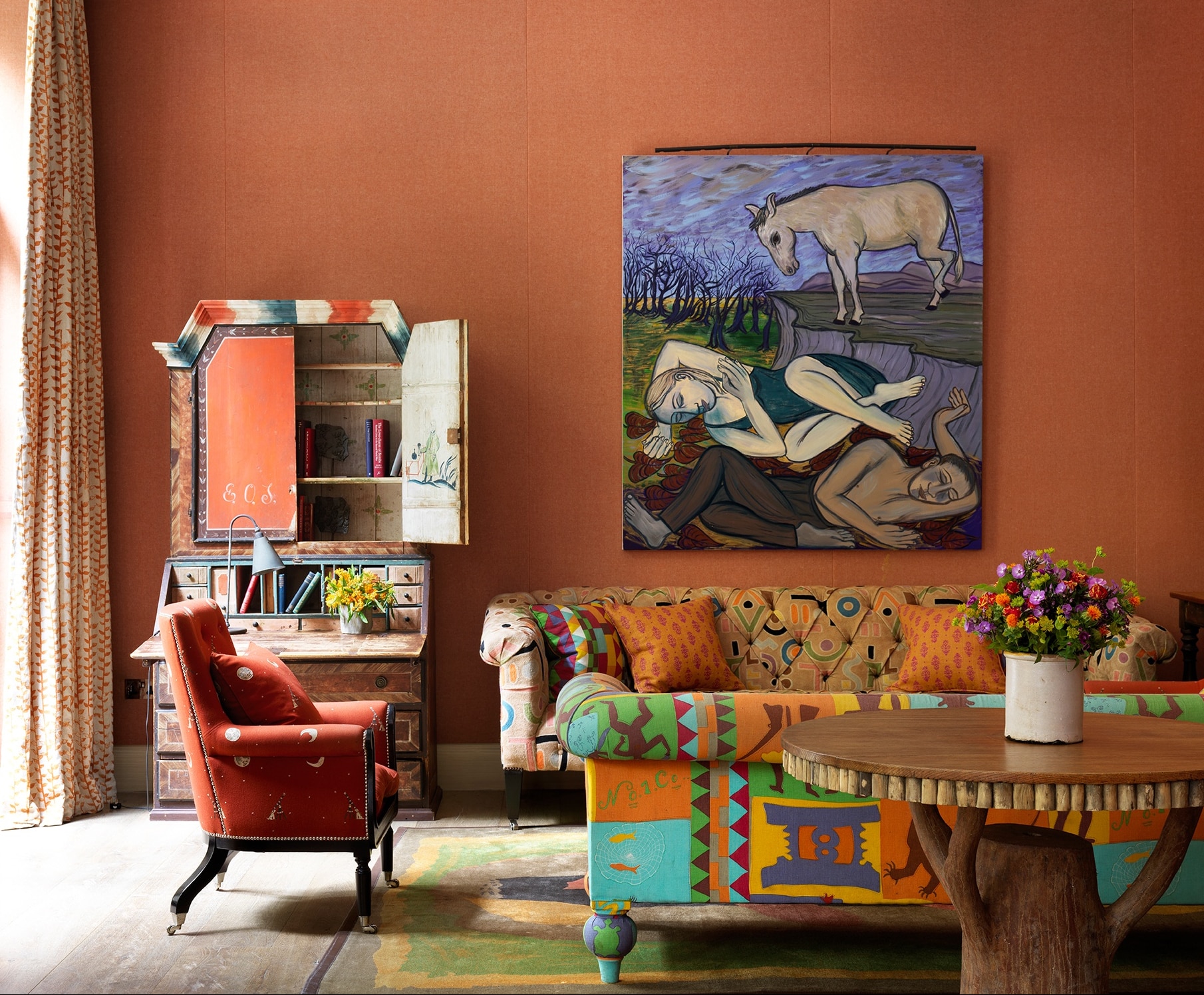
Visit the Drawing Room at Ham Yard Hotel to see the life size beauty, or buy a mini one to take home for yourself or a loved one.

