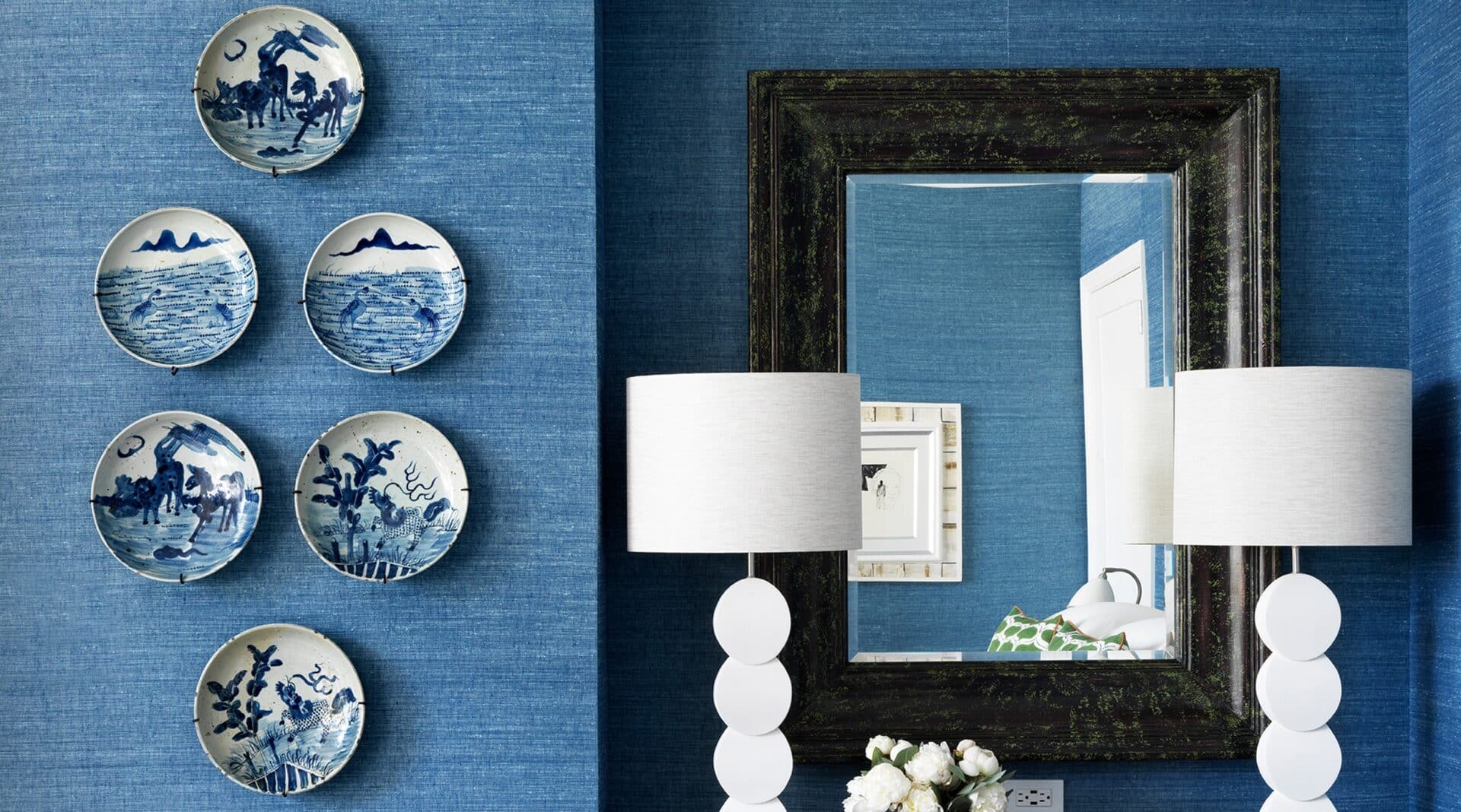
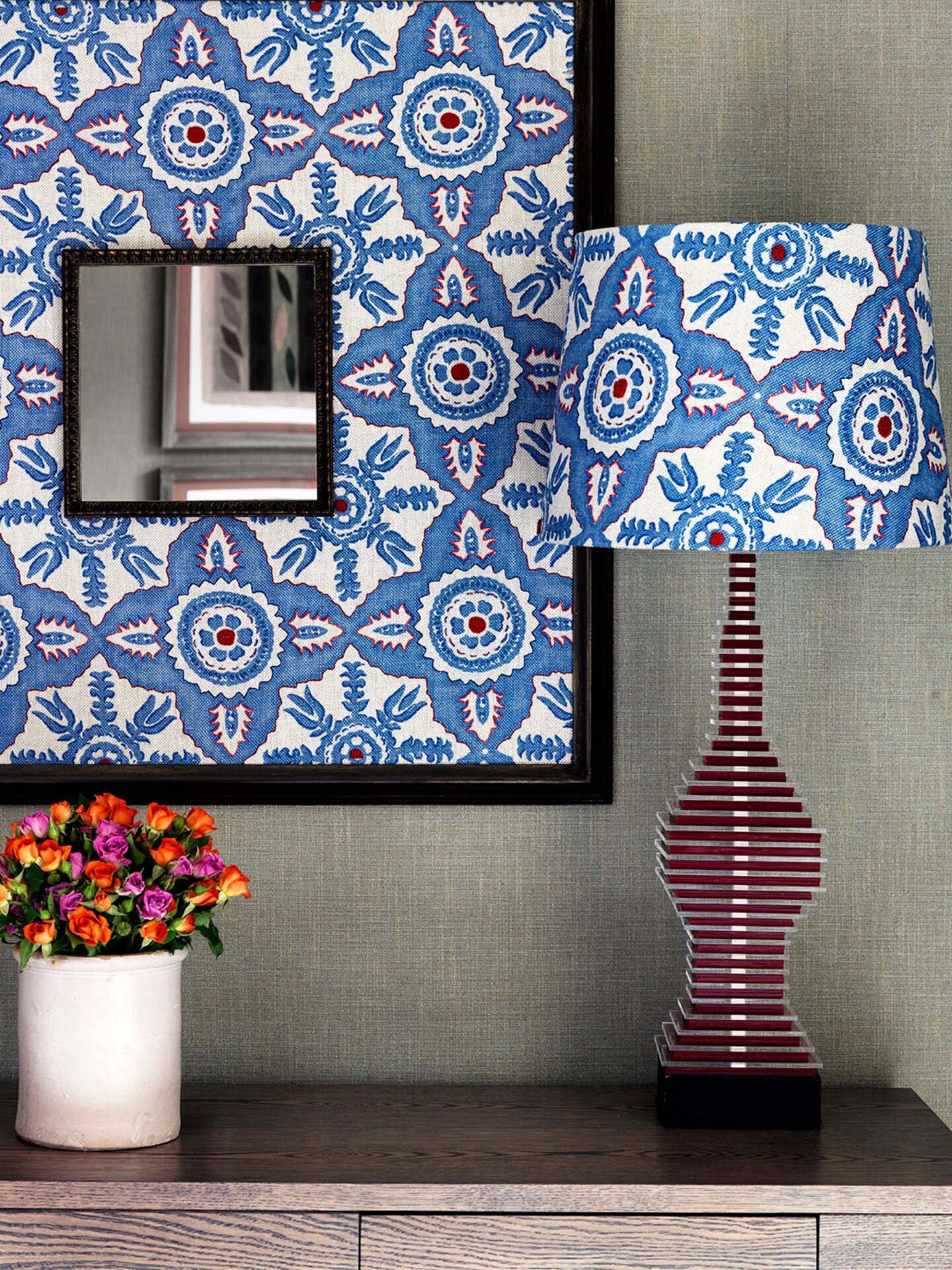
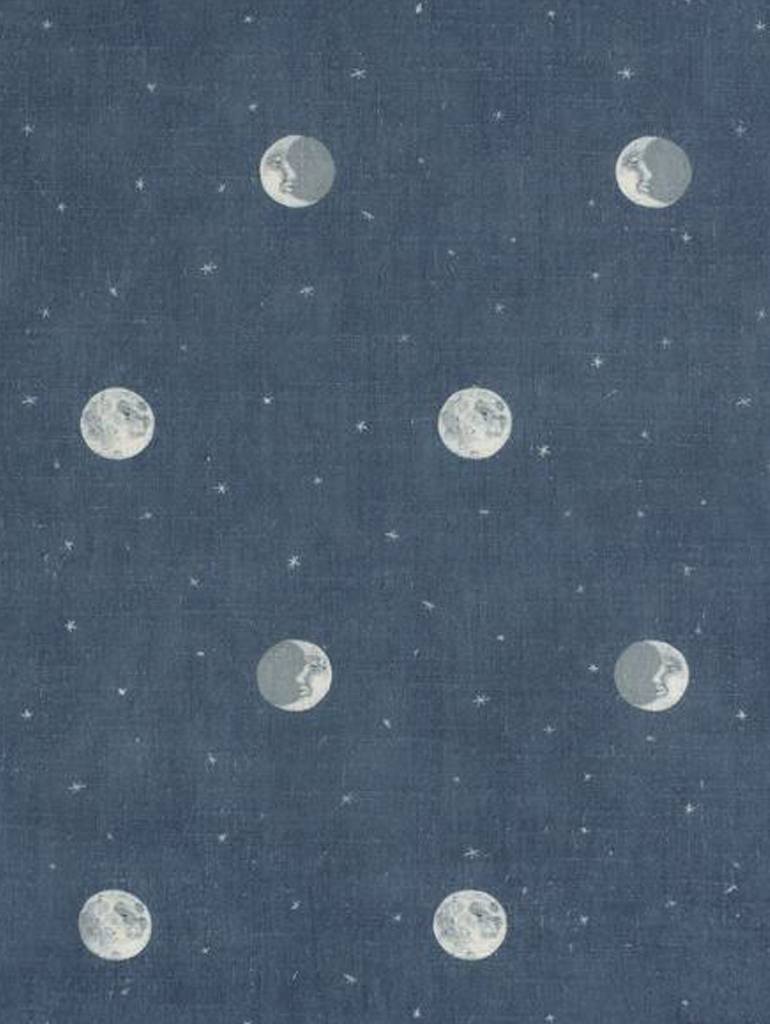
Blue is always a popular colour and one that we are often drawn to. There are so many tones to choose from – from pale sky blue to deep dark denim or the rich and the vibrant Yves Klein blue.
We may call them ‘the winter blues’, but blues don’t necessarily need to feel cold or moody. It is a comforting colour and when I design fabrics for Chelsea Textiles or Christopher Farr, the blue colourways are always the most popular.
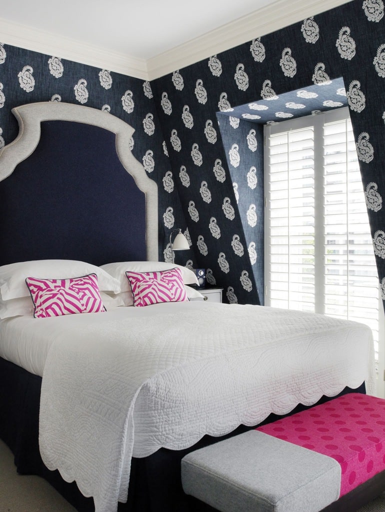
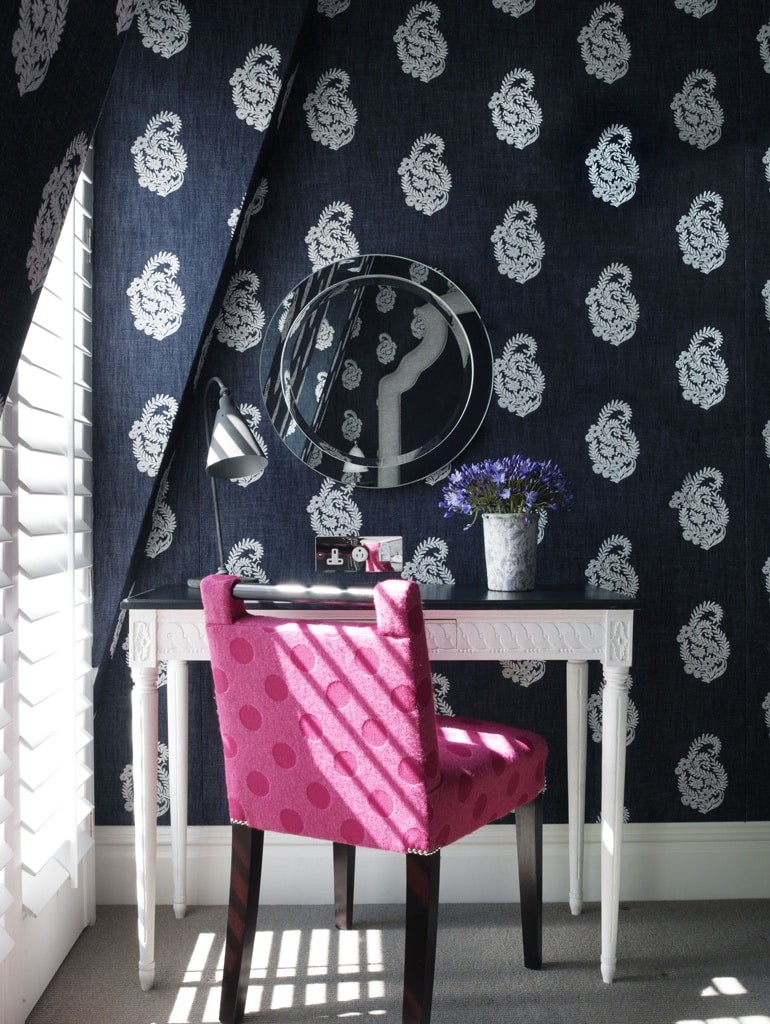
It is always important to consider the light in the room. At Dorset Square Hotel in Marylebone, We have used a navy denim fabric with a paisley motif in a sloping eaves room, giving it a sharply tailored but cosy feel. The light dances through shutters and brings the rich, indigo colour to life.
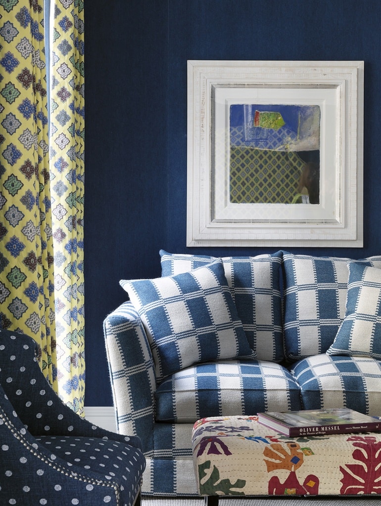
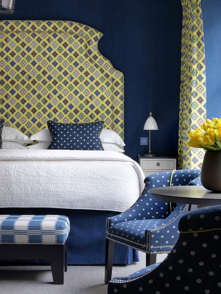
At Ham Yard Hotel, a bright yellow in the Provençal inspired fabric by Christian Lacroix provides an uplifting contrast to the rich blue fabrics by William Yeoward against Pierre Frey denim walls. A Roger Cecil painting complements the hues, and a footstool upholstered in a found Indian fabric adds another layer of interest.
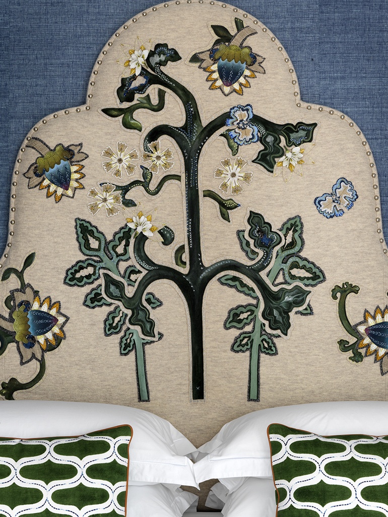
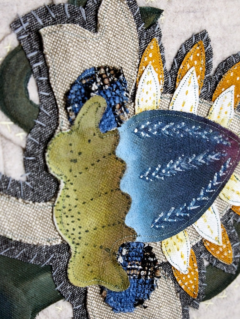
Blue fabric has also been used on walls in The Whitby Suite at The Whitby Hotel in New York. The embroidered headboard picks out the accents of blue.
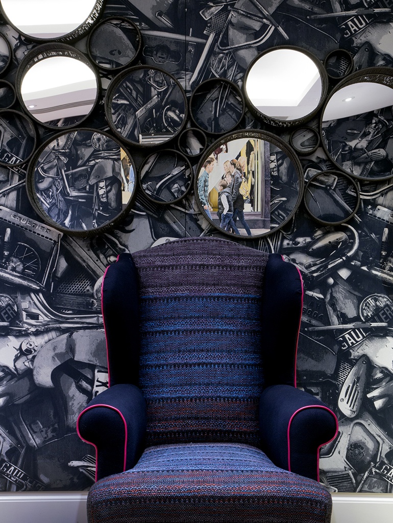
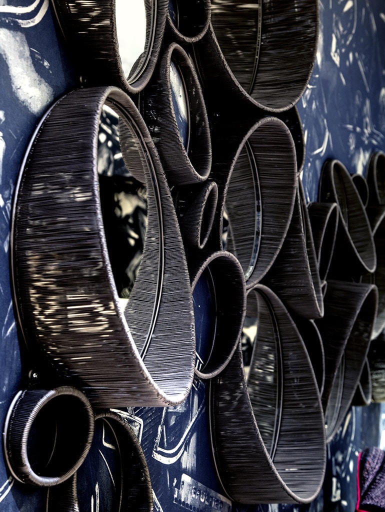
In the Archer Room at Ham Yard Hotel, an blue patterned wallpaper is off set with a collection of mirrors, hung without any space in between so they looked like one unified piece. The effect is random but perfectly symmetrical.
Mirrors are a clever and useful way to open up a space, making it look larger and adding a further dimension. The layering aspect to this composition helps create a sense of drama by forming shadows and bouncing light around the room.

