
Red is a colour we return to time and time again, especially during this festive time of year. It is a striking colour which works well as a bold accent that catches the eye.
In many ways, red is the colour of London with our iconic red buses, telephone booths and post boxes. There is a whole spectrum of tones, from rich deep shades of maroon, burgundy and vermilion to bright fiery scarlet or rusty muted tones.
In the Library at the Knightsbridge Hotel (below) a glorious, bright red on the walls and in accents in fabrics and lampshades pulls the scheme together in a bold combination of primary colours.

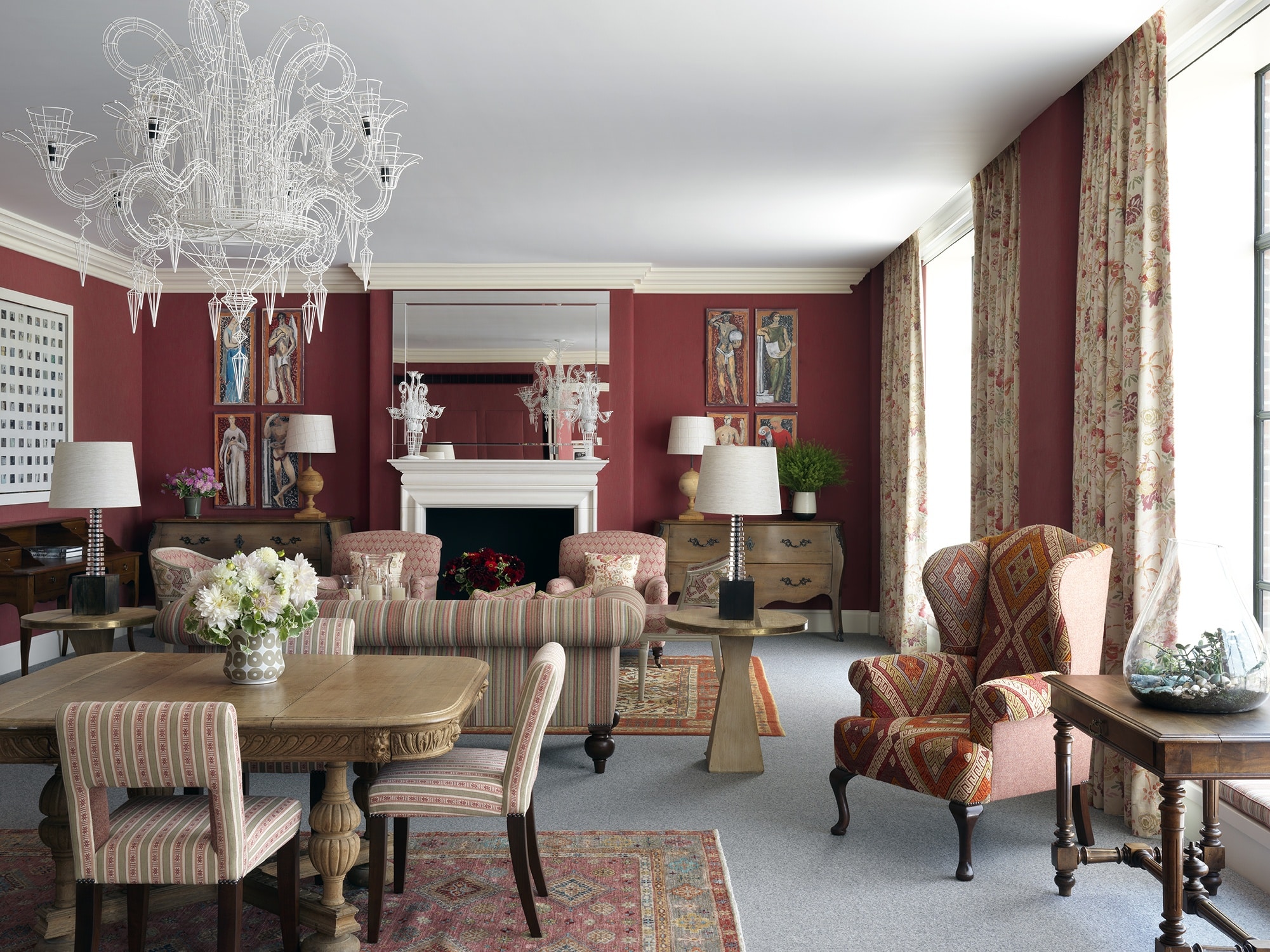
Meanwhile, in the One Bedroom Crosby Suite at Crosby Street Hotel (below), a wonderfully warming red on the walls makes the combination of fabrics including my design ‘Ashenwood’ for Chelsea Textiles feel lively and exciting.
The textures and embroidery are complemented by the warmth of the red, which is the heart of the scheme, tying the fabrics together.


Red can bring a room alive but it doesn’t need to be used in large doses to be effective. Red often works best with a more muted palette, a textured grey fabric wall contrasted with a vibrant red is one of our favourite combinations.
In Room 101 at Haymarket Hotel we have used vibrant dashes of red to awaken a contemporary combination of black and white. The soft textures of the black-and-white cloudy wallpaper, wrap around the elegant Regency room. The limited colour palette of greys enhance the vibrancy of the red touches.
The headboard is predominantly black with an interesting embroidered applique of a wind blown tree with red leaves. The unexpected purples and maroons in a framed Indian quilt contrast with the room’s predominant black, white and red to bring the entire colour palette to life.