
The Kit Kemp Design Studio is practically synonymous with colour, so we were as surprised as you when we set to writing and found ourselves falling down a rabbit hole of black and white.
Black’s most common association is power, authority, and strength, and it is for this reason that too much black can become overwhelming. However, when balanced with white – a positive, clear and open colour – the two colours communicate in a powerful way.
In today’s blog, we will show you how we have used monochrome designs in an unusual way, whilst retaining the fun and joyful spirit we love.
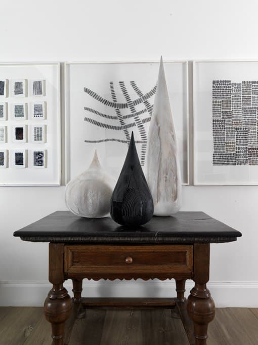
At Haymarket Hotel, we have a powerful black and white composition in the Conservatory. Uniformly arranged in the background are a set of three paintings by Sue Lawty, whose work is rooted in an emotional, spiritual and physical engagement with the land – in this case through found stones. In the foreground are “Large Pyriforms” sculptures in wood by artist Carol Sinclair. The vast but simple sculptures against the elaborated hanging pieces, in combination with the antique wooden furniture create a thoughtful, striking moment.
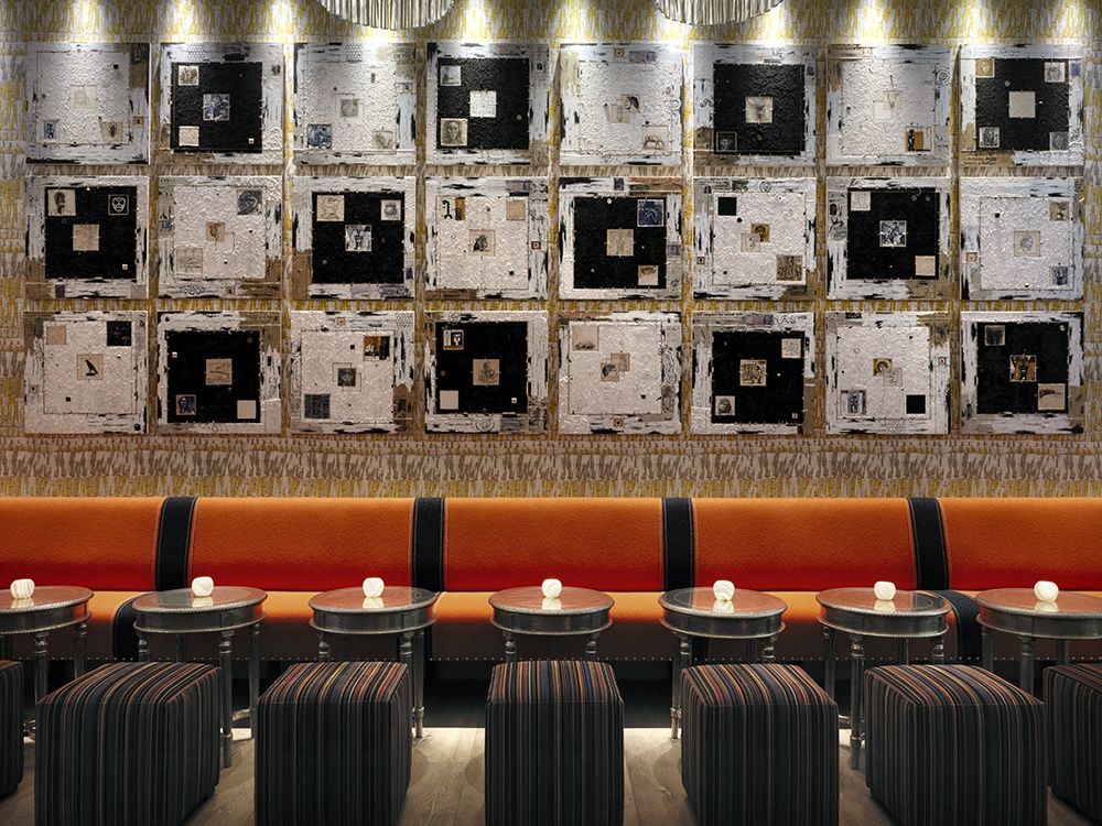
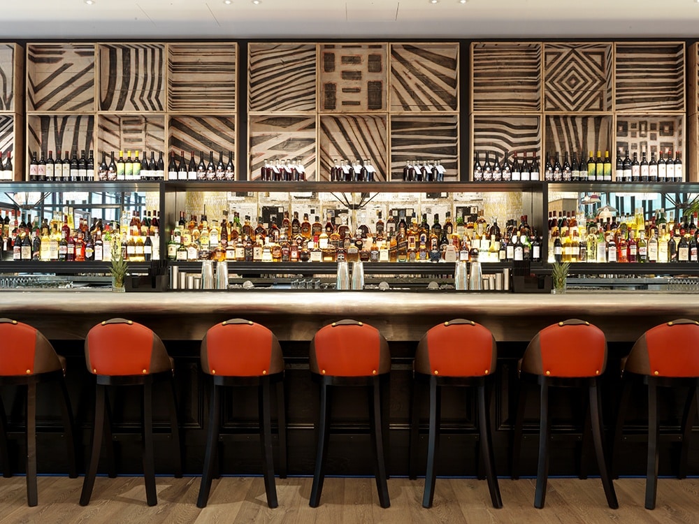
Moving into the bar, the wall is adorned with an arrangement of black and white canvases by artist Ras Ishi Butcher. The Caribbean-born artist used mixed media to create this arrangement of 24 pieces called Battlefield. This body of work is made up of several panels, each carrying innumerable little images, signs and objects. The brush strokes bring texture while the use of two colours holds the pieces together. The black and white has such a strong presence, but with amazing tactility it feels calm against the saffron tones of the ‘Willow’ wall covering, which we designed for Christopher Farr Cloth.
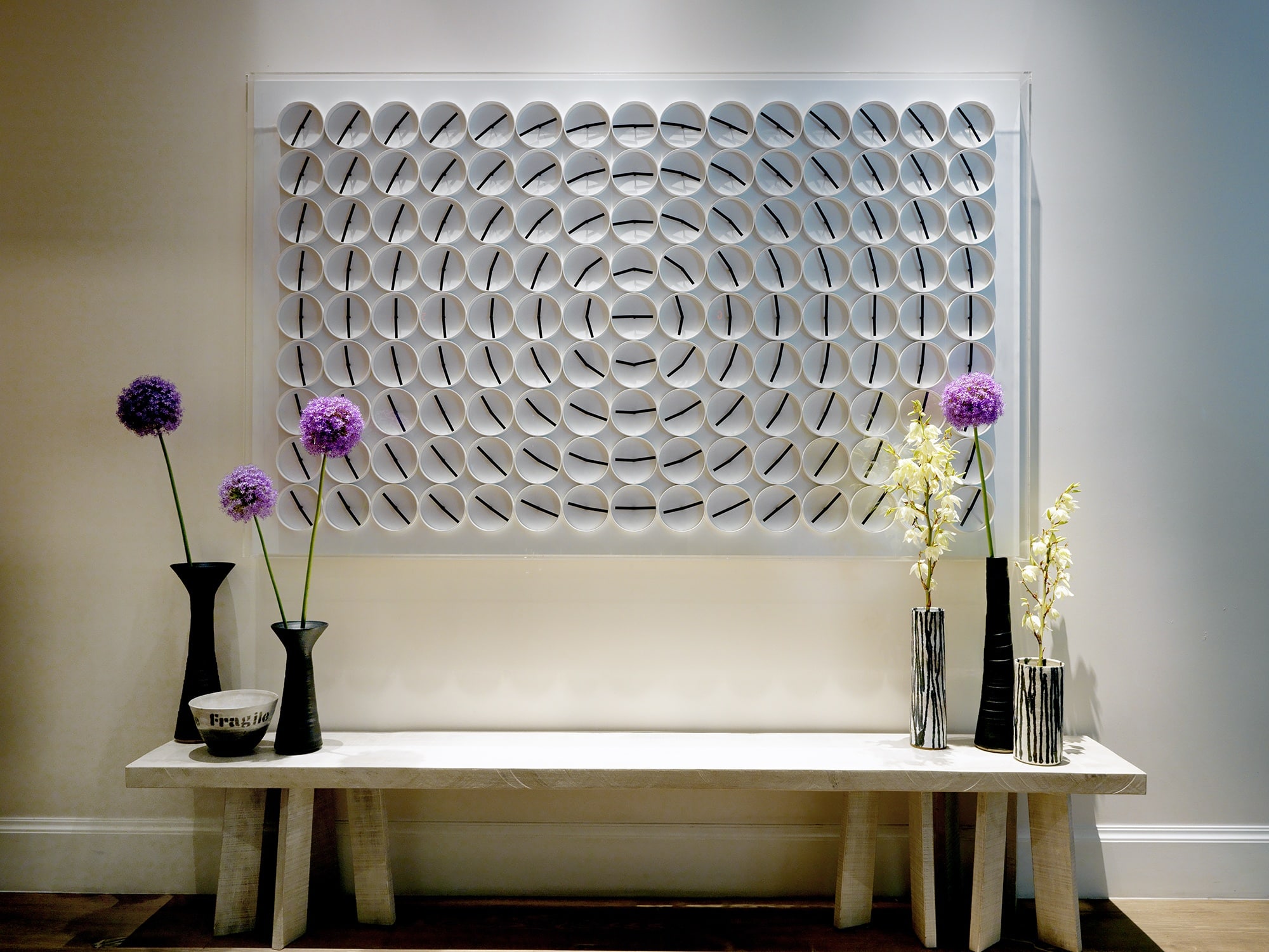
Welcoming guests in the lobby at Ham Yard Hotel is “A Million Times, 2013”, a strong and resolute piece of kinetic artwork by Humans Since 1982. As the hands of the clock move simultaneously they perform abstract, dance like choreographies, reuniting each minute to tell the time in a digital format.
Opposite the banquette seating, above the counter of the bar, hangs a set of wooden crates. The boxes have been hand-painted with different geometric patterns, which against the natural wood material creates a rustic and distinctive feeling.
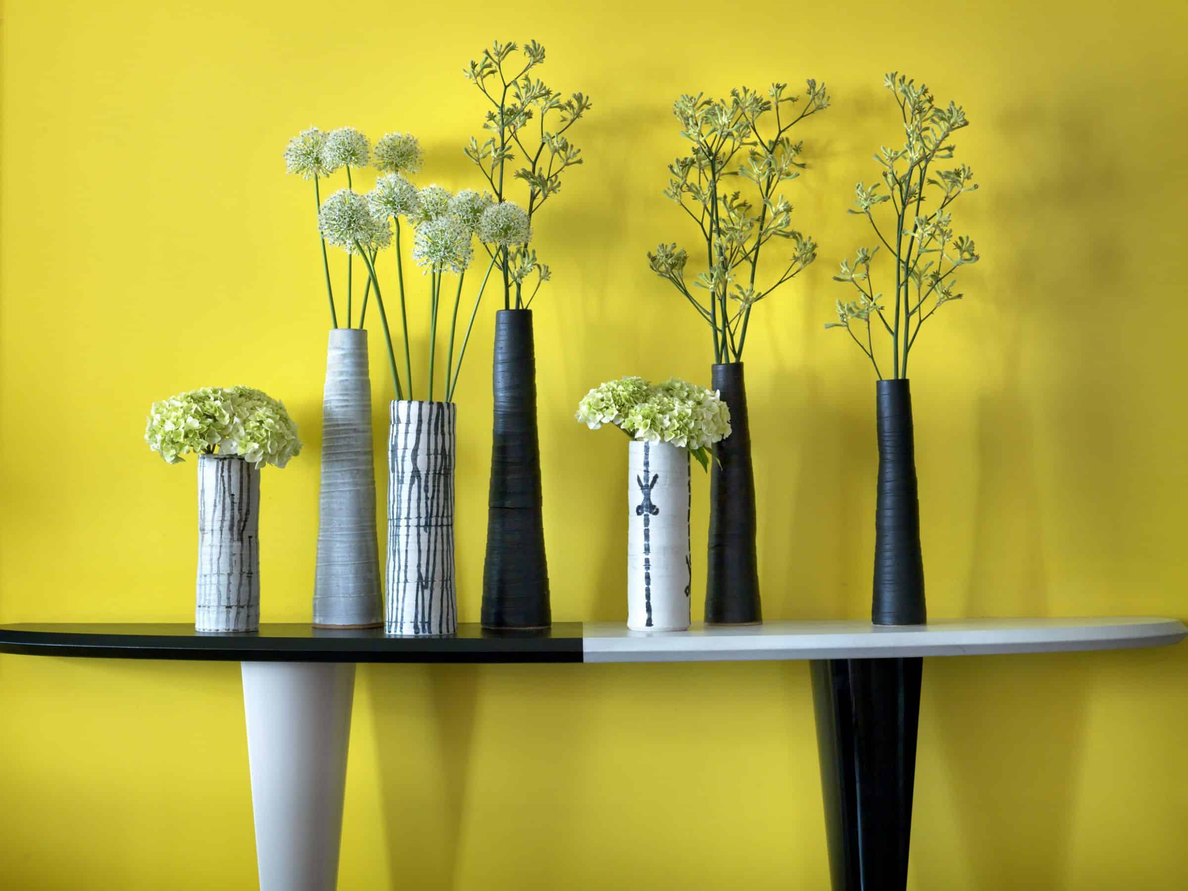
Below, we have made a graphic statement with a sleek monochrome console table that sits alongside the vases, all of it against a vibrant and punchy burst of yellow…
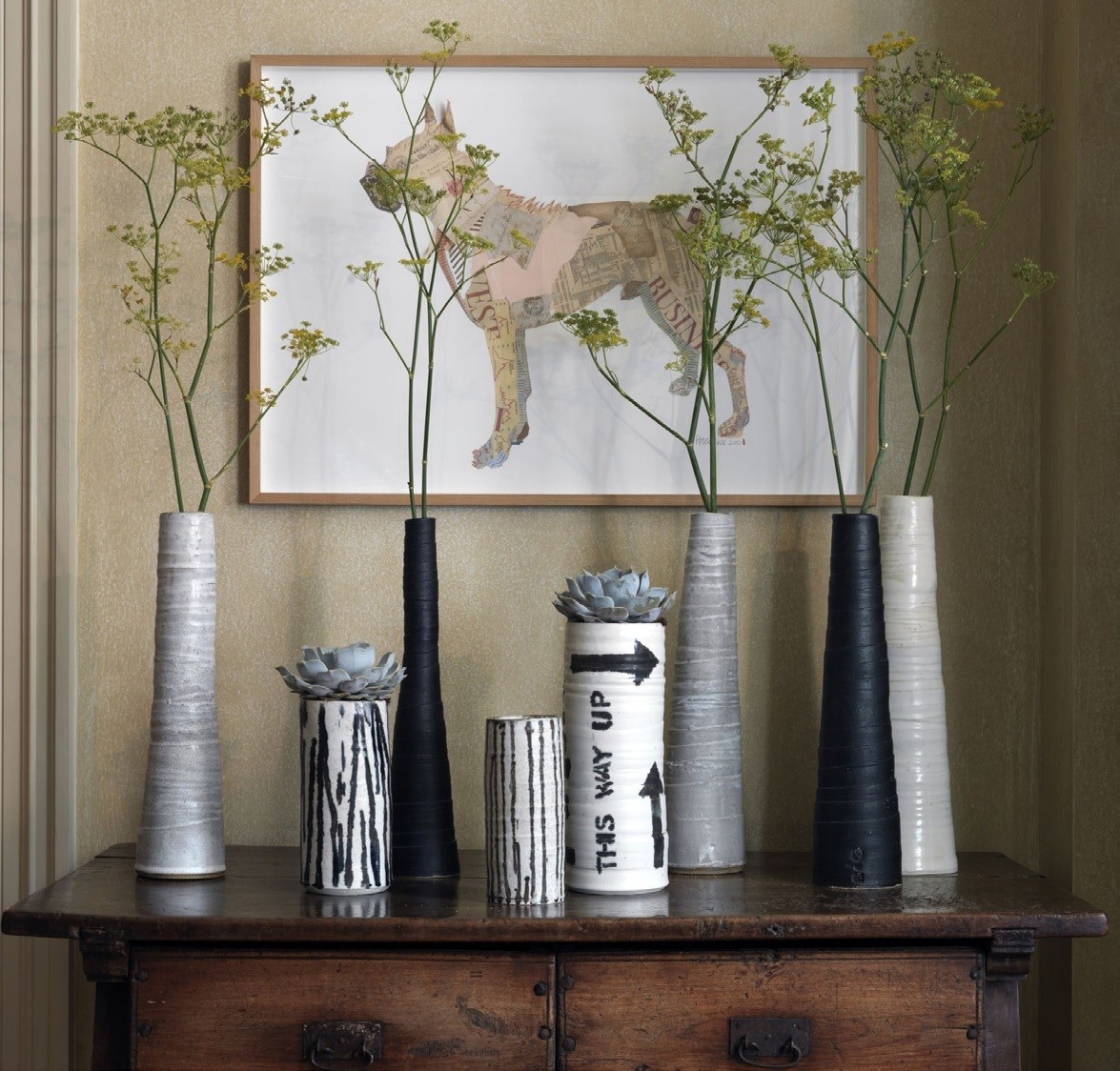
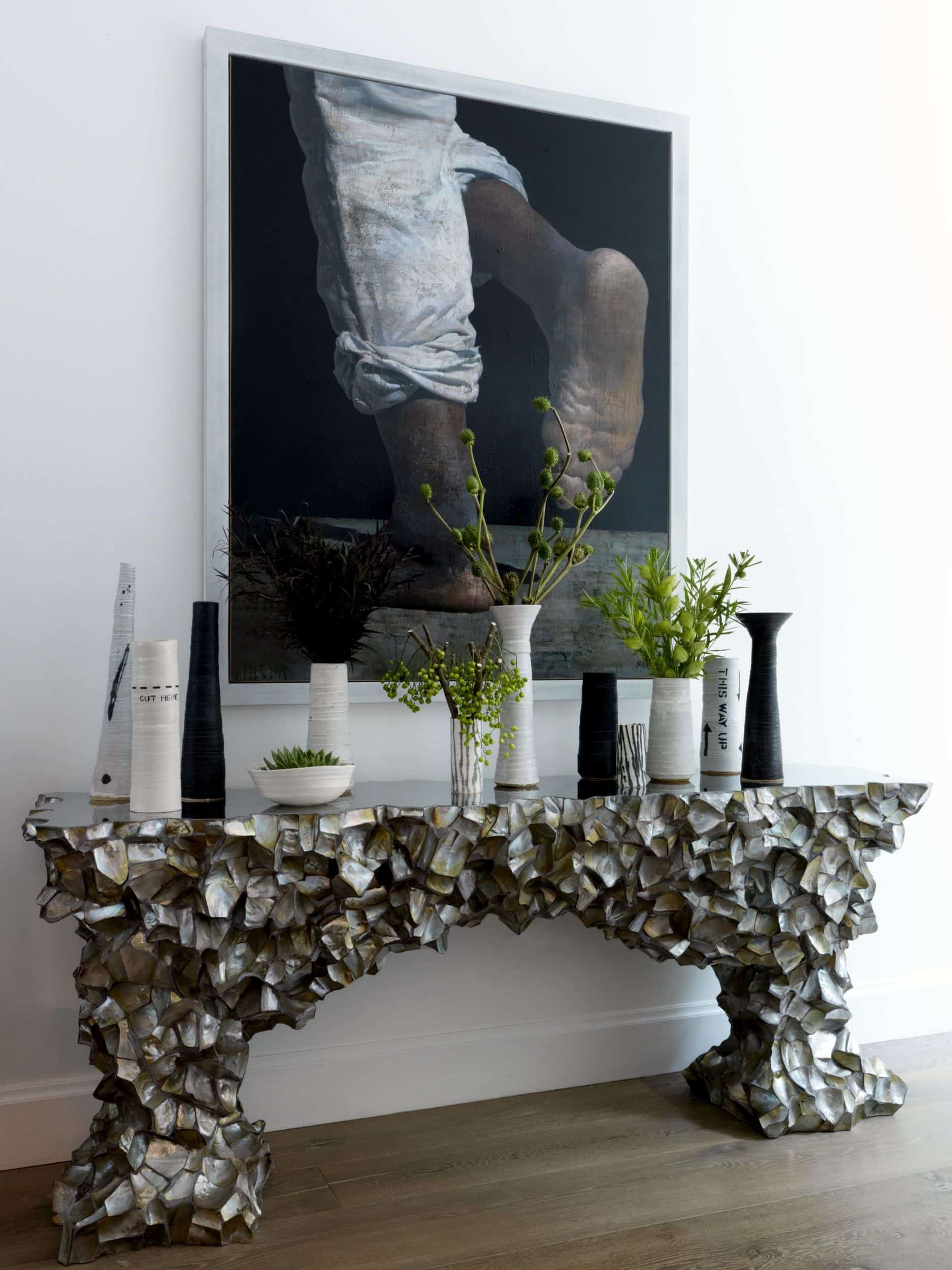
We can’t immerse ourselves in a monochromatic dream without mentioning Katherine Cuthbert. We have been avid collectors of her work for a number of years and her pots can be seen throughout our hotels. Her combinations of tall, smooth and graphic pots mixed in with organic, stalagmite-like vases are very sculptural and always look so striking teamed together in a curated collection. In our Meet The Maker post, Katherine explained to us that she becomes absorbed in the process, and she hopes that moment of calm absorption and serenity resonates with people who view her work.
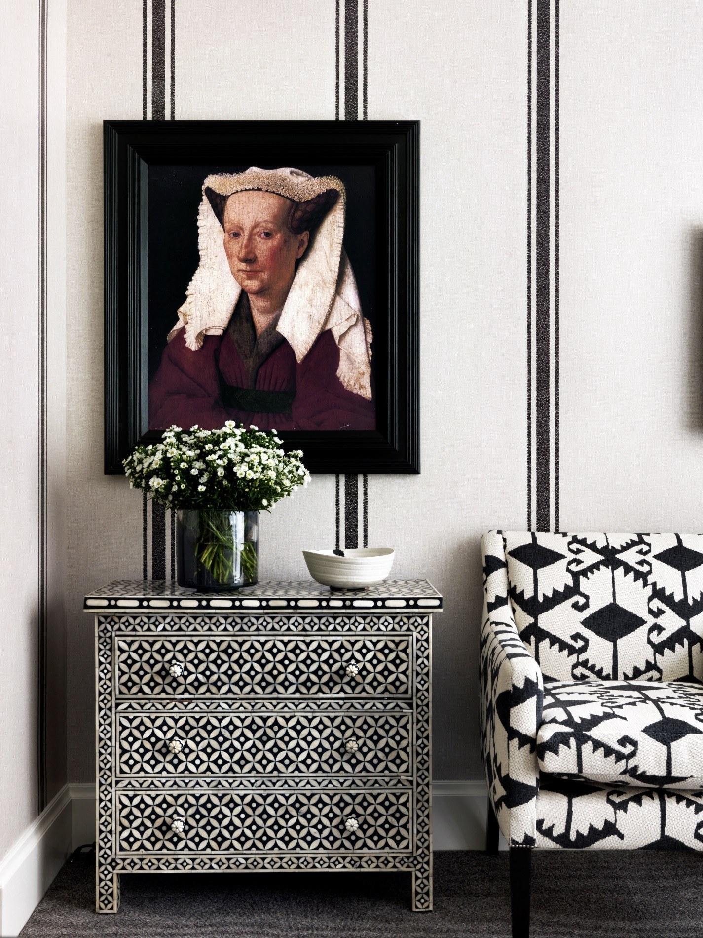
In this room at Crosby Street Hotel, there is a very fresh but calming atmosphere with black and white working in unison. The fabrics work so well together because of their scale and contrast in design. For the walling, a pinstripe fabric gives a masculine and tailored look, whilst the large scale pattern on the armchair lifts the room and makes it more playful. The beautiful commode next to it uses mother of pearl to bring a soft contrast of colour and adds that extra special touch to the room.
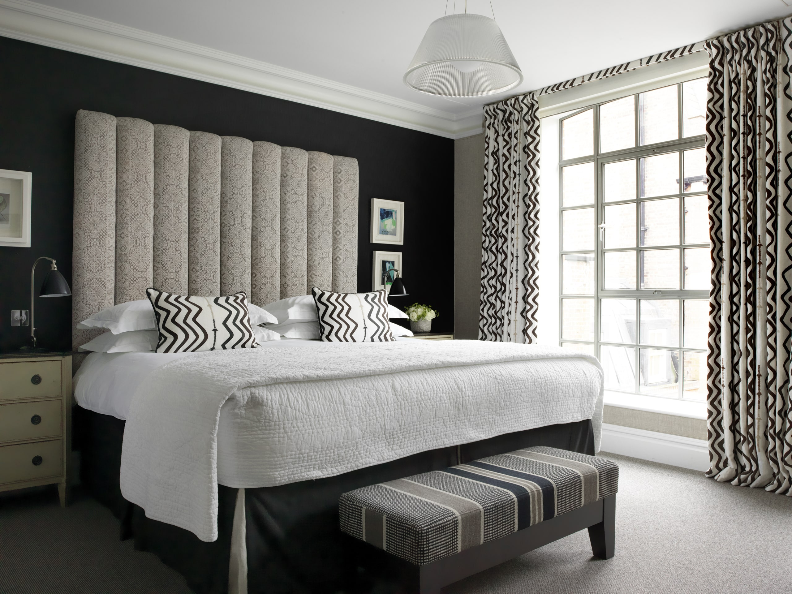
Last, but by certainly no means least, is our Rick Rack fabric, seen here in the chocolate colourway in a bedroom at The Soho Hotel. With a solid dark wall behind the bed, this room welcomes the playful lift created from the fluidity of the Rick Rack pattern combined with the drape of the curtains. The fresh white ground of the linen fabric keeps the room light and airy whilst the bold wavy vertical lines in their rich chocolatey tones pair perfectly with the darker furnishings in the room, adding height and interest to the space.
There are many ways of working with black and white that can give a space personality. We hope we have inspired you to view monochrome spaces differently, and have given you a fresh perspective to admire the subtle yet strong nuances of how black and white can come together in perfect harmony.