
Thankfully the third Monday of January, known as ‘Blue Monday’, is done and dusted for this year!
In 2005, a psychologist created a formula to calculate the most miserable day of the year, with the aim of analysing when people booked holidays, assuming we are most likely to do so when feeling blue.
Instead of feeling blue, we’re celebrating the many happy variations of the colour blue.
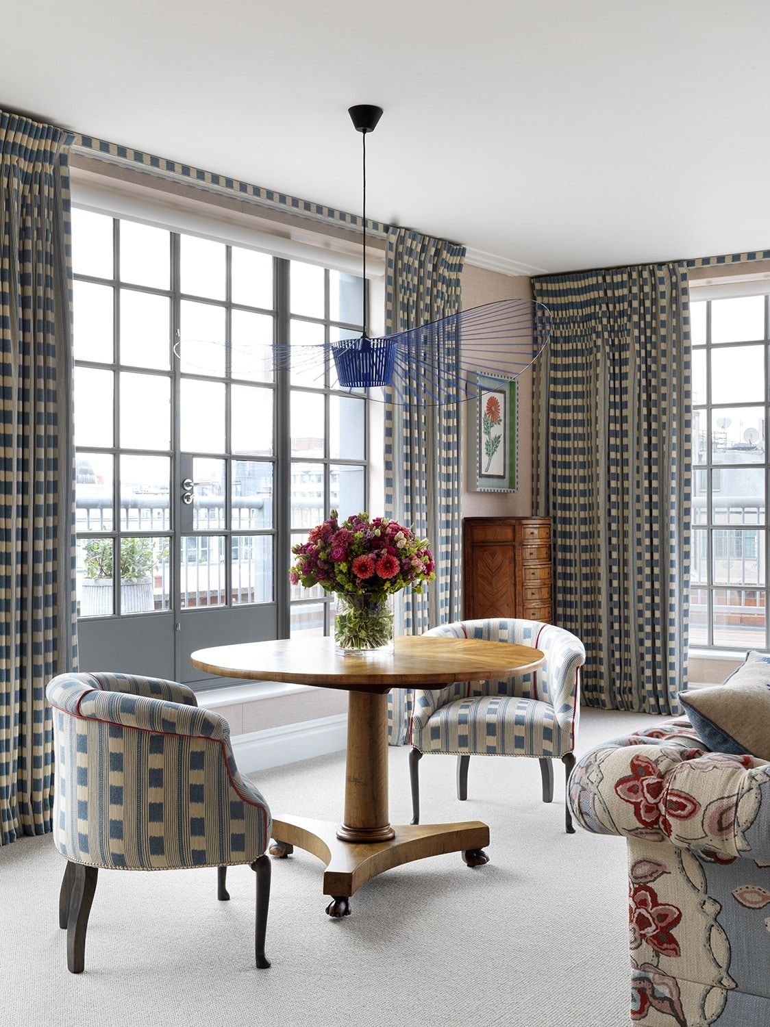
Blue is one of the colours that we always return to. Even in the warmest schemes, blue adds that touch of freshness that makes a space feel timeless and balanced.
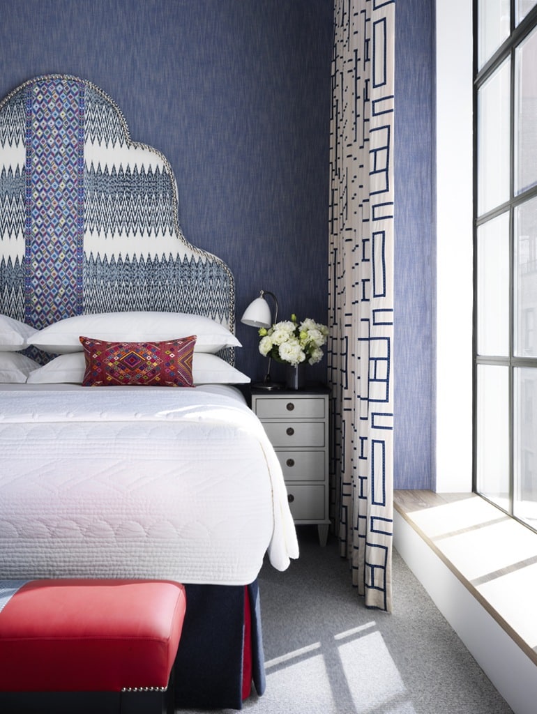
Adding a touch of blue will add a sense of calm to a lively red scheme. The blue on the walls in this room at Number Sixteen holds the scheme together, adding a contemporary feel.
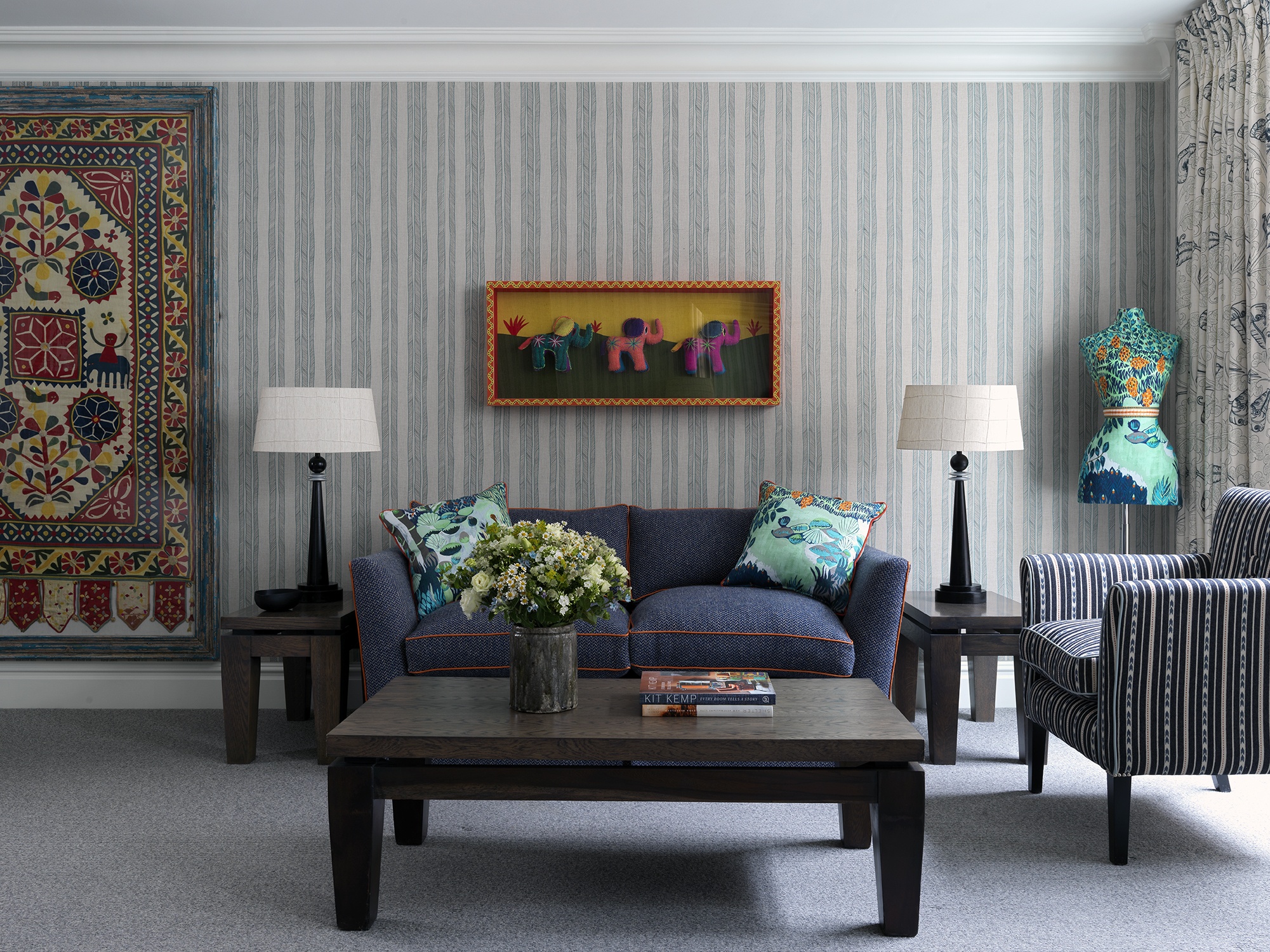
The hand drawn vertical stripe makes the room appear taller and modernises the concept of a classic stripe wall.
There are many different kinds of blue in this scheme, but they all harmonise beautifully.
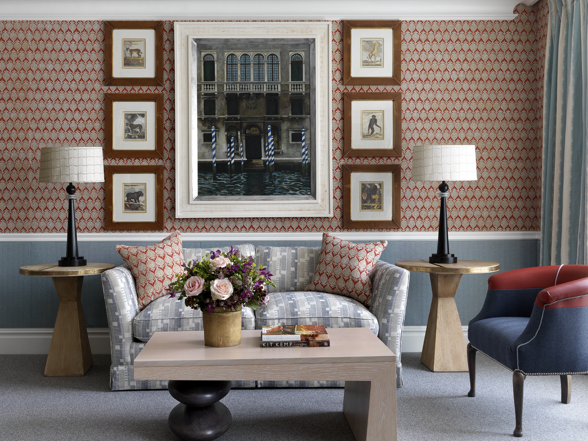
In room 201 at The Soho Hotel, we love the subtle blue thread on this fabric by Kravet on the walls. The blue stripe adds freshness to the beige linen background and elevates the room.
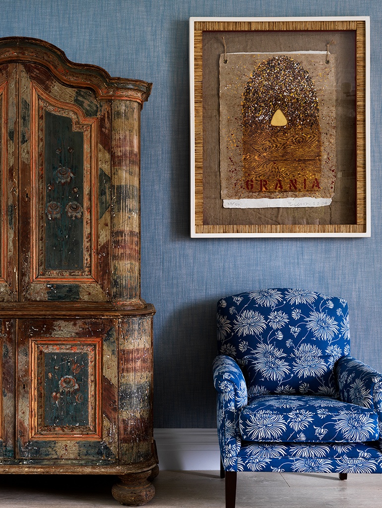
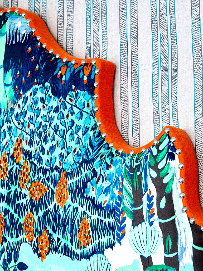
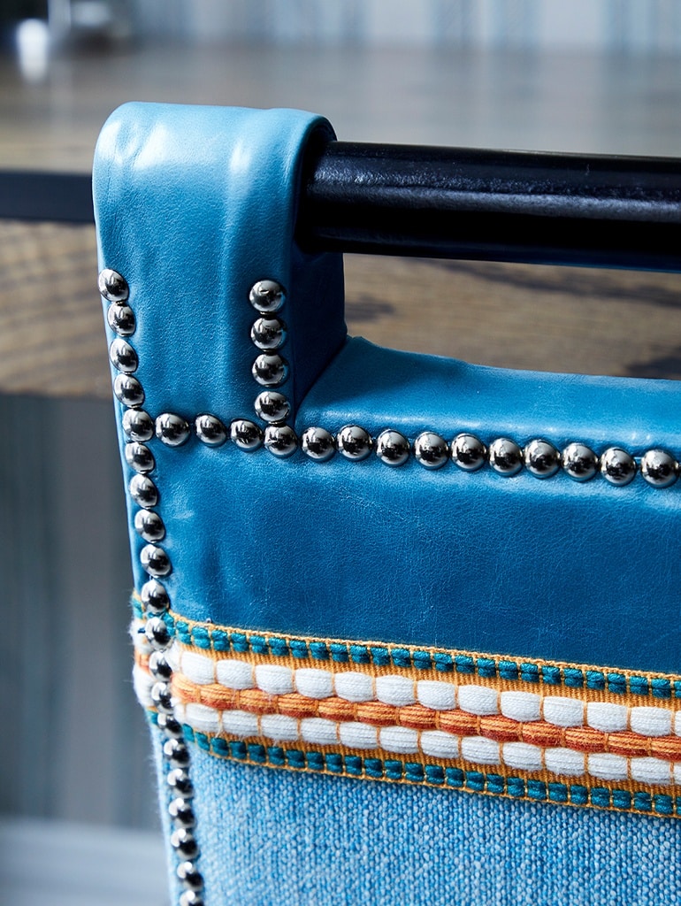
Little details, like accent cushions or even details on the chairs can make a blue scheme look warmer if you are worried about using too much blue.
Darker blues look more mature and elegant, while lighter hues are perfect for a young and lively room.
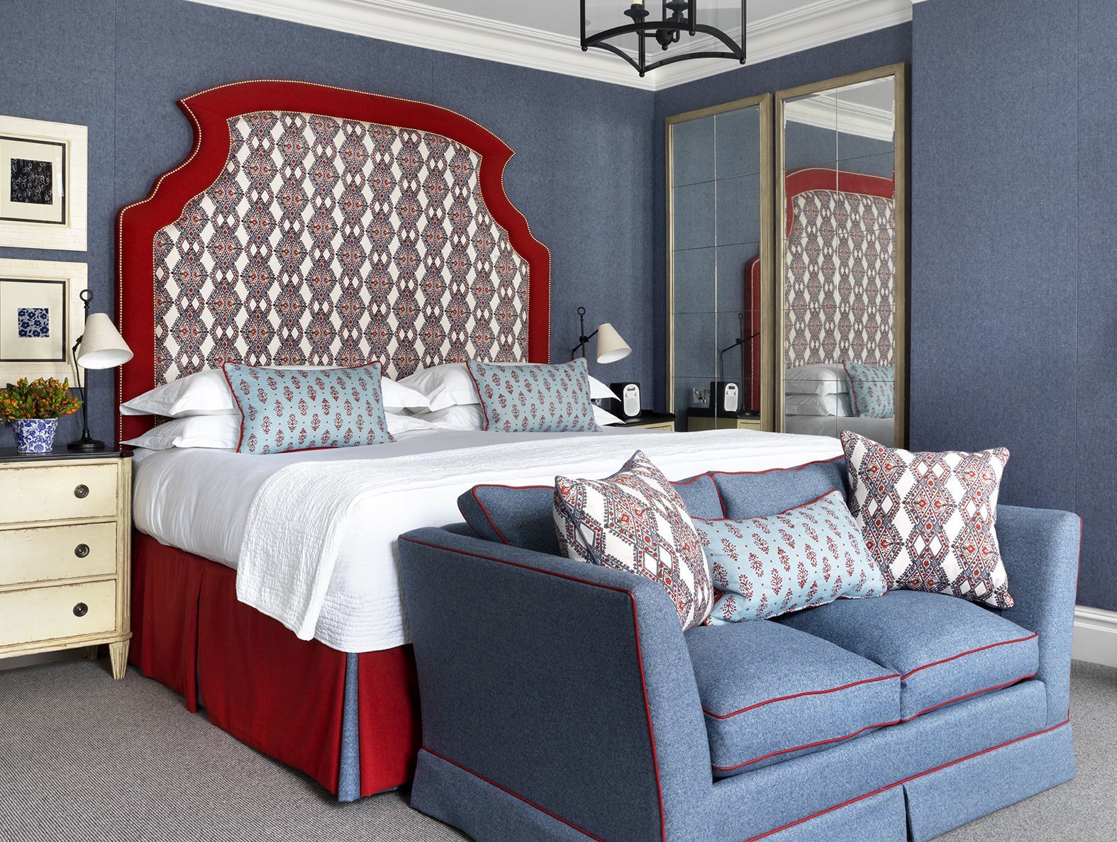
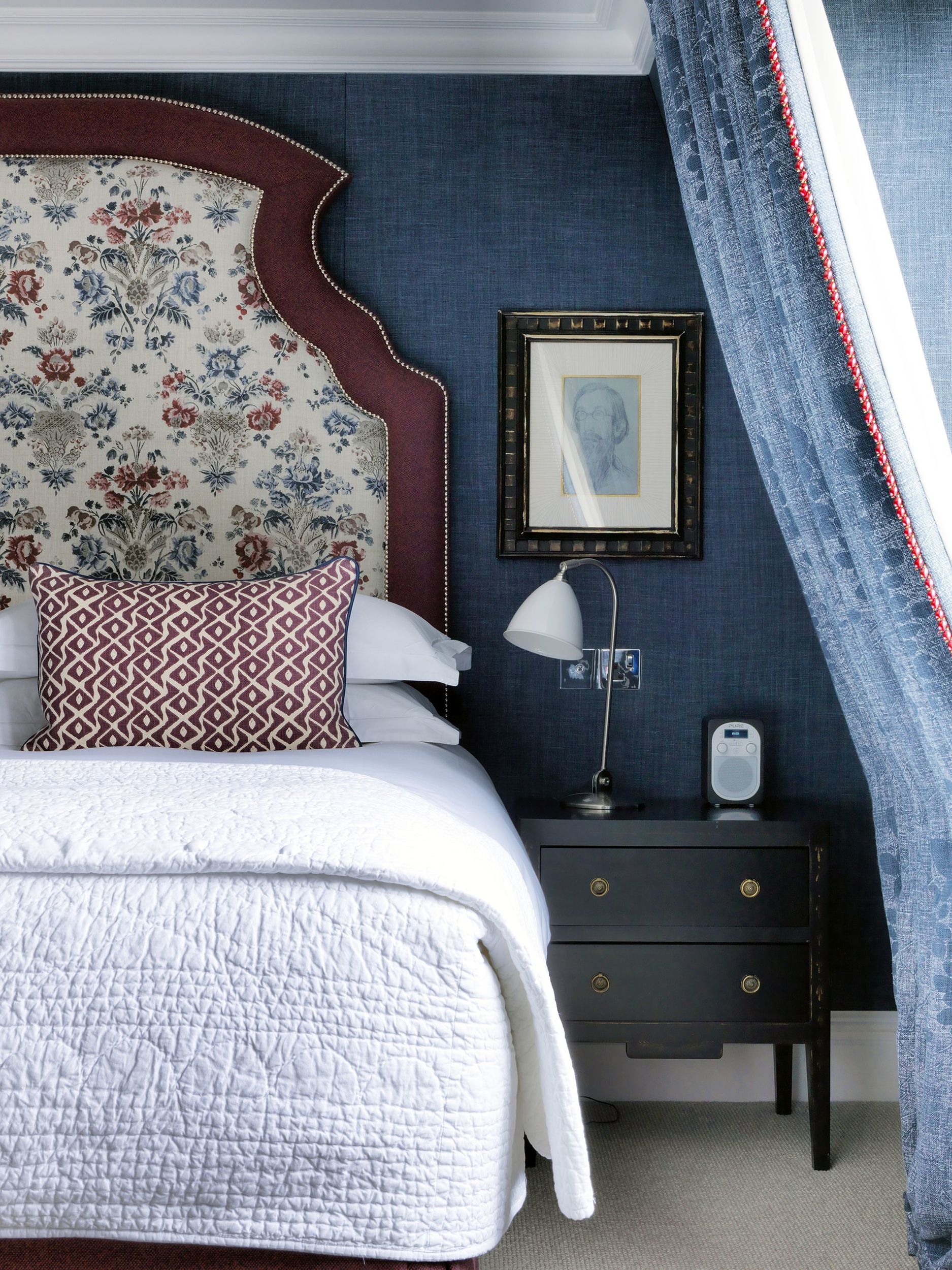
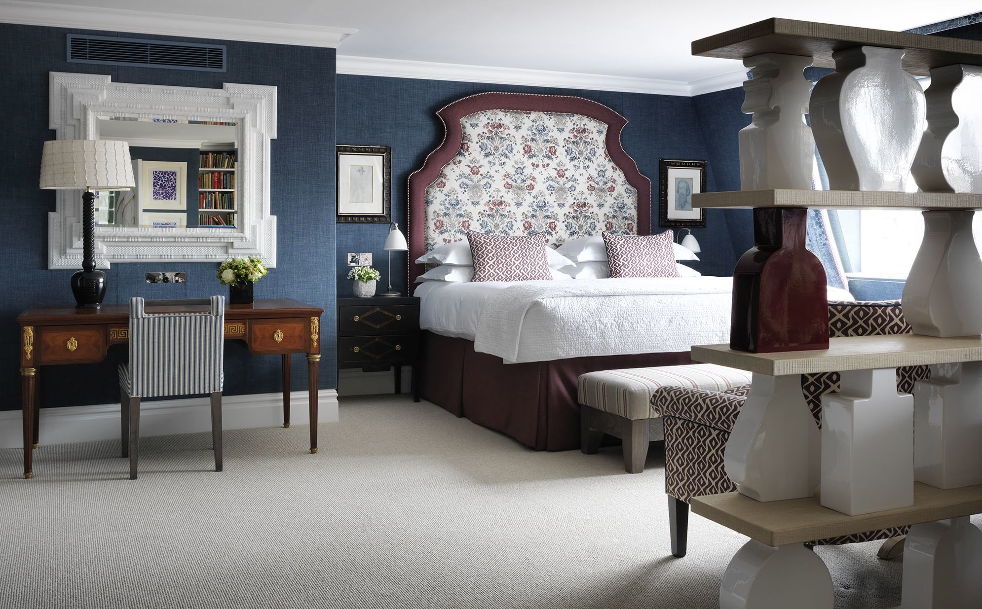
At Charlotte Street Hotel, the combination of a deep blue with the burgundy red details makes this suite look timeless and sophisticated.
Balance is a very important part of our work, when we play with so many textiles and take so many risks with colour and pattern.
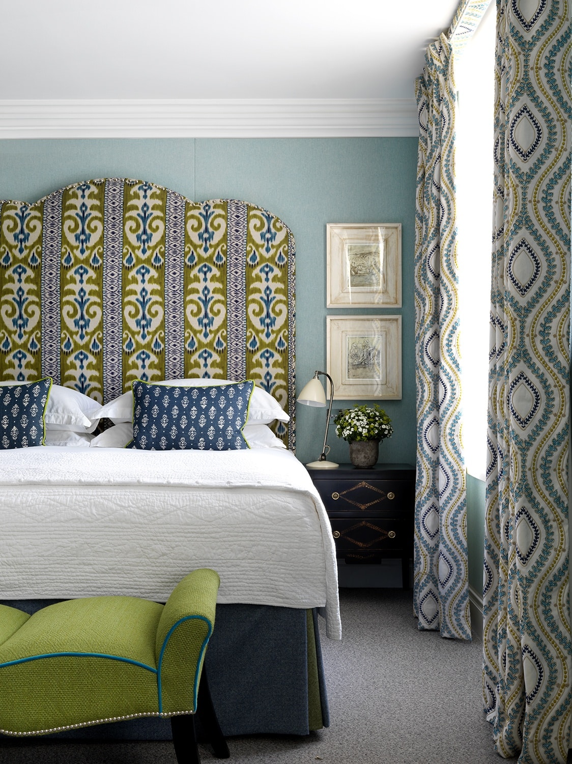
This suite feels like a combination of water and fire, they both need each other to create a room which is warm, with the vibrant Raoul textile above the dado rail, but fresh, with a plain blue linen below.
To create a sense of continuation through the room, we added some burgundy ceramic pots on the bookcase which divides the space.
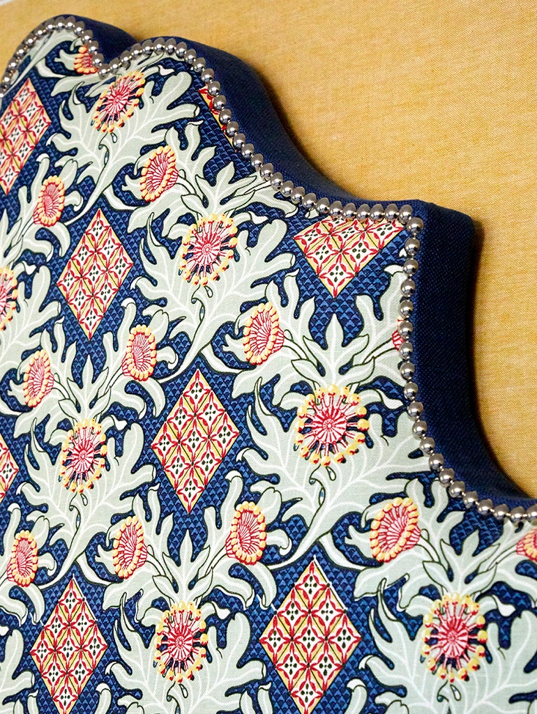
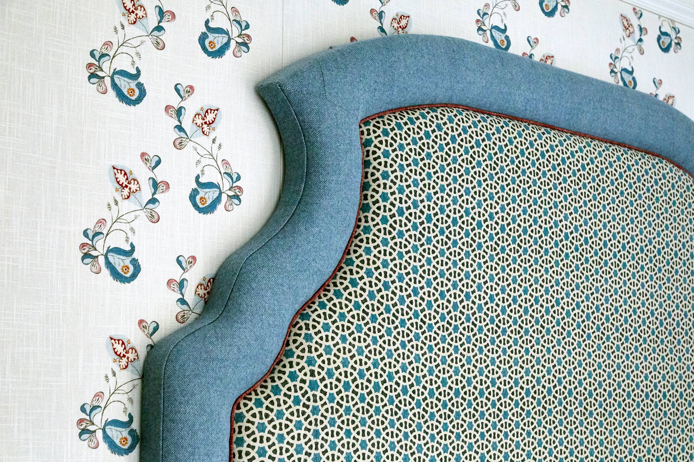
In this suite, we have used my ‘Psycho Sprig’ fabric on the walls. This design works well as it creates a calming flow on the walls, while the headboard has been upholstered in more solid and geometric fabrics to balance the scheme.
For a more refreshing look, we like to combine blue with green.
Green and blue seem to work together naturally, though it isn’t a combination we see very often in interior design.
This combination feels like being in a garden in the height of summer, with a swimming pool next to you!
With Blue Monday behind us, we hope these images show how much fun we have had orchestrating these blue schemes and we hope they give you some inspiration to create your own.