
“Life is just a bowl of cherries and nearly every one of them is good”
I love that ethos!
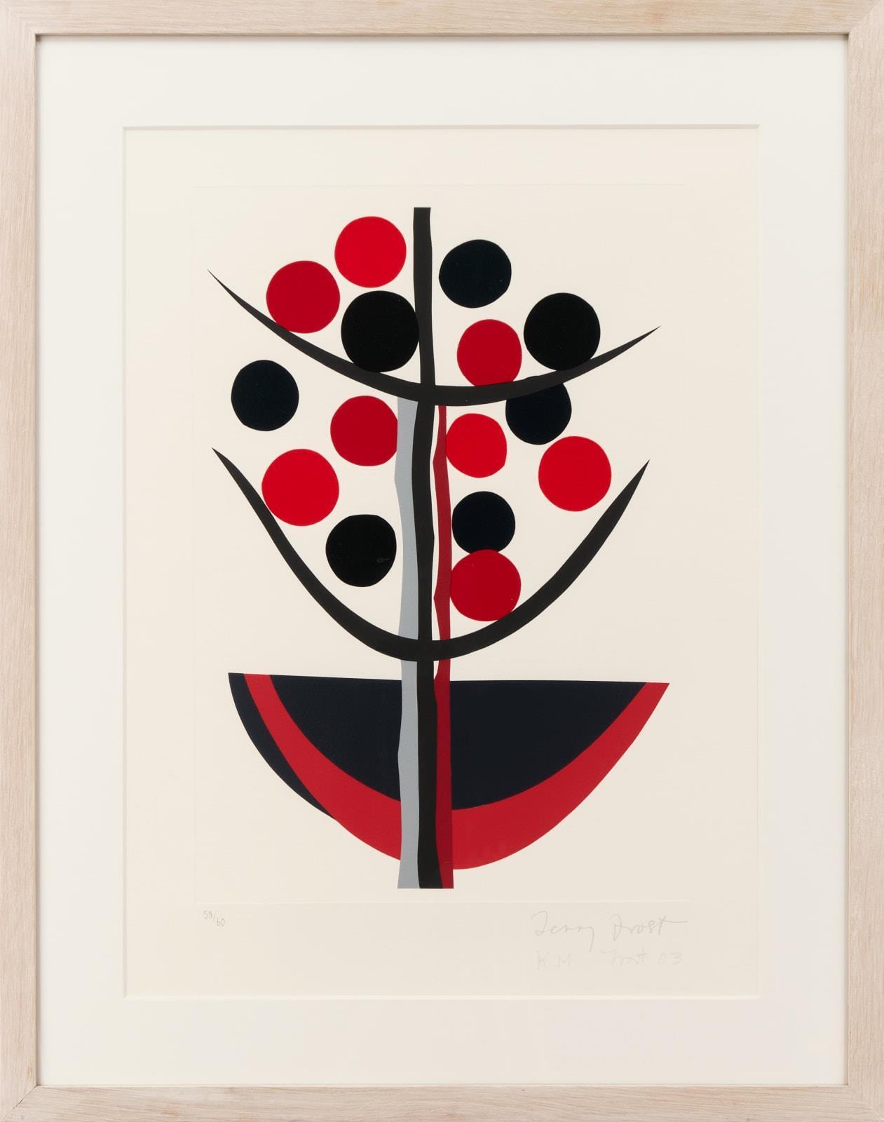
A favourite artist of mine is Sir Terry Frost. He was a key figure in the development of British twentieth-century abstract art and was renowned for his bold use of colour and shape.
In 1941 whilst serving in the army in Crete, he was captured and taken to Stalag 383 in Bavaria. It was in this place of incarceration, far from home, he met the artist Adrian Heath who taught him to paint. He painted self-portraits of the prisoners, saying that you had to capture a good likeness because with fourteen men in your room constantly walking past your work, they would be harsh critics and tell you exactly what they thought of it! Later when he was free and returned home he turned his hand to abstract art, where he found a freedom in himself to work with shapes and colours in a poetic way.


“Black, white, red. Wow!”
When viewing his work, you learn about strong contrasts….red to black to white. Every mark made, makes every other shape work.

Sir Terry Frost was determined to enjoy every minute of his life after his experience as a prisoner of war and I think this comes across in his art. He was a great communicator and raconteur. He was full of joy for his own and everyone else’s work.
He started teaching fine art, which led him to Bath Academy of Art, the University of Leeds, Cyprus College of Art and the University of Reading. He would talk about art and life and life and art being synonymous. Of course as an army boy he was up at the crack of dawn. No wonder he was such a positive character, going straight to his studio, an impression of colour, harmony and dynamics. I can imagine his enthusiasm rubbing off on you.
“It’s no good in having 25 different colours if you don’t know how to use them.”
Initially red, black and white were his favourite paint colours because they were the cheapest. In fact, he said that he only used to have black and white until someone gave him Cadmium red and it was when he used that, he discovered another colour of equal strength.
Sir Terry Frost was an artist in the golden period of St Ives in the 1950s, which was a melting pot for talent. He thrived in an environment being surrounded by other non-figurative and more abstract painters. He spent time as an assistant to Hepworth. This was a place where women could exhibit amongst the men. There wasn’t such prejudice in Cornwall compared to London at the time.
How wonderful that he was able to enjoy success within his lifetime. He was elected to the Royal Academy in 1992 and knighted in 1998.
I am proud to own my own prints, purchased through Georgia Stoneman’s gallery, now on display at Ham Yard Hotel.
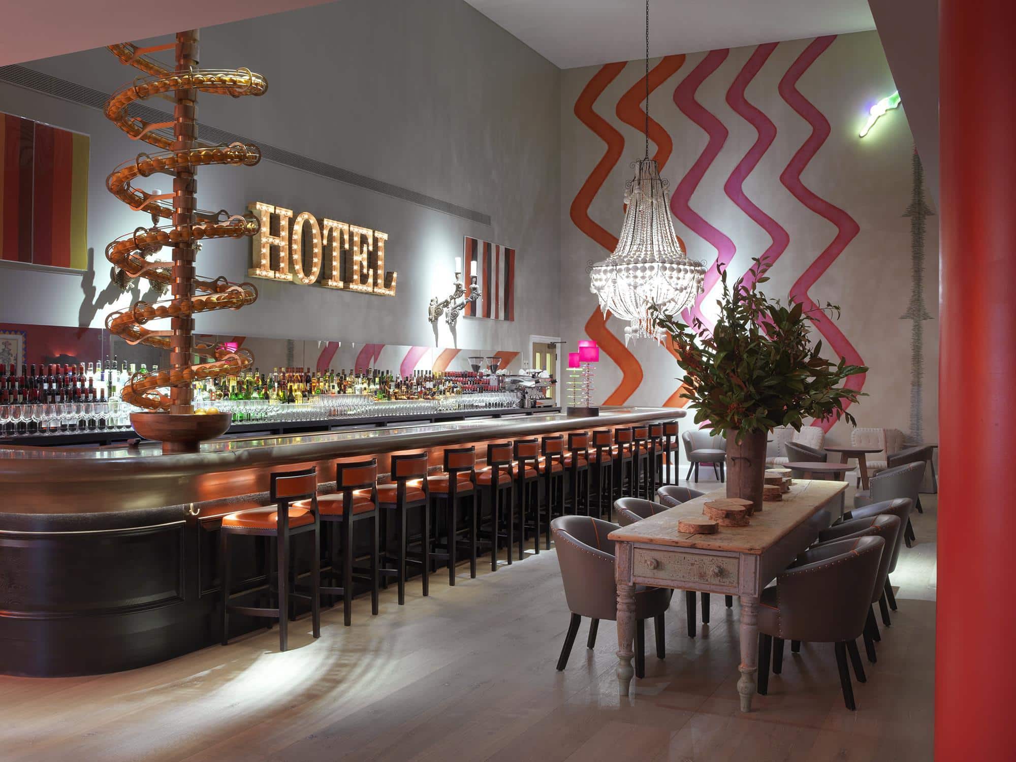


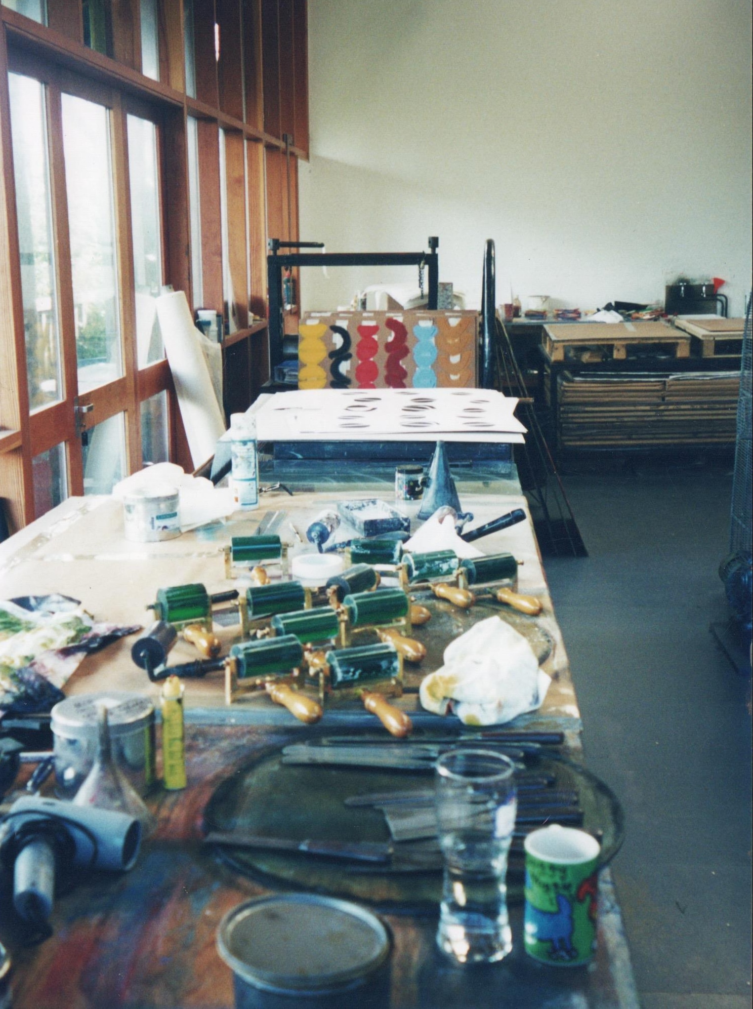
When designing the hotel lobby, I looked at artists such as Sir Terry Frost RA, Sandra Blow RA and William Scott RA to get my creative juices going. Georgia Stoneman’s late father, Hugh Stoneman, was a master printer who worked alongside Terry Frost. He had an extraordinary attention to detail, so the combination of the two masters resulted in work that made an enormous contribution to contemporary print practice.

Of Sir Terry Frost and Hugh Stoneman’s partnership, Georgia told us:
“Hugh and Terry worked together for over 20 years and had a wonderful relationship, based on exacting standards, a shared love of the printing process and very good sense of humours! The reason I feel Terry’s prints were so successful and as important as his paintings is that he respected the printing process as an art form in its own right. So often (too often!) artists treat it as the underdog, a way to reproduce paintings rather than adapting their creativity in a different medium, this is where the print maker becomes so important. The technician who can harness the ideas and desires of the artist and translate them into ink and paper. It has been said that the relationship between the printer and the artist is similar to that between conductor and composer. I think this sums it up quite well.”
“I used to also love Terry’s work schedule, he would insist on starting work early (Dad was always up and in the studio by 5am anyway so it suited him) so he could get back home at lunchtime for a jacket potato and Neighbours. Decisions on colour, tone, ink density and paper weight became a language I would absorb in a way which has built an internal understanding for art and craft. It was an education I now treasure over and above anything I learnt in a classroom.”
We absolutely love this medal award Terry made for Hugh and his good work on colour…


My Egg & Dart rug for Christopher Farr, shown here in the Meadow Suite at Crosby Street Hotel.


Finally, if you are fans of Desert Island Discs like us, we thoroughly recommend listening to Sir Terry Frost’s inspirational story that is bound to put you in a good mood:


My Pop Art trim I designed for Christopher Farr.

Have fun using it on cushions, curtain leading edges, or make a lampshade as we did for Vaughan Lighting’s Made in the Shade campaign.
I take endless inspiration from Terry Frost’s work. Our Rectangular Ruler Side Table and Disc Lamp are an example and can be purchased from Shop Kit Kemp.