5 Tips for Playing with Pictorial Patterns
How ToAt the Kit Kemp design studio, the bolder the better and one of our favourite patterns are motif heavy repeats that tell a story. These designs are often the hardest to use. You have to be brave and bold when working with busy patterns, but also know when to pare it back - here are my 5 tips for using complex pictorial patterns...
I love using bold patterns in my work, from traditional florals to smart stripes and modern, graphic designs. At the Kit Kemp design studio, the bolder the better and one of our favourite patterns are motif heavy repeats that tell a story. These designs are often the hardest to use. You have to be brave and bold when working with busy patterns, but also know when to pare it back – here are my 5 tips for using complex pictorial patterns…
1. Tone It Down
When working with busy fabrics or wallpapers, a way to bring calm to the chaos is to use softer and more natural colours.
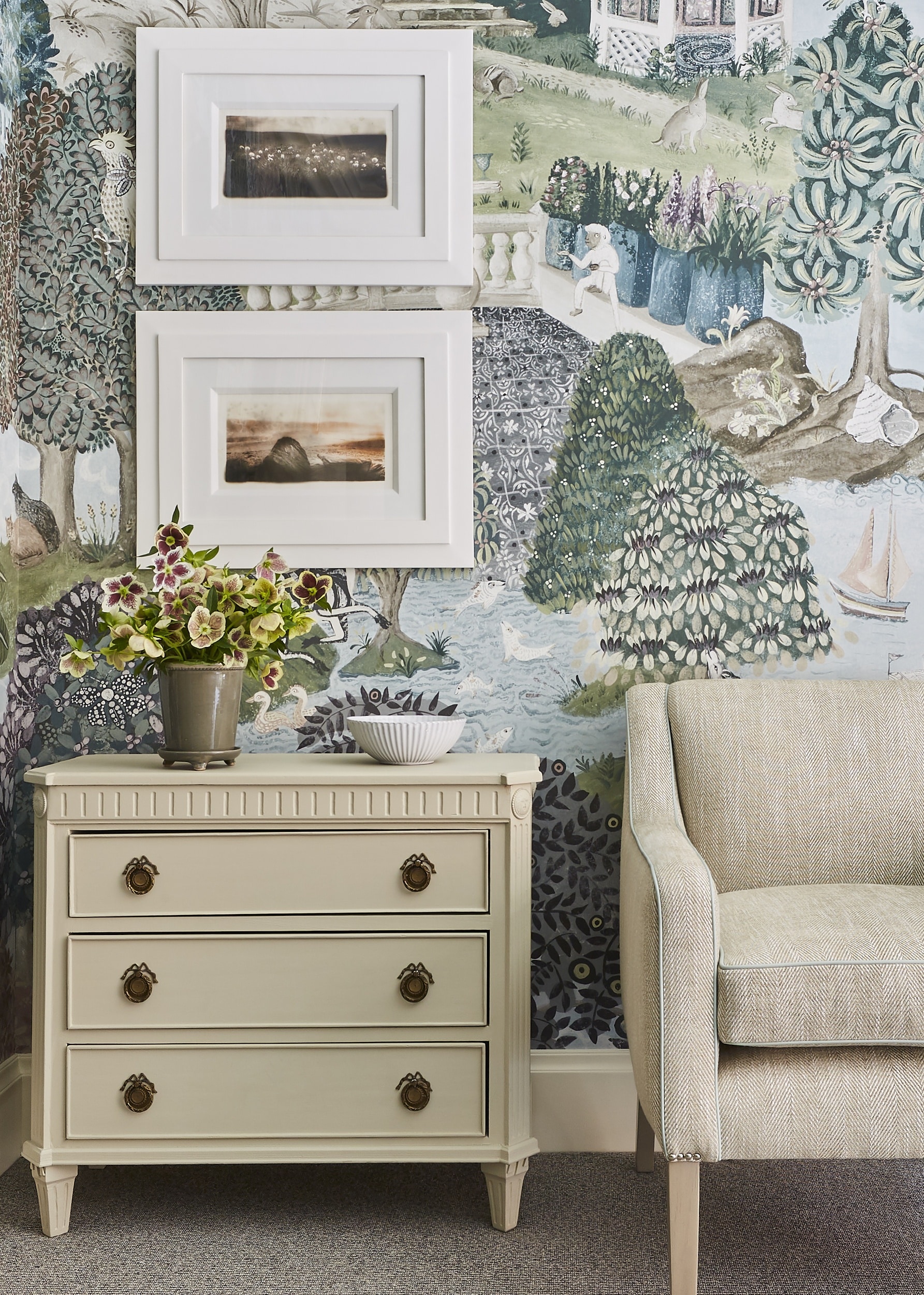
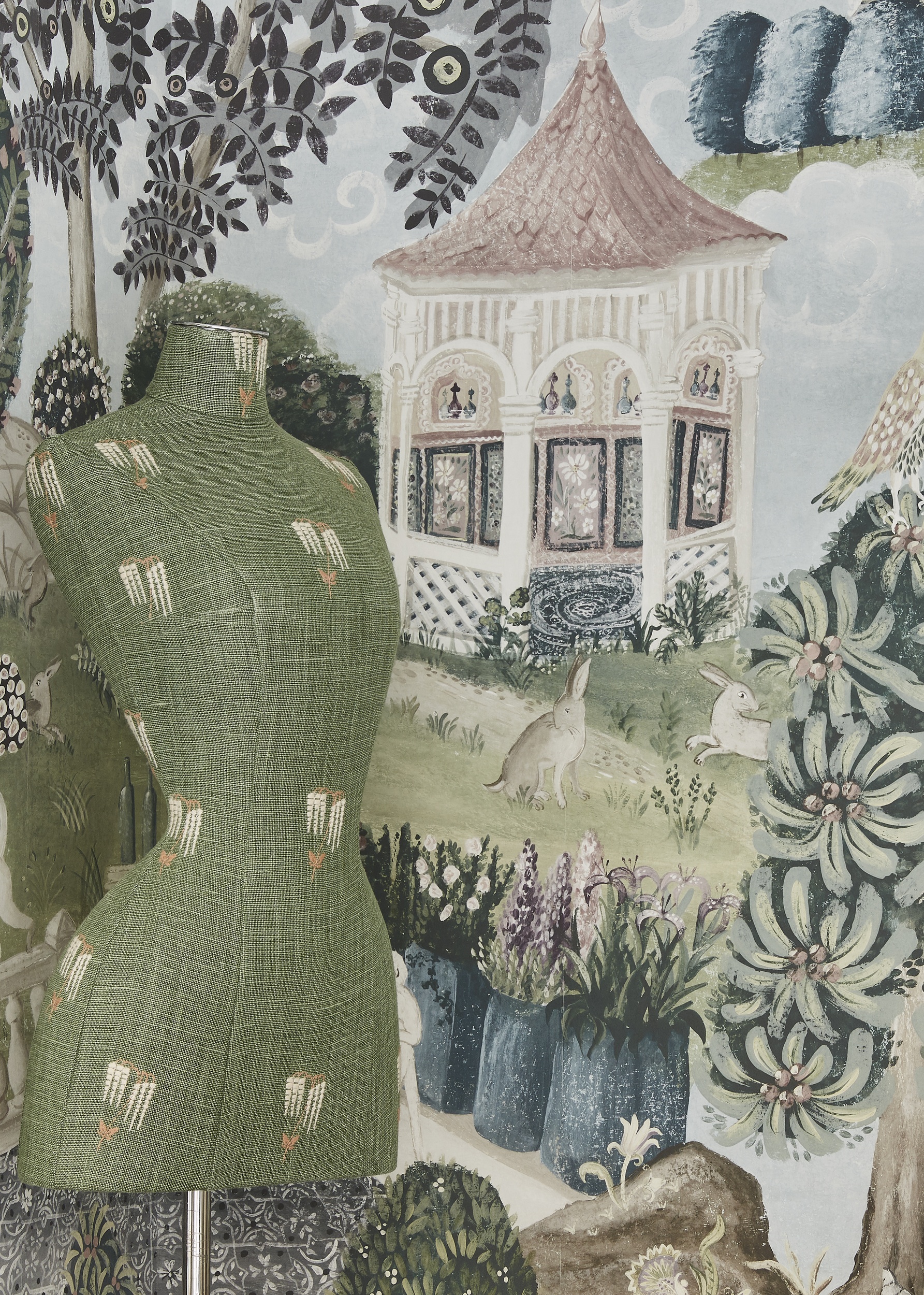
In this room at Crosby Street Hotel, the intriguing mural wallpaper transports you to the wonderful world of ‘Emily’s Garden’. In this scheme, the wallpaper is the star of the show. I used a combination of soft plain upholstery fabrics, so not to detract from the intricate storytelling in the wallpaper design. The more neutral fabrics create balance and a sense of calm in the room. I used a splash of pattern on the mannequin and bed cushions for that final flourish of detail.

2. Fire it up
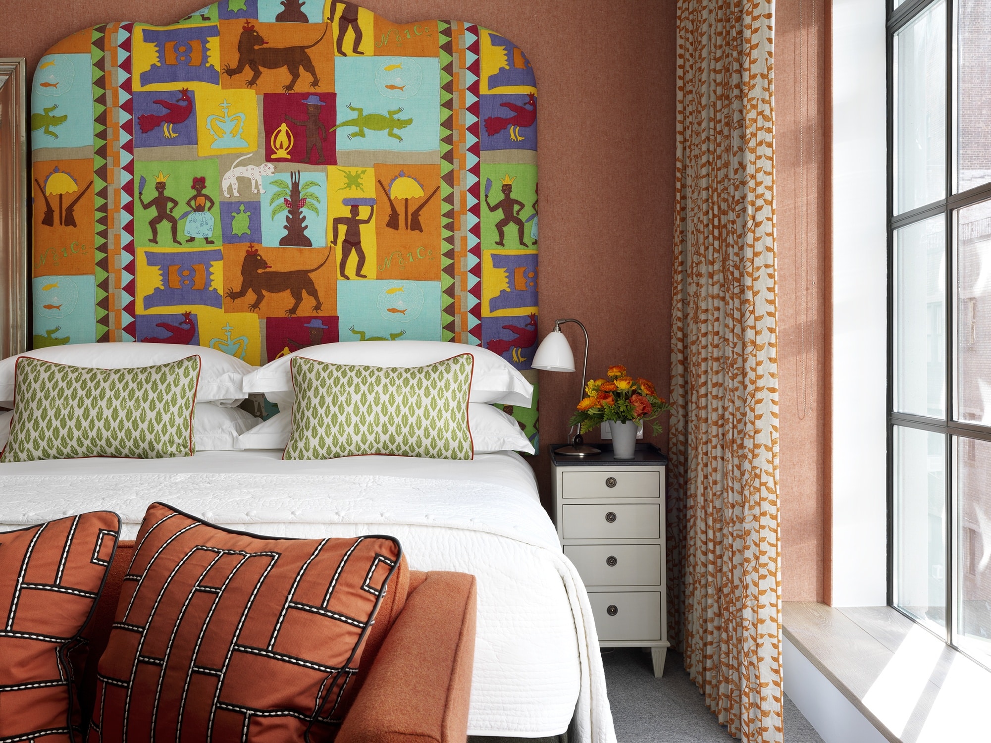
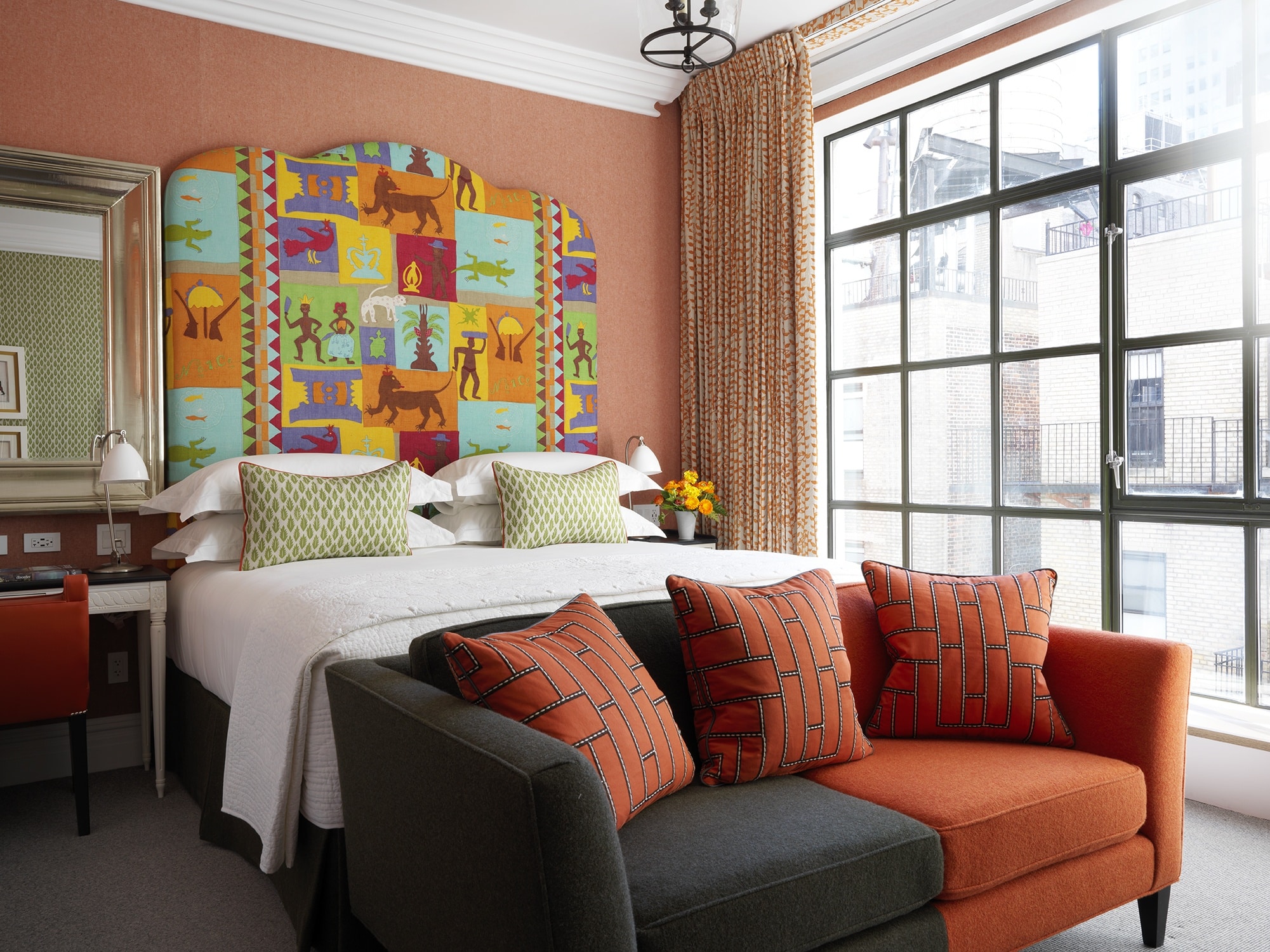
In complete contrast to the trick of paring things back, in this room at The Whitby Hotel we emphasised the feast of colour on the bold and rich design of the headboard. This wonderful fabric, inspired by the art of Asafo flags, is one of my favourites from Raoul textiles.
3. Continue the Narrative
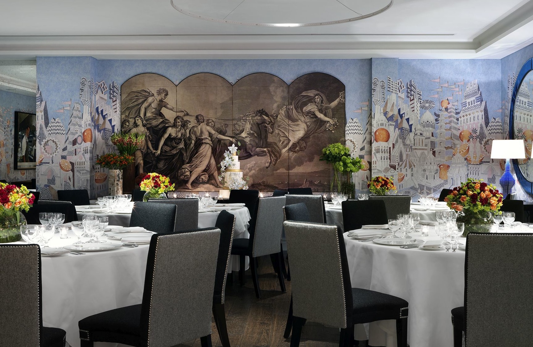
In the Indigo Room at The Soho Hotel, the wallpaper reminded me of a lost and forgotten city. Rather than shying away from the rich pattern the wallpaper provides I used a strong artwork that played into the story. The painting evokes a sense that the travellers are discovering the landscape on the wallpaper beyond.
To make the most of the design, the entire scheme is alive with colour and detail. On the curtains, I added in my ‘Tea Leaf’ design with its cascading orange vines, bringing in another pattern but mixing the scales to create stability. On the walls, I used a plain fabric so not to fight the statement headboard, but the fiery hues make it exciting. By playing into the hot and bold tones of the fabric, I have created a space where this fun textile feels at home and not at odds with the space.
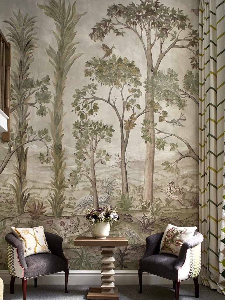
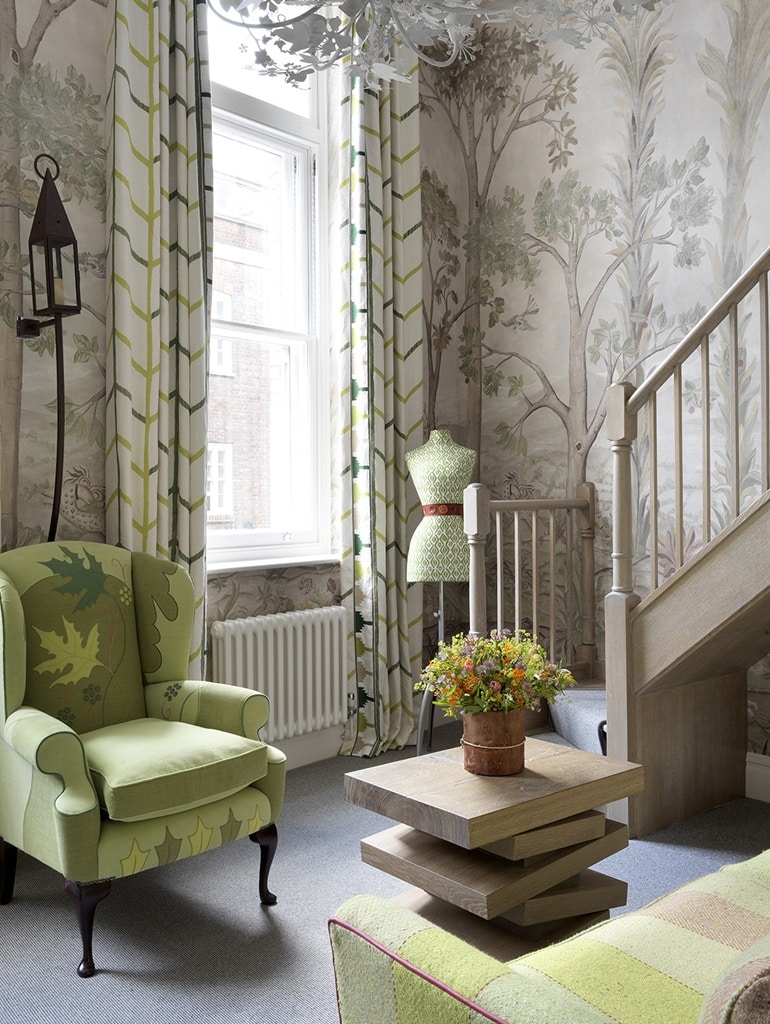
5. Opposites attract
In Room 109 at Charlotte Street Hotel, the walls are surrounded by birds, mythical creatures, towering trees and rolling hills fading into the distance on the double height 13-foot high walls.
We paired the mural with my large repeat graphic fabric ‘One Way’ on the curtains to create an interesting contrast between the romantic narrative on the ‘Tall Trees’ wallpaper. Don’t be afraid of using geometric prints with more painterly designs, opposites definitely attract and the unexpected combination of patterns create a modern and fresh twist.